|
Какой рейтинг вас больше интересует?
|
Главная /
Каталог блоговCтраница блогера PSDTUTS/Записи в блоге |
|
PSDTUTS
Голосов: 2 Адрес блога: http://psdtuts.com Добавлен: 2008-10-26 20:48:58 блограйдером DrakAngel |
|
Presentation: Working With Adobe Photoshop Lightroom 3
2011-05-28 18:00:03 (читать в оригинале)Advertise here
If you are a photographer or some one who works with photos quite a bit, chances are you’ve heard of Lightroom. Lightroom is an app that allows you to edit and organize your photos. While it can perform many of the same tasks as Photoshop, it is an independent app designed specifically with photographers in mind.
Each month, we try to bring you a design-related presentation or speech from around the web. Today, our friend and Adobe Design Master, Martin Perhiniak led a seminar organized by Academy Class, the leading training company in the UK as part of their Digital Photography Club. Please take a moment to review Martin’s excellent presentation if you’re interested in learning more about Lightroom 3. To learn more from Martin, check out the Photoshop Basix Series he did for Psdtuts or his personal blog Yes I’m a Designer.
The model’s portfolio whose photos the presenter used in this seminar can be found here.
Matte Painting 101: Basic Destruction Techniques
2011-05-27 20:00:29 (читать в оригинале)Advertise here
Matte painting is a technique that filmmakers use to create backgrounds for scenes that can’t or don’t exist in real life. In the early days, matte paintings were actually painted onto glass. Today, modern filmmakers use digital applications such as Photoshop to produce the backdrops that they need. We have published many matte painting tutorials on this site meant for intermediate and advanced users. This tutorial is part of a series of tutorials that we will be publishing on this meant for those of you who may be relatively new to Photoshop or matte painting in general.
Today’s tutorial, Matte Painting 101: Basic Destruction Techniques will teach you how to created a flooded city and destroy buildings and structures. This tutorial will focus on the destruction of New York, which seems to be a favorite amongst filmmakers. Let’s get started!
Tutorial Assets
The following assets were used during the production of this tutorial.
- Bridge
- Sky 1
- Sky 2
Create a Self-Portrait Caricature Illustration in Photoshop
2011-05-27 17:00:08 (читать в оригинале)Advertise here
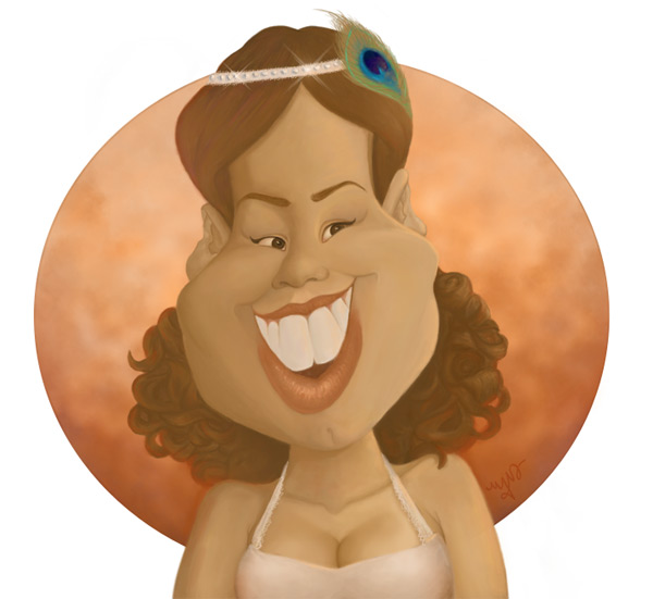
Revamping scrapped artwork is a great way to improve the skills of any artist. It is a great measure of your improvement and changes in style over time. Back in 2007, I had a caricature drawn of me at an event, which I later used to practice vector styles in Photoshop. Fast forward some years, and I’ve recreated that old artwork with improved skills as a digital painter. This tutorial will show you how I transformed that old vector illustration into a true digital painting. Let’s get started!
Tutorial Assets
The following assets were used during the production of this tutorial.
- Old Cartoon (Feel free to use your own)
Step 1
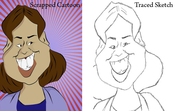
Cut and paste a previously scrapped cartoon into a 1800 x 1650 document at 150 dpi with a white background. Use Free Transform while holding down Shift to make sizing adjustments, then center the image. Trace that image using a high opacity, soft, black brush.
Step 2
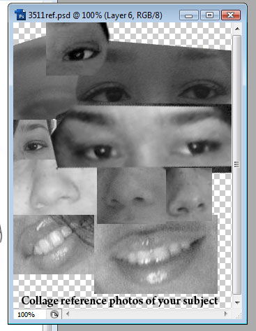
Since this cartoon is based on an actual person, quickly collage several photos together of your subject for reference. This reference will help when modifying the trace to look more like the subject. By keeping the reference black and white you can concentrate on just the characteristics of those features. And later on when figuring out how light should fall on the face, you can always reference the collage again.
Step 3
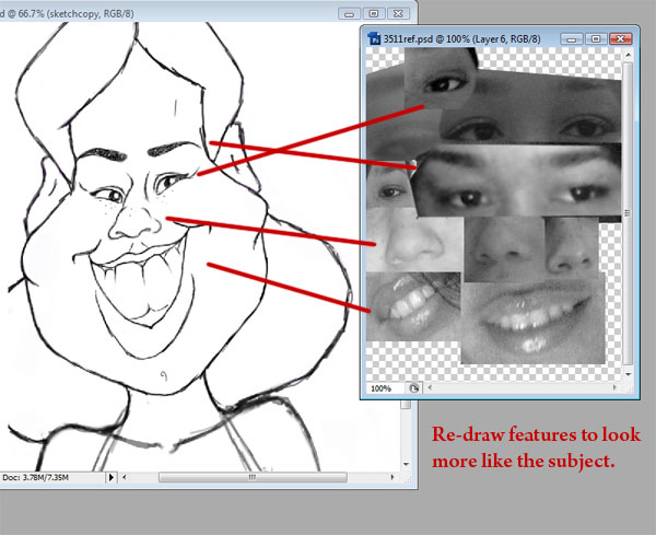
Modify your original sketch by using your tablet to redraw features to look more like the subject. In this case, I paid attention to the eyes, nose, and mouth to achieve this effect. Don’t worry just yet about making the cartoon more anatomically correct, you can save that for the painting later.
Step 4
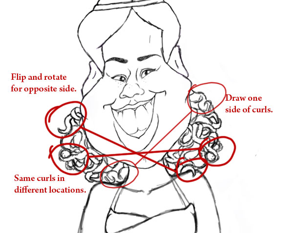
For sketching curly hair, draw the curls so that they interact with each other, looping with one another and bunching together. For a quick cheat, draw only one side of the curls and use the Lasso tool to copy and paste a new layer of curls for the opposite side. Flip and rotate the curls so that the copy isn’t too obvious, though any similarities will be covered up during the painting process.
Step 5
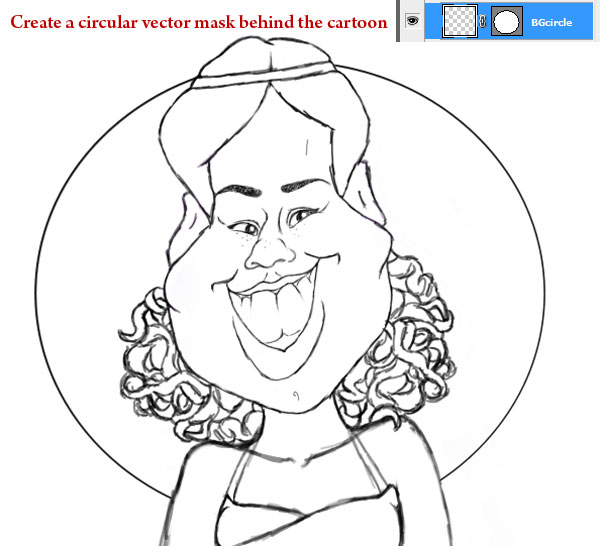
Add a new layer. Using the Elliptical Tool, create a large circle behind the cartoon with a stroke of 7 pixels. With the Pen Tool selected, right-click to create a Vector Mask. This circle will enclose the background scenery for the painting. You can leave the extra details for any of these additions until we start painting the image.
Step 6
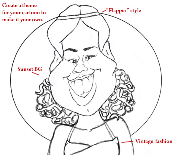
You can create a theme around your cartoon as I did. Since the original caricature artist drew me from their point of view, this where I can add a little flair to make it my own. I love vintage lifestyle and fashion, so I incorporated it into the drawing by adding a flapper style headband and halter top.
Step 7
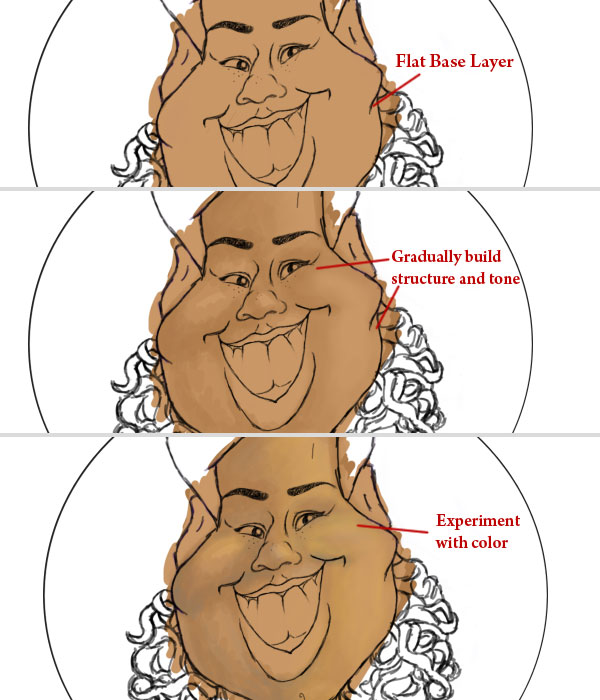
I always start off with a base layer of solid color for my paintings. Add a new layer underneath the trace layer, taking a soft brush at full opacity to fill the cartoon with color. Add another new layer above the base, and use this layer to add more shape and definition to the cartoon while experimenting with color. Originally inspired by the warm, romantic colors of sunsets for the background, I wanted to keep this color scheme consistent with the rest of the painting.
Step 8
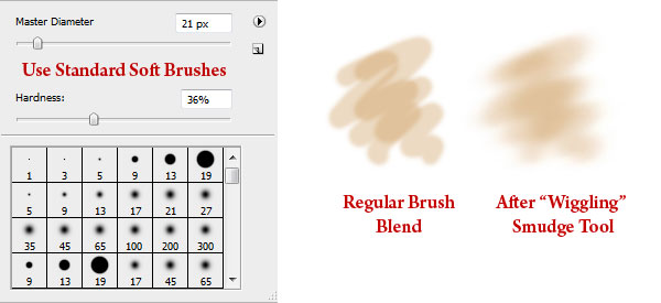
I use mostly the standard round soft brushes at medium to low opacity to paint the character. For a smoother look, take the Smudge Tool at 50% strength and wiggle it over an area to blend the colors softly together.
Step 9
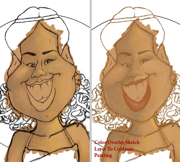
Strive to become a conscious artist so that you can mold your artistic approach to what works. This is where we’ll learn from my earlier mistakes and solutions. In this case, I realized that painting with a black sketch was distracting my eyes from building the shape of the cartoon. Using Layer Styles, set a Color Overlay to the sketch to reflect the color scheme. The sketch is only the initial guide to paint from and will be covered with color eventually, so don’t stress over minimal adjustments like this.
Step 10
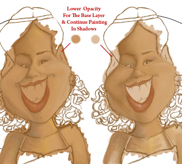
If there is ever a point where your painting begins to look scary, stop and walk away. Most of my painting time is spent looking at it thoroughly to understand what will make it work. If you’re still having problems, allowing another artist to see it with fresh eyes may reveal a solution. In this step I realized that the base color was showing through so intensely, that the color seemed too unnatural for skin tone. Select the Base Layer, and bring down the Opacity to 30%. Immediately the painting improved, and now I understand to build skin tone with less saturated colors in the future.
Step 11
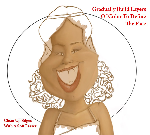
Continue defining the rest of the face and bust. I spend most my time focusing on different tones and shadows of the character, waiting until the very end to add highlights. For “fleshier” areas of the female anatomy, refer to traditional techniques of how light falls upon round objects.
Step 12
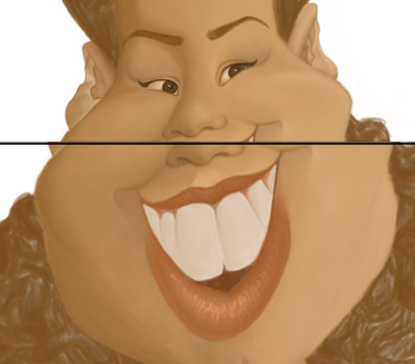
Move onto the other features of your cartoon such as the eyes, mouth, ears, and hair. Pick a hard, standard round brush for the lips in order to add texture. Nothing on our body, at least from our outward appearance is ever a true white, so keep this in mind when painting the eyes and teeth. Fill in the hair with enough color so that we may quickly move onto the background.
Step 13
As mentioned previously, I was inspired by sunsets for the circular background. Use a large grunge brush to paint warm hues for a textured sunset effect. On a new layer, take a small round brush and draw squiggles of varying opacity. Add a Gaussian Blur of 35.5 pixels for a subtle glowing effect. Using Layer Styles, add a #e4af88 Color Overlay to the background and set it to Hue.
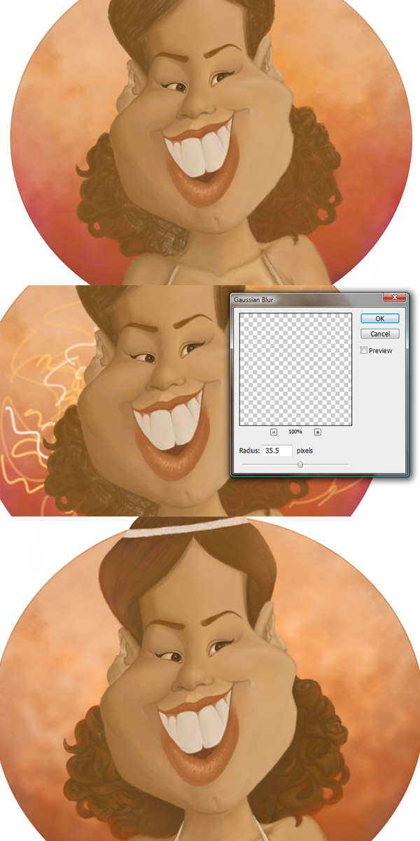
Step 14
Though painting in many layers helps with experimentation, you may merge those layers at any time to help with file size or slow computers. As we draw close to the finish, the only layers which dont have to be merged yet are the background, character, and clothing layers. Continue defining the cartoon’s hair. Our bodies pick up color from our environment, so keep this in mind by adding touches of warm color to the hair. You can even paint a subtle glow to the tips using a vibrant color to make the hair more dynamic.
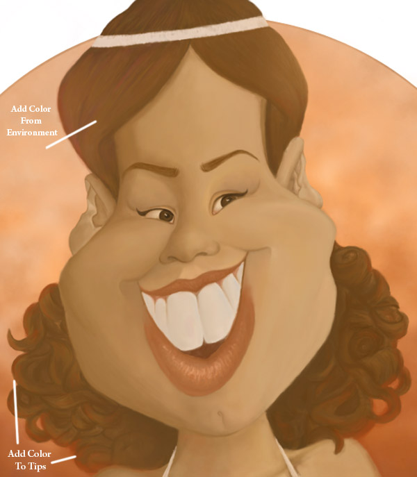
Step 15
Next we’ll move onto the clothing and accessories. Just like the hair, the halter top and headband should be affected in color by their environment. You can add a shiny element like the appearance of rhinestones by painting contrasting colors side by side. Use a custom brush to add sparkle to those rhinestones.
To stay in theme, the peacock feather was an additional touch to pay homage to vintage flapper fashion.
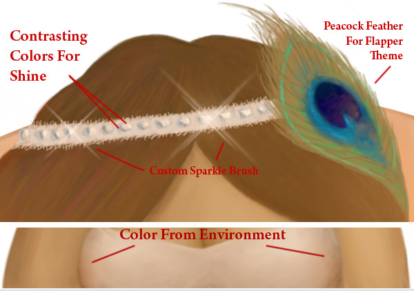
Step 16
You can add further details to the cartoon’s top and headband by painting material-like texture. Simply wiggling your pen stylus creates the appearance of lace, while adding strokes of texture to the headband creates the appearance of frayed edges.
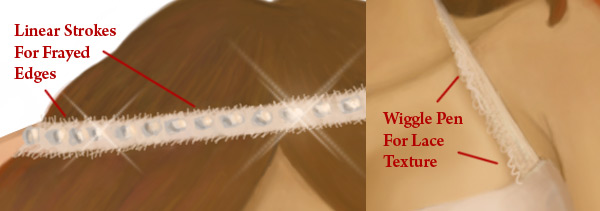
Step 17
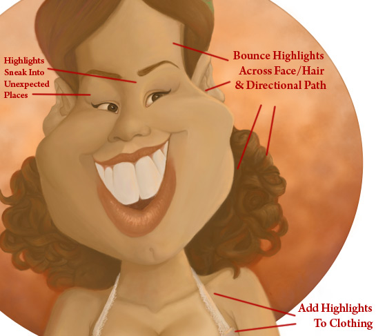
Create a new layer for the highlights. The facial structure of the cartoon should be a clue to how the highlights fall upon the face. Use a bright peach color instead of white to reflect the sunset inspired color scheme. Place highlights on areas of the skin which poke out like the nose and cheeks, as well as areas in its directional path. Highlights often make their way into unpredictable places like edges of clothing, so feel free to experiment until you find what works.
Conclusion
Add your signature to your digital masterpiece. Merge all the layers together and you have just finished revamping an old cartoon!
Create a Majestic Script in Photoshop – Psd Premium Tutorial
2011-05-26 17:00:14 (читать в оригинале)Advertise here
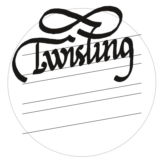
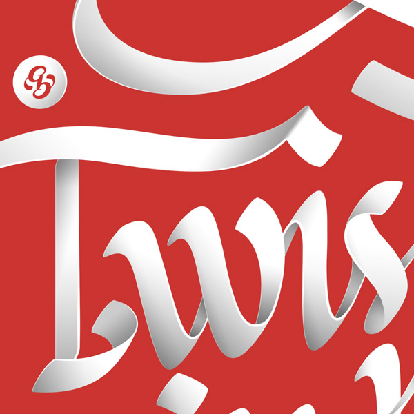
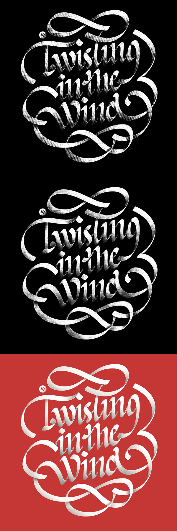
Custom typography can be a lot of fun to create. In this Psd Premium tutorial, author Alex Beltechi will demonstrate how to create a custom script in Photoshop in three different styles based on the same lettering layout. The result will be a clean, grungy, and distressed text effect. This tutorial is available exclusively to Premium Members. If you are looking to take your typography skills to the next level then Log in or Join Now to get started!
Professional and Detailed Instructions Inside
Premium members can Log in and Download! Otherwise, Join Now! Below are some sample images from this tutorial.
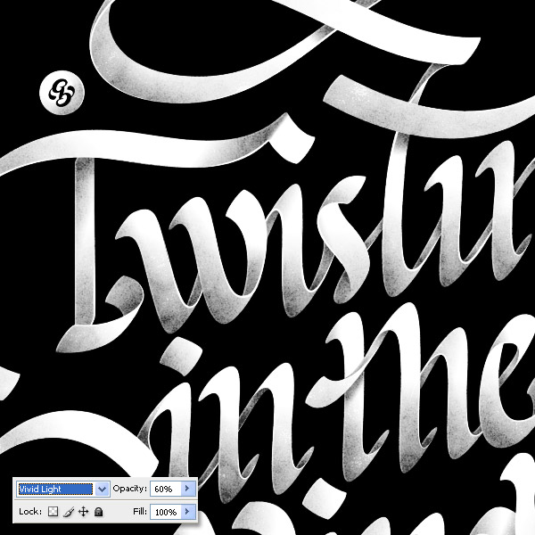
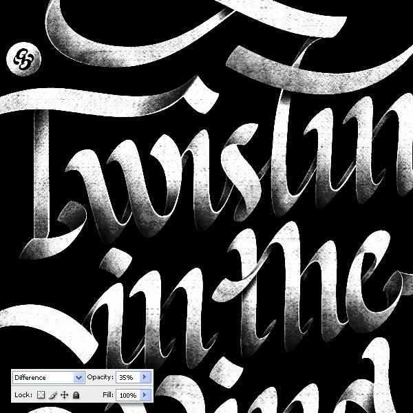
Final Image
Psd Premium Membership
You can join Psd Premium for as little as $9/month. Premium membership gives you access to the source files for all our tutorials as well as access to premium tutorials like this one. This also includes the rest of the sites in our network including Vectortuts+, Webdesigntuts+, Phototuts+, Nettuts, and more! Premium Members can Log In and download this tutorial. Otherwise you can Join Today!
Let’s Change the Background, Shall We?
2011-05-25 17:00:33 (читать в оригинале)Advertise here
Are you new to Photoshop? Have you been trying to teach yourself the basics of Photoshop but have found the amount of educational material available on the net a bit overwhelming? As the world’s #1 Photoshop site, we’ve published a lot of tutorials. So many, in fact, that we understand how overwhelming our site may be to those of you who may be brand new to Photoshop. This tutorial is part of a 25-part video series demonstrating everything you will need to know to start working in Photoshop.
Photoshop Basix, by Adobe Certified Expert and Instructor, Martin Perhiniak includes 25 short video tutorials, around 5 – 10 minutes in length that will teach you all the fundamentals of working with Photoshop. Today’s tutorial, Part 22: Let’s Change the Background, Shall We? will explain color range and refining the selection in a Layer mask. Let’s get started!
|
| ||
|
+40 |
47 |
Фрагменты |
|
+30 |
57 |
тот_самый_Петрович |
|
+19 |
40 |
история интерьера |
|
+1 |
27 |
Новости сайта RocketsMusic.ru |
|
+1 |
17 |
промо радио |
|
| ||
|
-17 |
20 |
Радио ФМ Онлайн слушать бесплатно |
|
-24 |
2 |
Лучинин.net |
|
|
|
|
|
|
|
|
|
|
|
|
Загрузка...
взяты из открытых общедоступных источников и являются собственностью их авторов.

