| Сегодня 9 апреля, четверг |
|
|
|
Какой рейтинг вас больше интересует?
|
Главная /
Каталог блоговCтраница блогера PSDTUTS/Записи в блоге |
|
PSDTUTS
Голосов: 2 Адрес блога: http://psdtuts.com Добавлен: 2008-10-26 20:48:58 блограйдером DrakAngel |
|
Create a Surreal Rock Formation in Photoshop – Psd Premium Tutorial
2011-05-19 17:00:24 (читать в оригинале)Advertise here
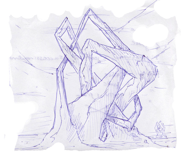
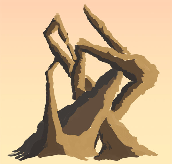
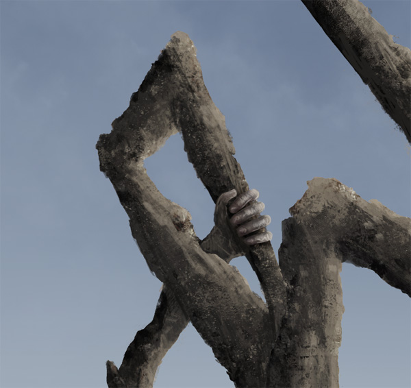
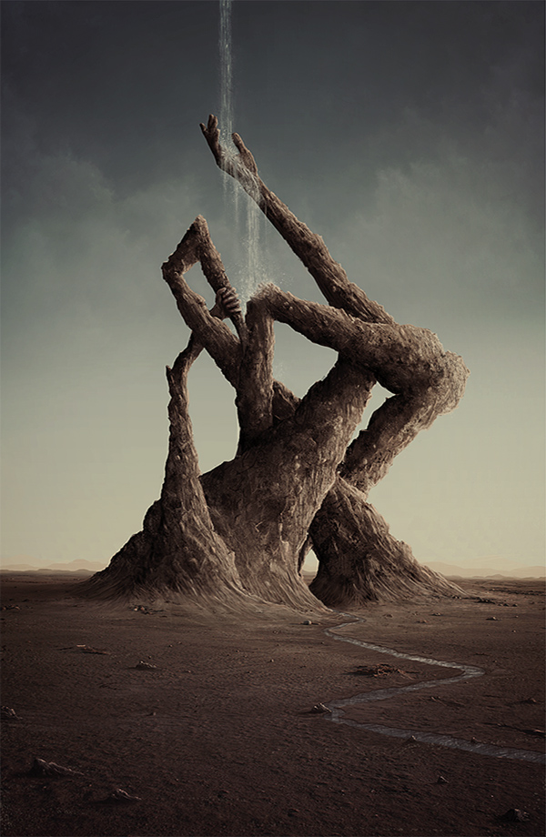
While photo manipulation is an important part of just about everything we do in Photoshop, photo manipulation isn’t always the answer. Sometimes you’ll need to do a bit of digital painting to create the image that you need. In this Psd Premium tutorial, author Marco Casalvieri will demonstrate how to create a surreal rock formation in Photoshop. This image was part of SlashThree’s recent Paradigm Shift Exhibition and is available exclusively to Premium Members. If you are looking to take your photo manipulation and digital painting skills to the next level then Log in or Join Now to get started!
Professional and Detailed Instructions Inside
Premium members can Log in and Download! Otherwise, Join Now! Below are some sample images from this tutorial.
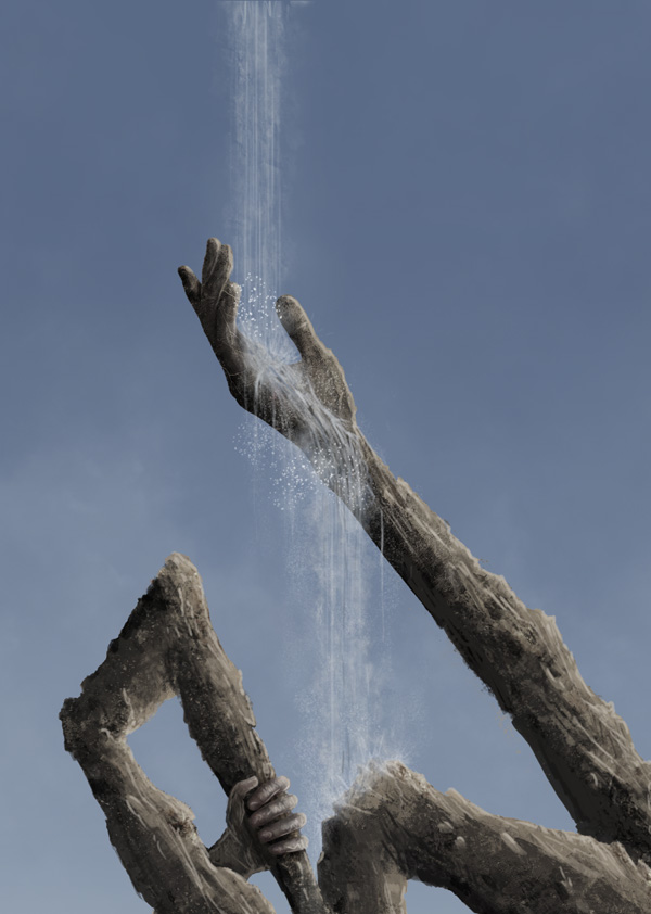
Final Image
Psd Premium Membership
As you know, we run a premium membership system here that costs $9 a month (or $22 for 3 months!) which gives members access to the Source files for tutorials as well as periodic extra tutorials, like this one! You’ll also get access to Net Premium and Vector Premium, too. If you’re a Premium member, you can Log in and Download the Tutorial. If you’re not a member, you can of course Join Today!
Selecting Hair is Easy – Basix
2011-05-18 17:00:04 (читать в оригинале)Advertise here
Are you new to Photoshop? Have you been trying to teach yourself the basics of Photoshop but have found the amount of educational material available on the net a bit overwhelming? As the world’s #1 Photoshop site, we’ve published a lot of tutorials. So many, in fact, that we understand how overwhelming our site may be to those of you who may be brand new to Photoshop. This tutorial is part of a 25-part video series demonstrating everything you will need to know to start working in Photoshop.
Photoshop Basix, by Adobe Certified Expert and Instructor, Martin Perhiniak includes 25 short video tutorials, around 5 – 10 minutes in length that will teach you all the fundamentals of working with Photoshop. Today’s tutorial, Part 21: Selecting Hair is Easy will explain how to combine selection tools, the non-destructive use of the Eraser tool, refine mask, and pen tool. Let’s get started!
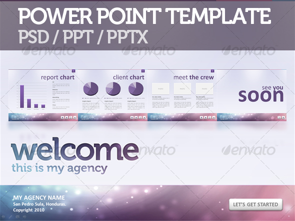
Create PowerPoint Presentation Graphics in Photoshop
2011-05-17 17:00:26 (читать в оригинале)Advertise here
So, you’re about to have a public speech and need to support it with good-looking presentation slides? Today we’re going to learn how to do this by designing a PowerPoint presentation in Photoshop. The purpose of a presentation is to present information in best possible way. Before you start with the design you need to know if your presentation is meant to entertain, inform, persuade or sell. In today’s tutorial I will show you how to design a PowerPoint presentation that needs to inform (of course) and show presenters creativity and diversity. Let’s get started!
Tutorial Assets
The following assets were used during the production of this tutorial.
- Ink Scratches (Graphic River)
- Ink Scratches (Free Alternative Brush Set)
- Vector Circles Photoshop Shapes
Step 1 – Creating the Background Pattern
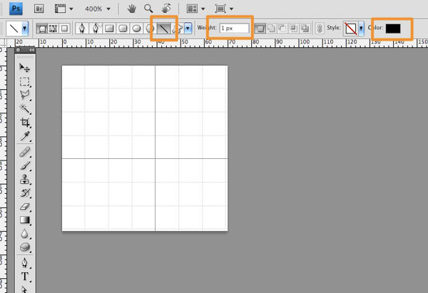
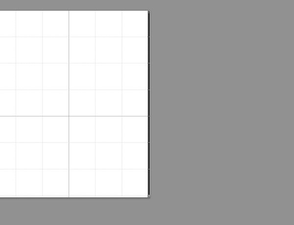
Before we start drawing on a bigger canvas we need to create some patterns for our background effect. To do this open a new document, 70×70 px, fill it with white color #ffffff. Go to View > Show > Grid, it will turn on Grid view. This will help us easily draw a perfect pattern. Now, choose the Line Tool (U) and draw a vertical 1px, black line on the far right of the document.
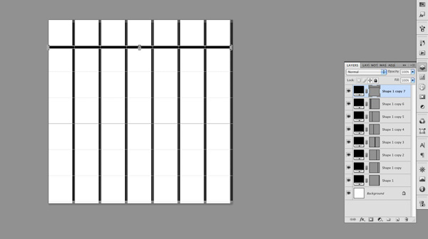
Duplicate the line and align it to the grid.
Do the same now for horizontal lines. Please note that I left out the top and left line, I didn’t fill the whole grid. This is because the pattern will be repeated and the right and bottom line of next pattern to come will fill that gap.
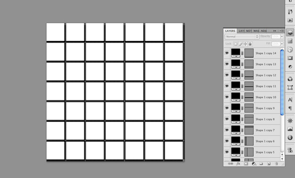
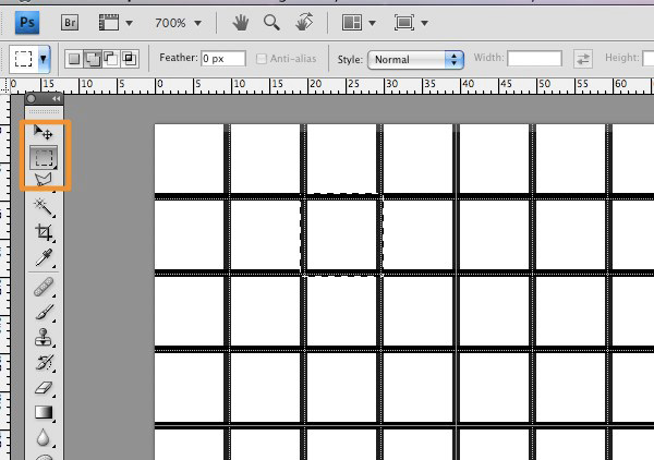
Create new layer. Choose Marquee Tool (M) and holding shift draw a selection that fits exactly within one unit of our document grid. Fill the layer with black color #000000 and give it 60% opacity.
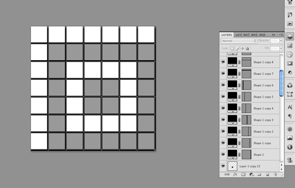
Duplicate that layer to create a patter like shown in the following image.
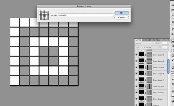
Go to Edit > Define Pattern, give it a name (I named it “mozaik”) and click OK. Close the document. It is saved now and will appear in our patter library.
Step 2 – The Big Canvas
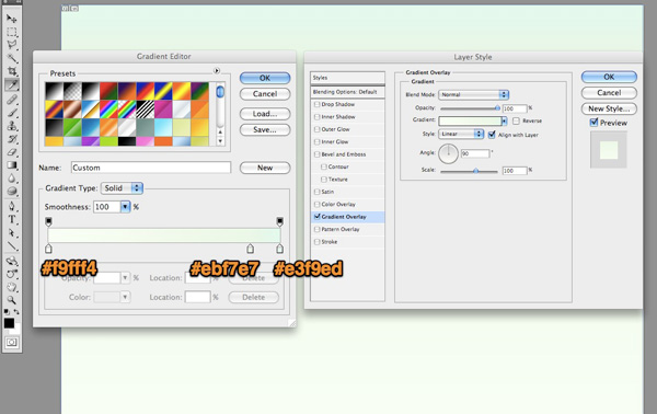
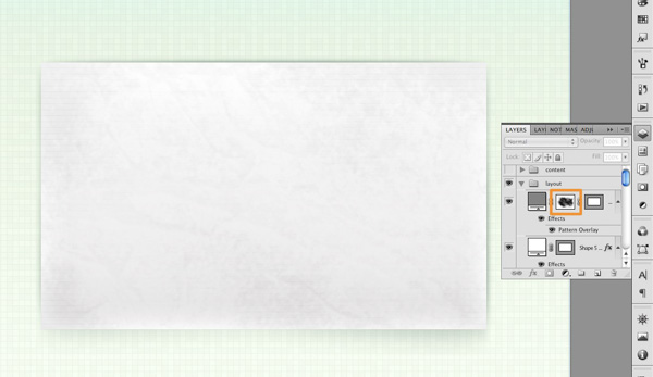
Create new 1024×768 px document and save it as background.psd. Unlock the background layer by double clicking it and clicking OK in dialog box (this removes the lock icon from the layer). Double click again on the unlocked background layer, a effects dialog box will pop up. Add gradient effect like shown in the image. Gradient colors from left to right: #f9fff4, #ebf7e7 and #e3f9ed.
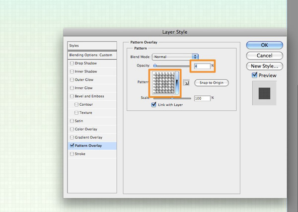
Create new layer above and fill it with white. Set blend mode to Multiply and add the pattern overlay with previously created pattern “mozaik”. In effects settings set Opacity to 4%, leave other values default.
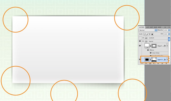
Step 3 – Content Layout
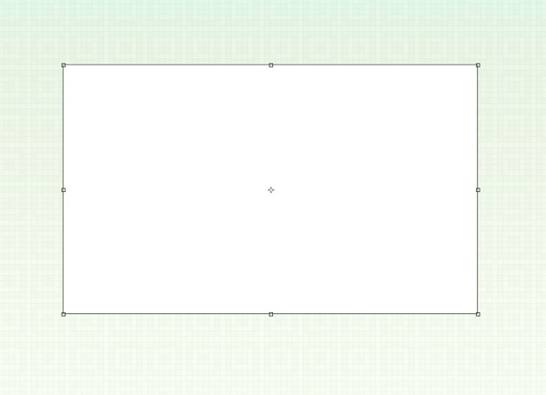
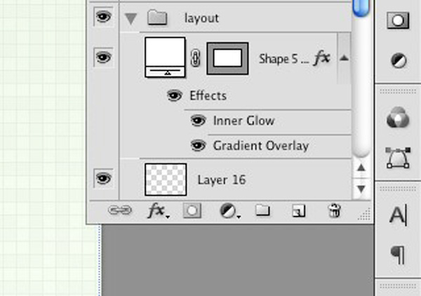
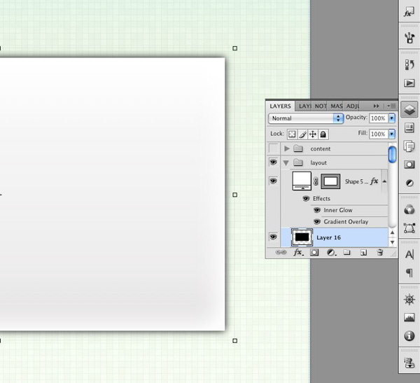
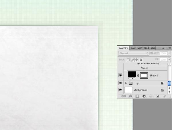
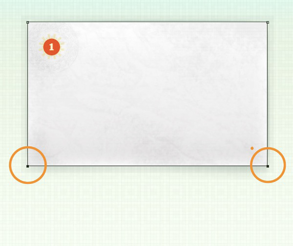
Create layer folder and name it “Layout”. Select Rectangle Shape Tool (U) and draw out a 365×747 px shape, fill color #ffffff.
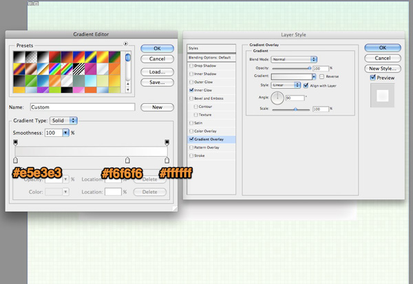
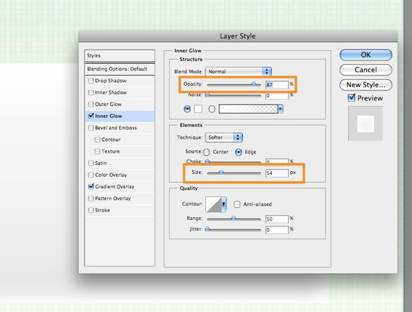
Add gradient effect like shown in the image. Gradient colors from left to right: #e5e3e3, #f6f6f6 and #ffffff. Add Inner Glow effect, color #ffffff, opacity 87% and size 54. Leave other settings default.
Step 4 – Shadow
Create new layer underneath the rectangle shape layer.
Hold Command/Ctrl + Click the shape layer to create a selection from it. While the newly created empty layer is selected, fill it with black #000000. Go to Filter > Blur > Gaussian Blur and enter 6px radius.
Add Layer Mask by clicking the small mask icon at the bottom of the layer palette. Choose a 300px soft brush and set background color to black #000000.
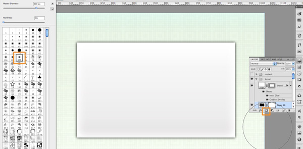
Now, gently brush the parts of the shadow you want to mask (hide), doing this we’ll create a nice shadow effect.
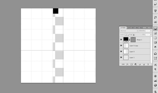
Step 5 – Dotted Lines Pattern
We want to give the content layout a bit more of a real paper look so we need some horizontal paper lines. In order to add them we need to create the pattern first. Create new document 70×70 px, just like we did with our first pattern. Turn on Grid view and draw out two (2) white (#ffffff) rectangles on both sides. Leave the center of the document empty (transparent) size of one grid unit. Draw a black rectangle size of half the grid unit like shown in the image.
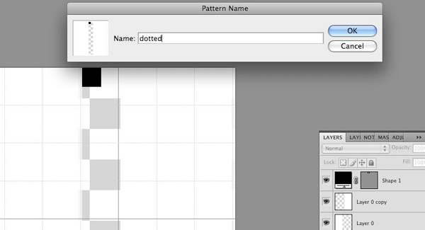
Go to Edit > Define Pattern, give it a name (dotted) and save it. Close the document.
Step 6 – Paper Effect
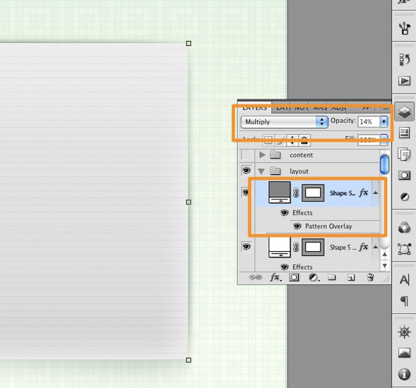
Now we can apply this pattern to our content layout. Copy rectangle shape layer, remove the effects and change color to #838383. Add Pattern overlay effect and choose the dotted pattern we created in previous step. Change layer Blend mode to Multiply and set opacity to 14%.
I wanted to give it a bit worn look so I masked the horizontal lines with a grunge brush. To do this first go to Graphic River and grab some cool grunge brushes. Click the small mask icon at the bottom of the layer palette, select one of the grunge brushes (any will do), set background color to black #000000 and slightly mask the center of the content layout (lines) keeping the lines visible at the edges.
To make it pop out more, I added a semitransparent black border. Do this by duplicating the base shape layer and move it underneath it. Expand the shape by 20px on each side, remove all effects from it, set background color to black and opacity 3%. Done!
Step 7 – Creating the Ribbon
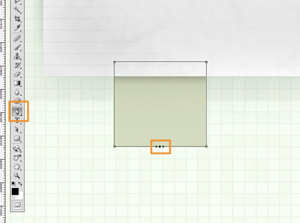
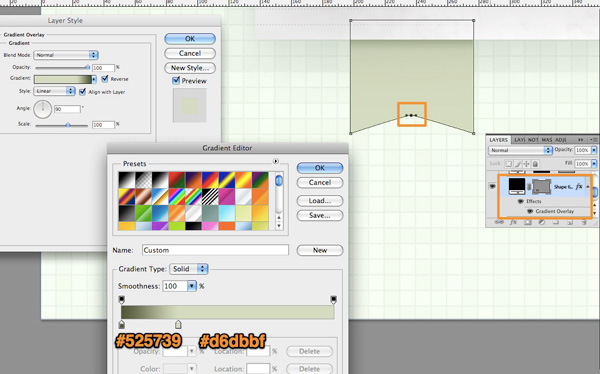
Create new layer folder under the content layout (layout folder) and using Rectangle Shape Tool (U) draw a 78×72 px rectangle. Place it so that it is hidden about 10px underneath the content layout. Fill it with gradient overlay as shown in the image with colors from left to right: #525739 (location 0%) and #d6dbbf (location 27%).
Switch to Direct Selection Tool (A) and select the path. Now change to Pen Tool (P) and add an anchor point in the bottom middle part of the path as shown in the image. Adjust the handles so they’re close to each other.
With this anchor selected hold Shift and using arrow up key nudge the point one time (10px).
Create new layer above. Select Custom Shape Tool and choose the one shown in the image.
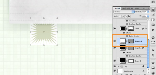
Command/Ctrl + click the ribbon shape layer underneath, go to Select > Modify > Contract and enter value of 4px. This will contract the selection by 4 px creating a nice border around.
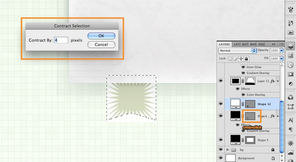
While selection is active, click the star shape layer (select it) and click the Mask icon at the bottom of the layer palette. This will automatically mask the star shape by the marquee selection we contracted earlier.
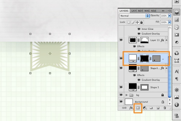
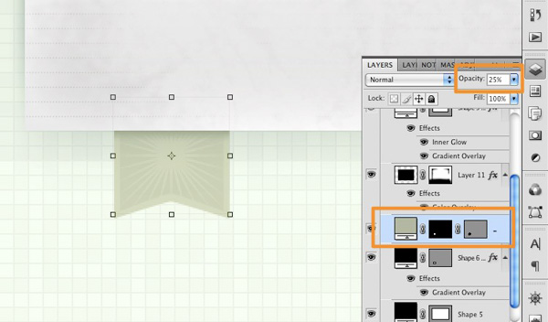
Change the color of masked star shape to #b2b7a1 and set opacity to 25%.
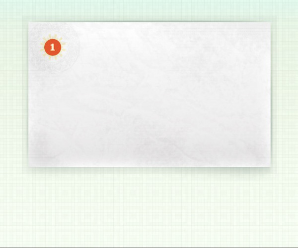
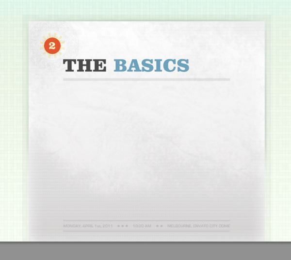
Step 8 – Slide Counter
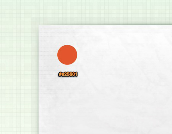
Create new layer above the content layout and using Ellipse Tool draw a small 52×52 px circle. Fill it with #e25601.
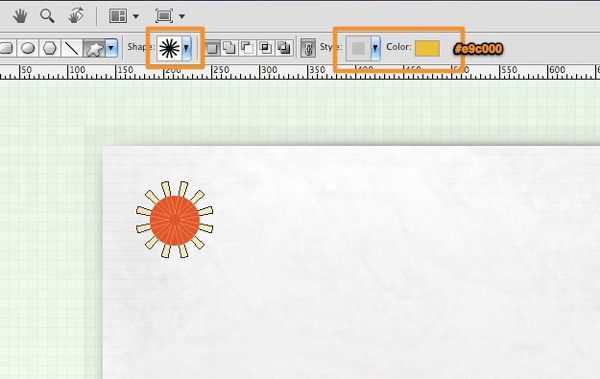
Create another layer and place it under the red circle. Select Custom Shape Tool and choose the star burst shape like shown in the image. Fill it with #e9c000. Holding Shift key draw the shape from center of the red circle. Set layer opacity to 20%.
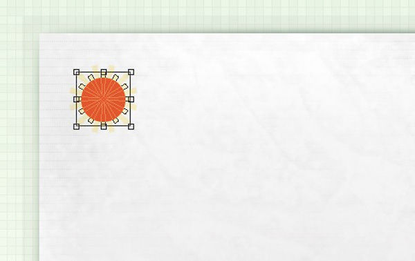
Copy the star burst shape layer and place it under the original star burst shape. Using the Transform Tool hold Shift key, rotate and scale the shape so it is placed like shown in the image.
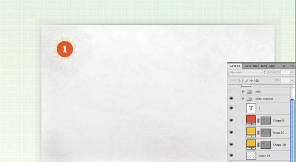
I spiced it up just a tiny bit more by adding a circular mandala shape (using custom Photoshop Brush) underneath the layers and lowering the opacity to 40%, but you can skip this step, it will still look great!
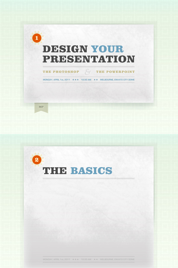
Finally, add your content and you’re done with the first slide design! I’ve chosen to crate welcome screen text directly in Photoshop instead of inserting it in PowerPoint because I use custom fonts and graphics.
Step 9 – Inner Page
After creating the welcome screen we’re now going to create a generic background that’ll be used for all other slides of our presentation. Copy the background.psd and rename it to inner.psd. Delete the ribbon layer folder and all content, leaving just the content layout. Nudge all remaining graphics 50px from document top.
First select the base rectangle shape (the one with the gradient effect), choose Direct Selection Tool (A) and select two bottom anchor points of that shape. Holding Shift, press arrow down to expand the rectangle till it overspills the document boundaries.
Do the same with horizontal lines shape…
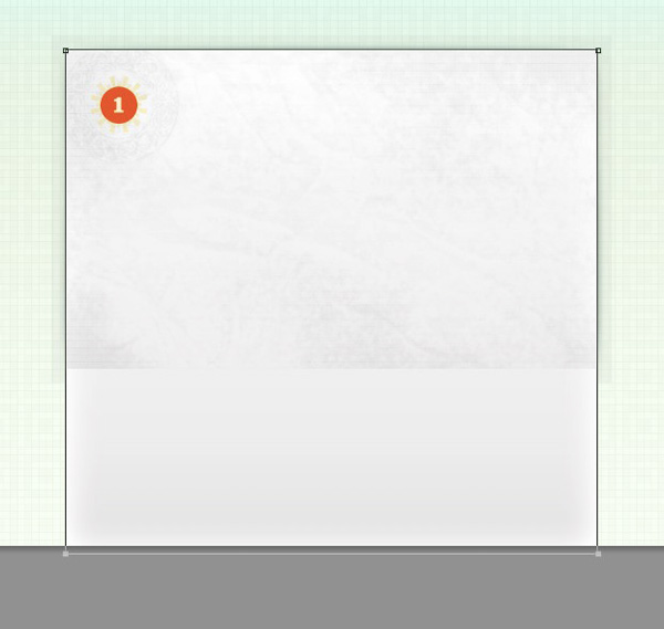
Finally repeat the step with the semitransparent border. Optionally you could scale or redraw the shadow too.
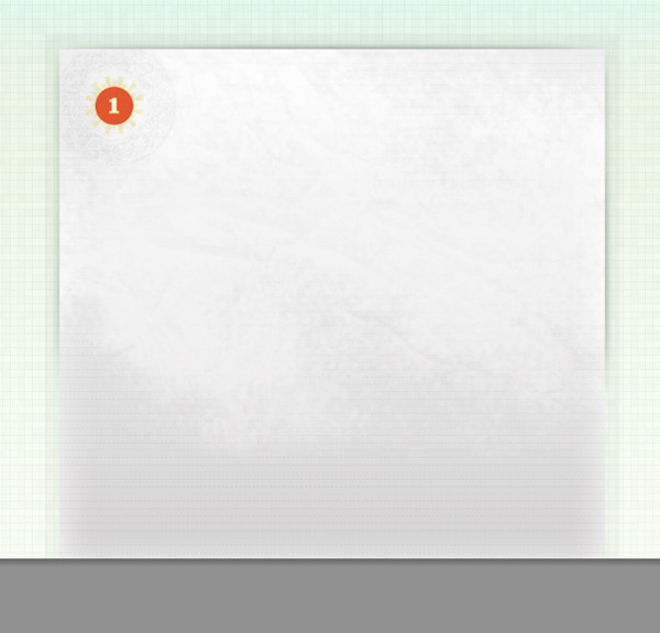
Change the slide number inside the red circle, add title and footer. That’s it!
Final Image
Step 10 – The PowerPoint
We created the design, now we need to make a real presentation out of it. Export PSD designs to high quality jpeg using the Save for Web option in Photoshop. Name files accordingly and place them in your presentation folder. Fire up PowerPoint and click File > New presentation.
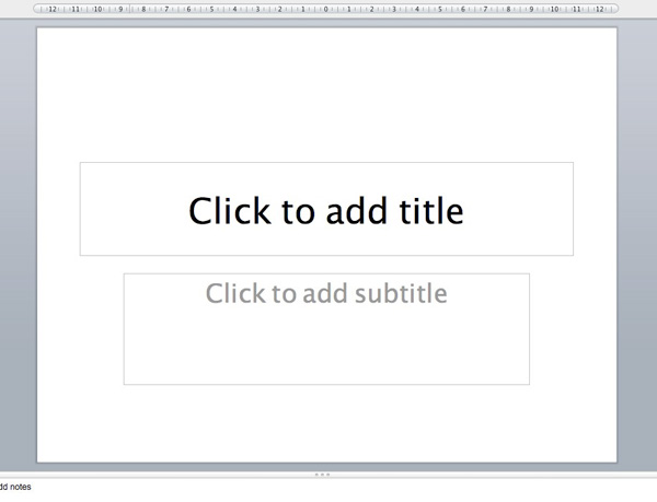
By default PowerPoint adds a title and text field to newly created slide. Go ahead select and delete them because you’re not going to need them.
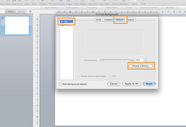
Right click the slide thumb preview in sidebar and click Format background, a popup screen will be shown. Select Fill from the popup sidebar, select Picture from popup top menu and choose the previously exported background image for welcome slide.
You can copy the first slide or create new one, repeat the step above for inner page (slide) and choose the second background image.
Conclusion
And you’re done. Well… almost done, because now you need to create the rest of your slides and prepare for the speech! I hope you learned a trick or two how to create custom designed PowerPoint presentation and I wish you all the best with your public speaking. See you next time!
PowerPoint Templates on Graphic River
Check out some of these fantastic templates available on our sister site Graphic River.
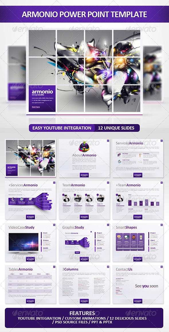
Armonio PowerPoint Template | $20 | by EAMejia
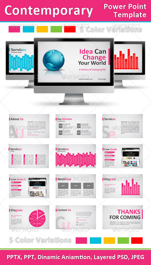
Contemporary PowerPoint Template | $15 | by Femo
Simply Premium PowerPoint Template | $15 | by Kilik

BIGIdea PowerPoint Presentation | $20 | by EAMejia

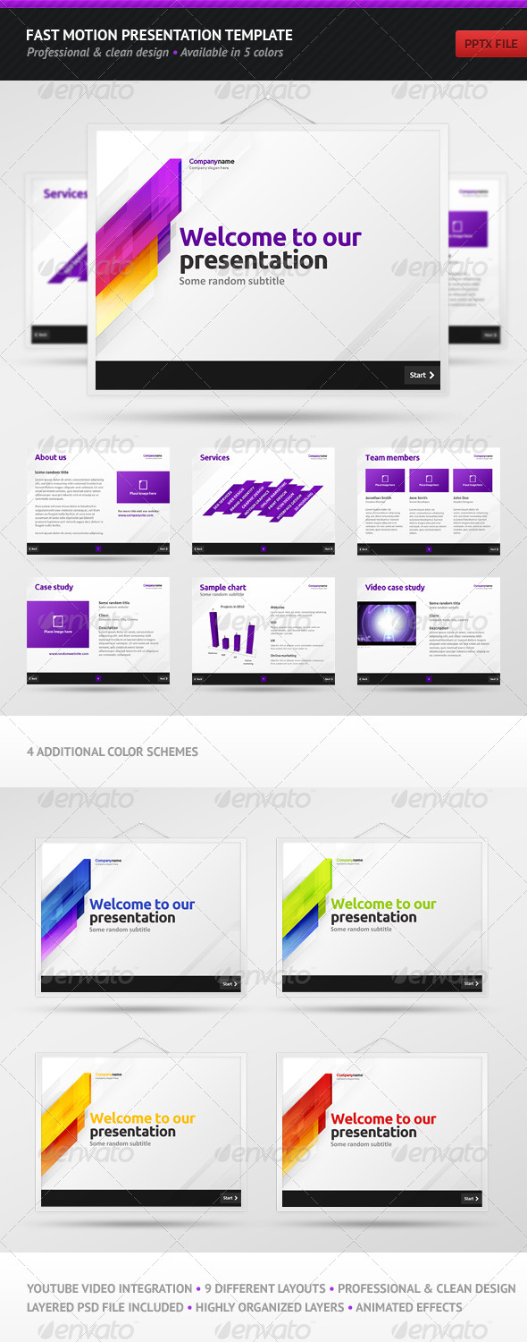
Fast Motion Presentation Template | $20 | by Vladedimovski
SharpDesign PowerPoint Template | $20 | by Mikestraser
Modern Agency Presentation | $20 | by EAMejia
Clouds Keynote Template | $15 | by Segen

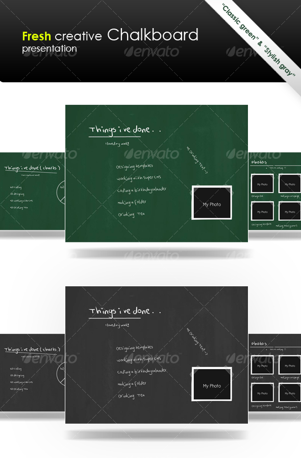
Fresh Creative “Chalkboard” Presentation | $15 | by Jorne
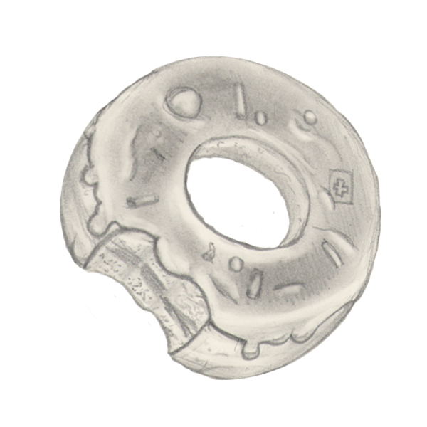
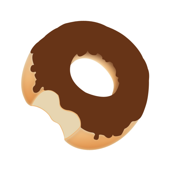
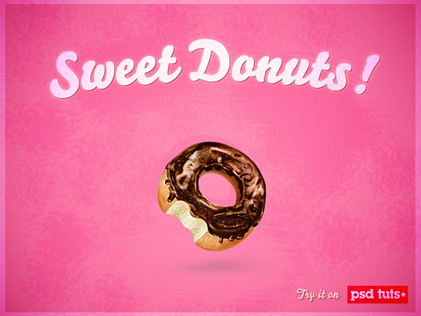
Create a Sweet Donut Icon in Photoshop from Scratch
2011-05-16 17:00:43 (читать в оригинале)Advertise here
In this icon design tutorial we will learn how to make a sweet and tasty donut icon from an initial sketch. So let’s begin, and remember: don’t try to bite the screen!
Tutorial Assets
The following assets were used during the production of this tutorial.
- Sketch
- Color Palette
- Texture
Step 1
As you probably see the first step is to draw a donut with pencil and paper. There’s no need to be precise because it’s only a reference image. Otherwise you can download my own sketch from assets.
Step 2
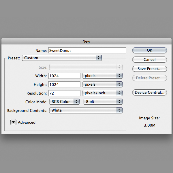
In Photoshop, create a 1024×1024 pixel document and import the donut sketch, you can also alter the donut with the Free Transformation command by pressing Command/Ctrl + T while the donut layer is still selected.
Step 3
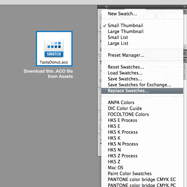
For this project I created a color palette, you can download the .ACO file from Assets. On the Swatches Palette click the option menu button and select Replace Swatches to load the color palette.
Step 4
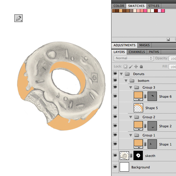
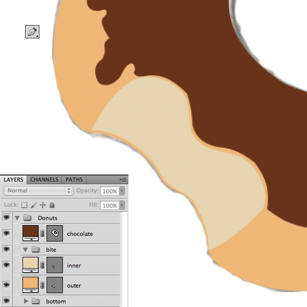
Let’s start with the bottom parts. With the Pen Tool (P) begin to trace the donut as below to create the shapes. Then select a creamy color from the color palette. Also keep your layers organized in groups.
Step 5
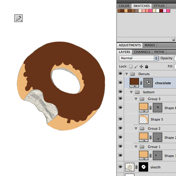
The next step is to draw the chocolate shape and select the appropriate color from the Swatches Palette.
Step 6
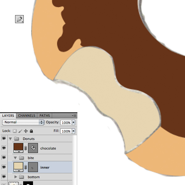
As usual draw another shape for the inner bite part. Use this color: e6d5b0.
Step 7
Draw another shape to define the thickness of the donut. Use the same color of the bottom parts. You can disable the sketch layer by clicking on the little eye icon in Layers Palette.
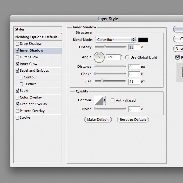
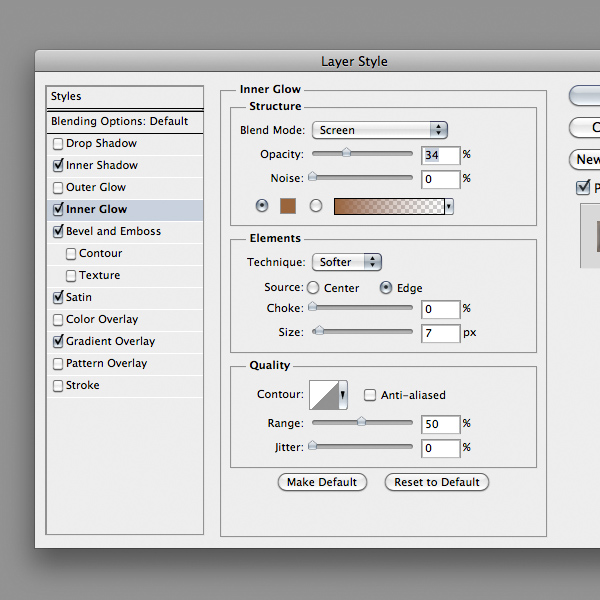
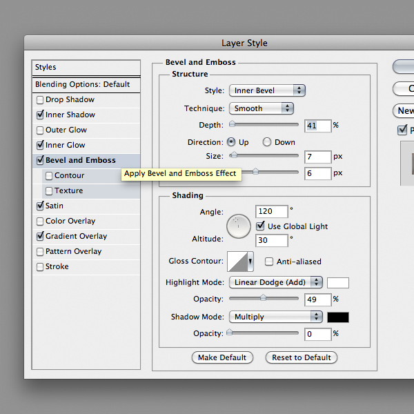
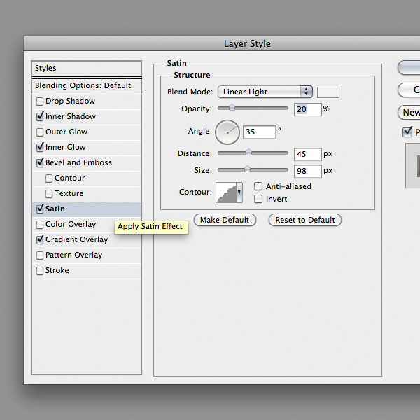
Step 8
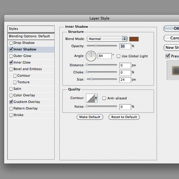
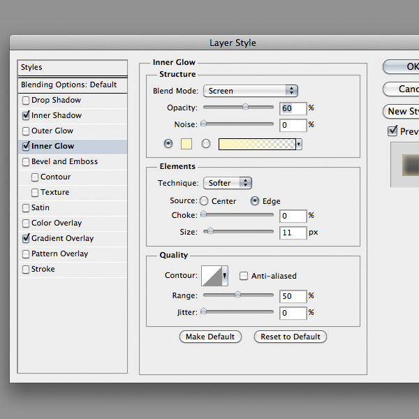
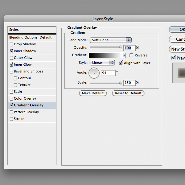
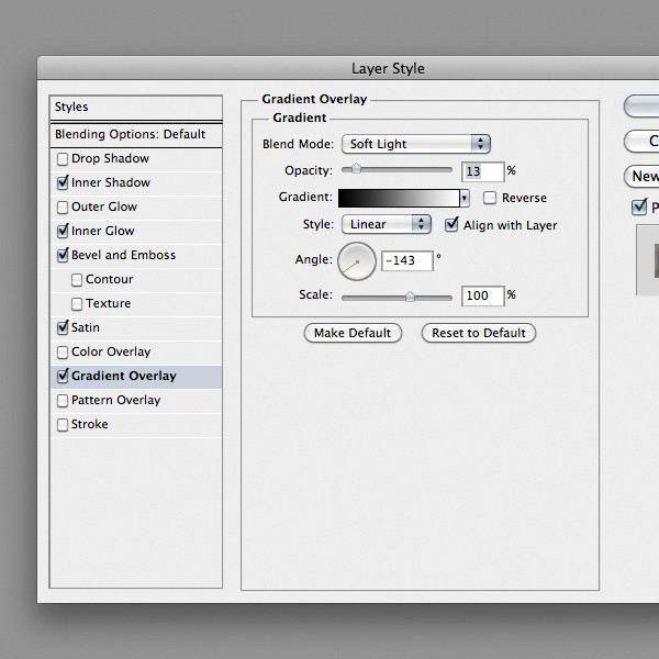
Double-click on a bottom part layer in Layers Palette and add the following Layer Style. Do the same with the other parts, but remember to alter the values of Inner Shadow propriety correctly to the light direction. Use the image below as a reference.
Step 9
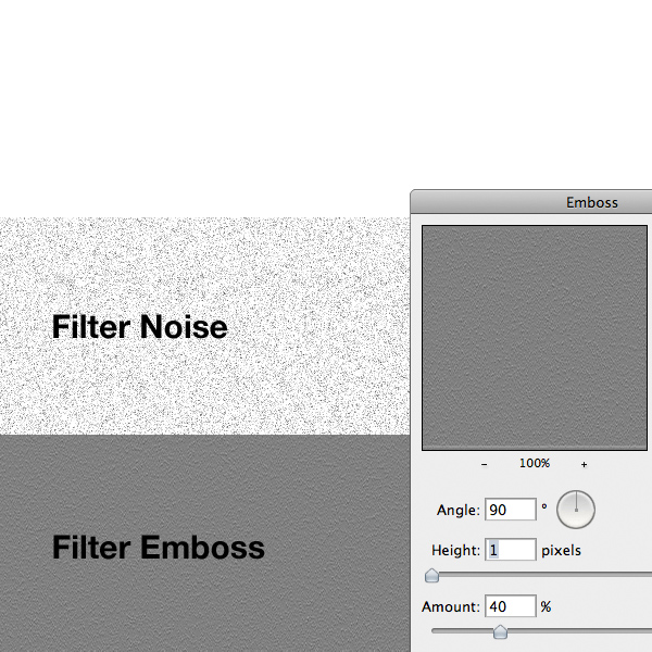
Now we have to create a texture for the bottom parts. Create a new layer and fill it with white. Next go to Filter > Noise > Add Noise and select a value around 20%. Then go to Filter > Stylize > Emboss and set the values as the image below.
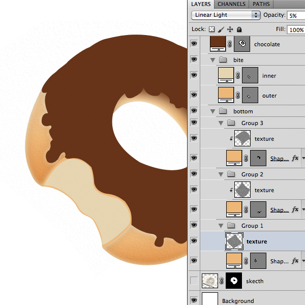
Step 10
Rename the layer as "Texture" and set it as a clipping mask by clicking on the line between the two layers while holding down the Alt key. Decrease the layer opacity to 5% and set the blending mode to Linear Light. You can transform the layers, as I did, to follow the shape of the donut by pressing Command/Ctrl + T on a texture layer. Repeat this step for each bottom part. There is no need to create a new texture, just duplicate the previous one by pressing Command/Ctrl + J.
Step 11
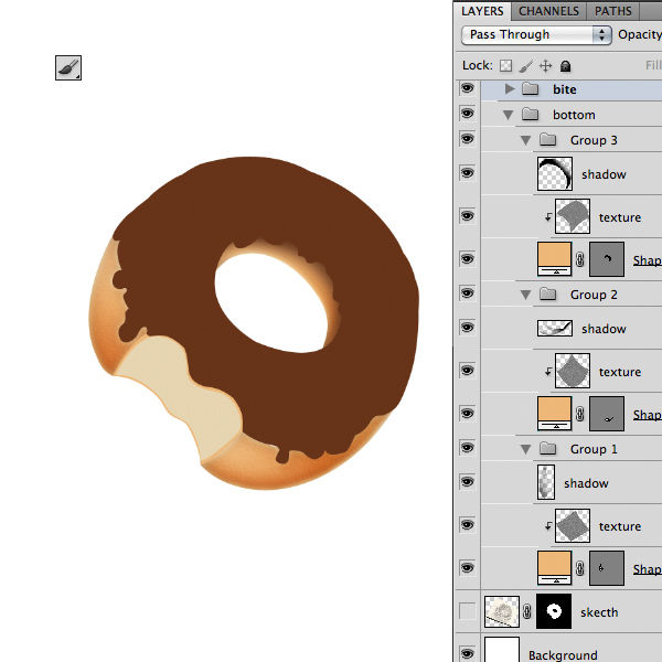
In separate new layers, select the Brush tool (B) with a soft brush and paint some shadows using a black color on the bottom parts as below. Set the blending mode to Soft Light. If you want try to decrease the layers opacity. Each shadow must be placed in separate layers.
Step 12
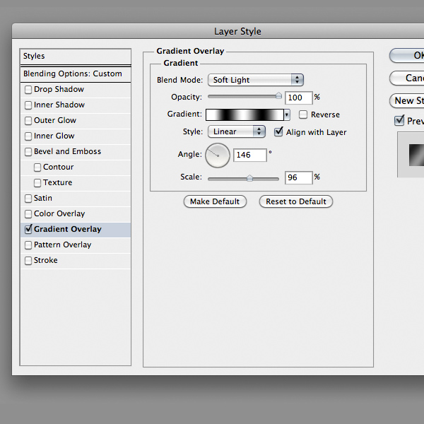
Next add this Layers Style to the inner bite layer. The gradient should follow the bite direction. So pay attention at the angle value.
Step 13
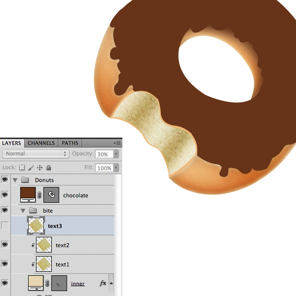
The next step is to create a texture for the bite part. This time I used an image reference, you can download it from assets. Drag & Drop the texture inside the document and duplicate it the layer two times by pressing Command/Ctrl + J on the keyboard. Set the first two as a clipping mask on the bite inner part. You can move them with the Move Tool (V), finally set the opacity to 30%.
Step 14
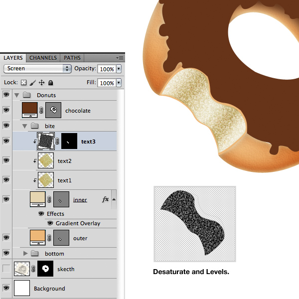
Select the third copied texture layer and press Command/Ctrl + Shift + U in the keyboard to desaturate it. Next press Command/Ctrl + L to open Levels Adjustments windows and increase the contrast by dragging the outer sliders toward center. Next select Screen as blending mode and set the layer as a clipping mask. If you want you can add a mask layer mask to soften the edges, by painting on it with a soft brush and black selected as foreground color.
Step 15
It’s time to improve the chocolate: add this Layer Style.
Step 16
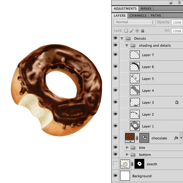
Now comes the hard part. We have to isolate each part of the donut and create a “special” layer that improve the details. To do this choose a part and load it as a selection by hold down the Command/Ctrl key and click on the layer thumbnails in Layers Palette. I’ll start with the chocolate layer. Create a new layer and fill the selection with a 50% Gray, to do this go to menu Edit > Fill and press Ok. Set the blending mode of the layer to Linear Light.
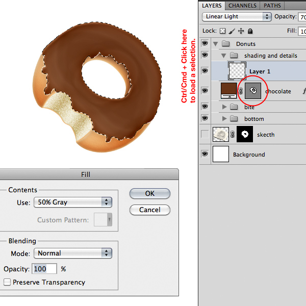
Step 17
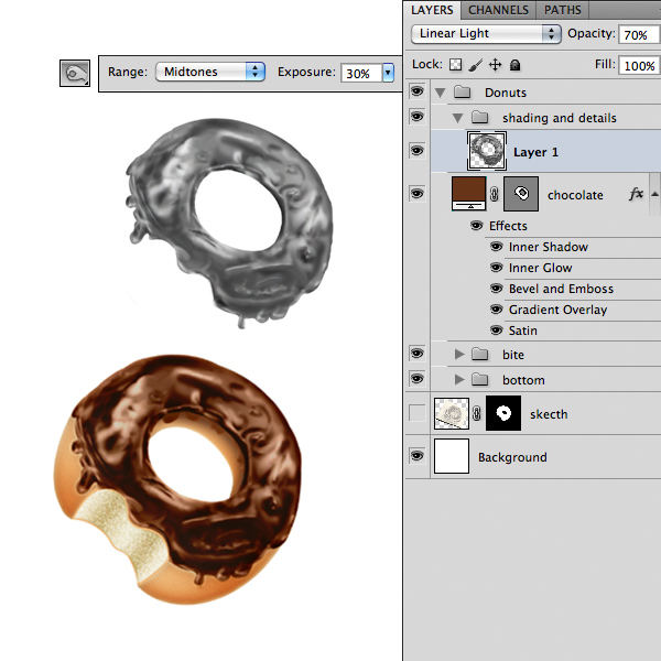
Select the Dodge & Burn tool and set it as below. Begin to paint with these tools to achieve the same result as below. Remember that you can easily switch between the tools by holding the Alt key. This is a difficult and long step because the final result depends on how better you can draw details on this layer. You can decrease the layer opacity too.
Step 18
Repeat step 16-17 for each part of the donut.
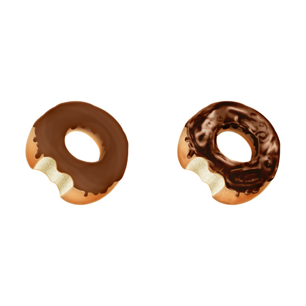
Step 19
Let’s see a Before/After version.
Step 20
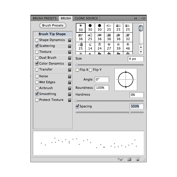
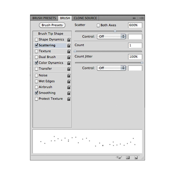
To make the little candies inside the chocolate we have to create a custom brush. Create a new layer and select the Brush Tool (B). Now open the Brush Palette by pressing F5 on the keyboard or in the menu bar Window > Brush. Select a default soft brush and add the following style.
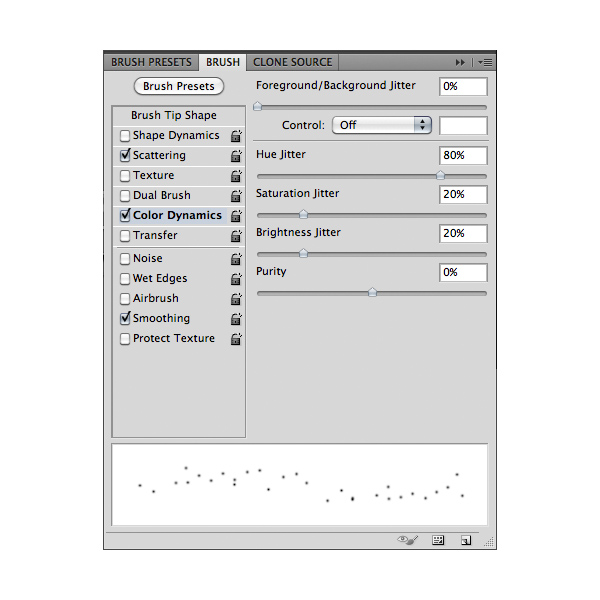
Step 21
Add some new layers and paint with the custom brush using a color from the palette. Set the blending mode to Soft Light and try to decrease the layers opacity to achieve a smooth effect. Tip: try to use different brush size from 1 to 4 pixel.
Step 22
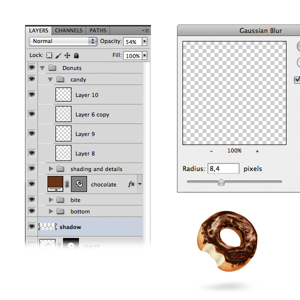
Create a new layer and with a soft brush paint some black under the donut. Next go to Filter > Blur > Gaussian Blur and use a radius around 30px. Decrease the layer’s opacity to achieve a nice shadow.
Step 23
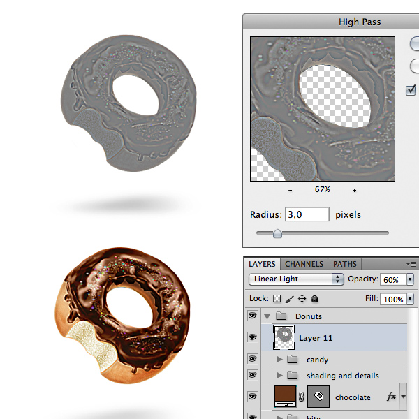
One final step is to create a copy of the donut’s layers group and flatten the layers. Next go to Filter > Other > High Pass and set a radius around 3px to boost details. Set the layer on Linear Light and if needed reduce the opacity.
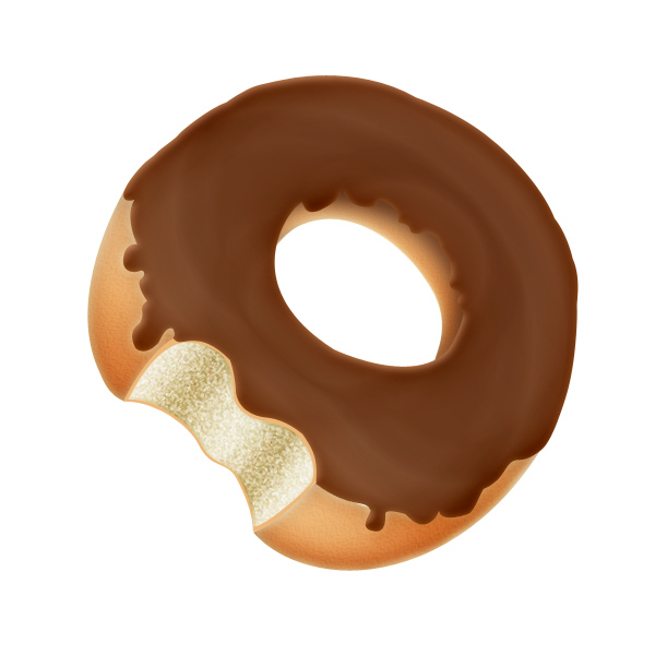
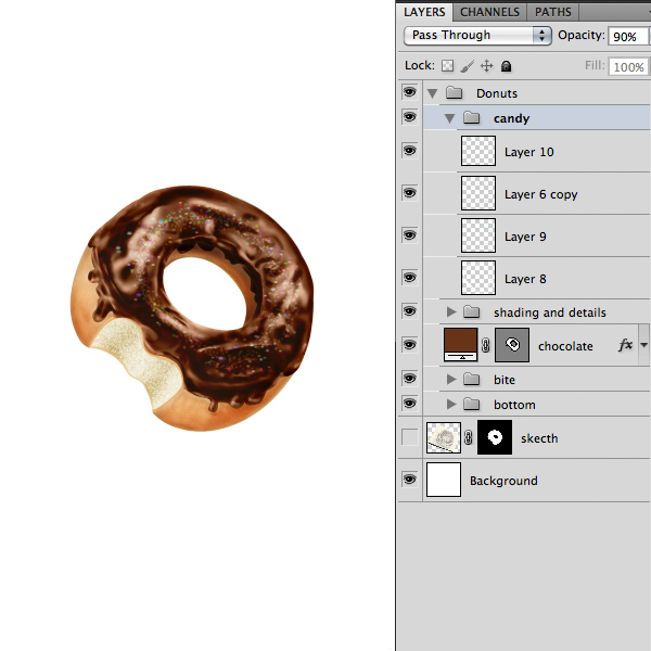
Final Image
If you want you can add a grunge background and some type. I’ve create a custom background for this project with a pink vibrant color. So here it is the final version. Hope you like it!
Designer Round Table (Audio)
2011-05-14 17:00:25 (читать в оригинале)Advertise here
It’s not often that designers get to share their thoughts with other designers outside of an academic setting. Not too long ago our friends Anthony Harmon, Stephen Walker, Jennifer Cirpici, and Maebh Costello sat down to discuss their experiences within the design industry. They fielded a series of questions from Twitter users and recorded their discussion; shedding light on subjects including the best career advice they’ve received, where they draw their inspiration, their greatest personal and professional challenges, and less serious topics like their favorite films and whether being attractive helps build your career. This 40-minute discussion was the first time any of them had spoken to one another, but their mutual love for art and design made the conversation sound like they were old friends. Sit back, relax, and get a glimpse into the minds of these four up and coming creatives.

|
| ||
|
+382 |
399 |
Follow_through |
|
+328 |
331 |
שימותו הקנאים |
|
+320 |
334 |
Tomas50 |
|
+317 |
357 |
krodico |
|
+307 |
359 |
Ланин Сергей |
|
| ||
|
-4 |
42 |
Similis_Deo |
|
-5 |
2 |
Dark Music in Your Heart | Dark Music in Your Heart |
|
-6 |
9 |
BrightBand |
|
-15 |
135 |
Музпросвет в мыслях |
|
-16 |
167 |
Trance Music - Транс музыка |
Загрузка...
взяты из открытых общедоступных источников и являются собственностью их авторов.