| Сегодня 26 июля, воскресенье |
|
|
|
Какой рейтинг вас больше интересует?
|
Главная /
Каталог блоговCтраница блогера PSDTUTS/Записи в блоге |
|
PSDTUTS
Голосов: 2 Адрес блога: http://psdtuts.com Добавлен: 2008-10-26 20:48:58 блограйдером DrakAngel |
|
The Artwork of Anton Semenov
2011-09-10 17:00:20 (читать в оригинале)Today, we will be taking a look at the incredible artwork of Anton Semenov. Semenov is a 28-year-old digital painter and graphic designer born and raised in Bratsk, Russia. His unique style and incredible attention to detail have gone into creating artwork for several clients. Anton has also been a contributor to the SlashThree collective’s exhibitions since late 2009. Let’s take a look!
Evil
Created for SlashThree’s 15th exhibiton, Paradigm Shift.
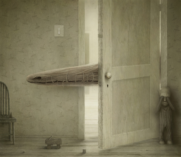
Gaping
An illustration created for Semenov’s personal portfolio.
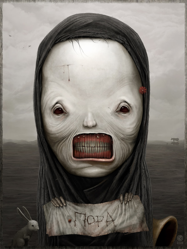
Morning
An interpretation of death created for Semenov’s personal portfolio.
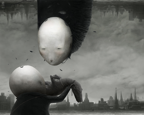
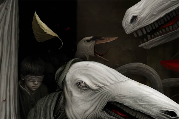
Silence
An illustration for SlashThree’s 13th exhibition, "Unleashed", depicting a collision of two worlds only possible in the dreams of a child.
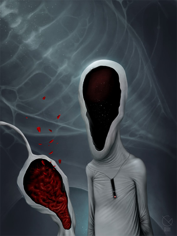
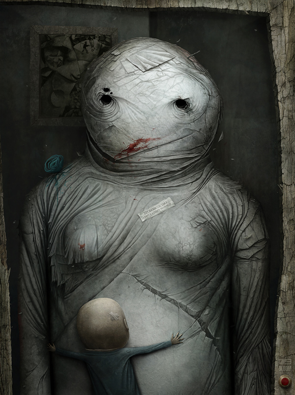
Surrogate
A depiction of the love we hold for our parents, or any person or thing that acts as a parental figure, also created for SlashThree’s "Paradigm Shift" exhibition.
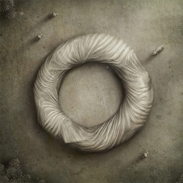
Thistle
A personal painting based on one of Semenov’s favourite childhood books, "Scary Fairytales", depicting a child held captive by a bathhouse demon.
Noon
A personal painting about childhood fears; showing that our worst fears live in our subconscious.
Where to find Anton Semenov on the Web
- Semenov’s DeviantArt
- Semenov on SlashTHREE
Amazing Fan Art From the DC Universe
2011-09-09 17:00:24 (читать в оригинале)We recently featured some outstanding fan art from the Marvel Universe. Today, we have even more comic fan art but this time from the DC Universe. DC comics include some of your favorite super heroes such as Superman, Batman, and Wonder Woman. Please take a moment to review some of this fantastic artwork.
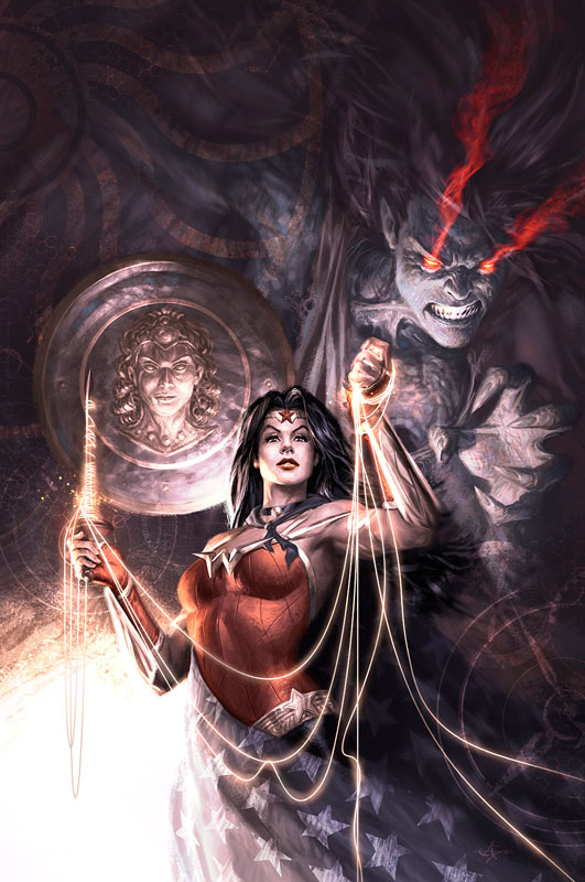
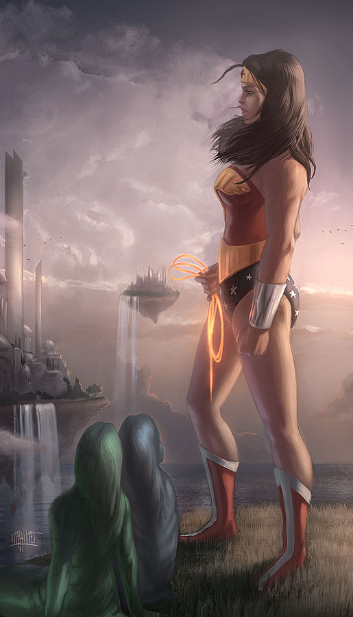
Wonder Woman By Alex Garner
Our first piece of fan art features an astounding painting of Wonder Woman. This cover doesn’t lack in anything especially detail; this definitely does the famous female super hero justice.
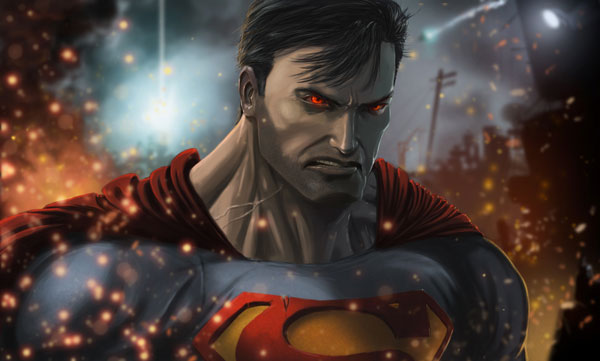
Superman By Elias Khasho
A very angry looking Man of Steel is up next on this list, here is another painting that is extremely detailed and really captures the expression in the hero’s face.
Wonder Woman By Memed
Here goes another homage to Wonder Woman and this one dosen’t disappoint as well. Another tremendous looking painting with some great scenery surrounding the hero.
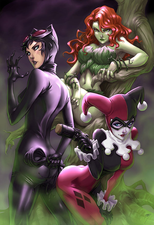
Sirens By Drake Tsui
Anyone familiar with the Batman world will recognize these ladies. This is a very well painted illustration featured some of the female villains that make it hard for Batman to do his job, another great piece of fan art.
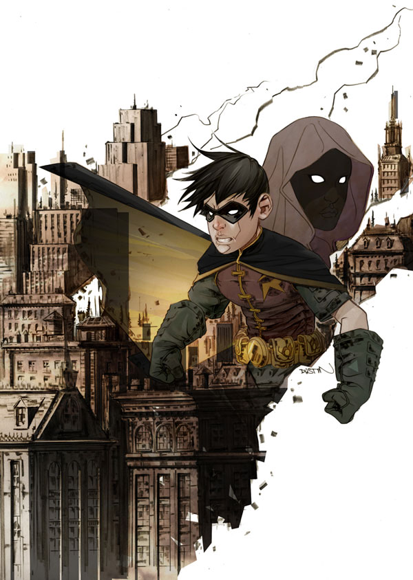
Robin By Justin Nguyen
This gritty an abstract cover features Batman’s sidekick Robin. The designer does a fantastic job giving the cover a dark look as well as keeping it original and unique at the same time.
Justice League Of America By Alex Garner
This outstanding cover features some beautiful vibrant colors that flow throughout the whole illustration and surround Batman who is painted to perfection. Another great piece of fan art.
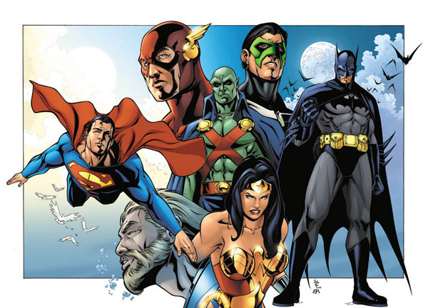
Justice League By Brian Reber
A whole group shot of the Justice League is featured here and it is nothing short of awesome. To be able to see all the members of this team in one painting makes it amazing.
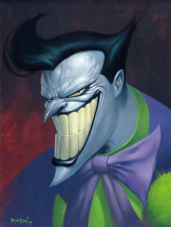
Joker By James Ryman
The most popular villain in almost all of the DC Universe is featured here with his signature evil grin. The designer did a fantastic job having the villain convey his evil feelings through the painting, great job.
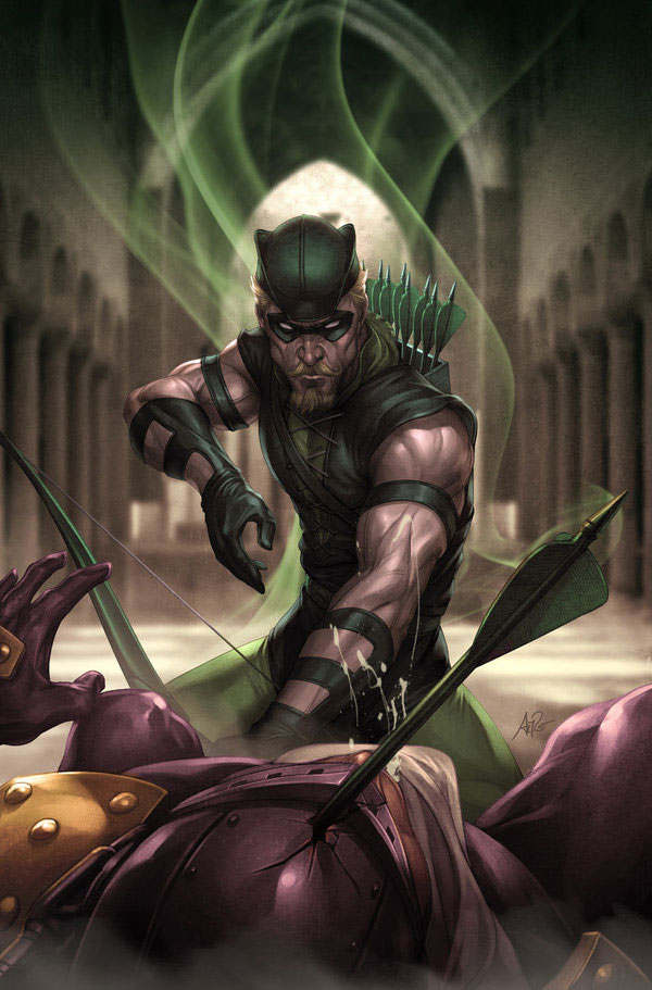
The Green Arrow Stanley Lau
Although this painting is of a lesser-known super hero The Green Arrow it still dosen’t lack in quality. This cool action shot painting showcases this super hero in a great way.
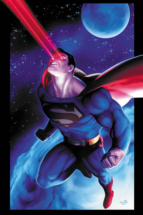
Superman By Jeremy Roberts
One of Superman’s most interesting super powers is his laser beam and it is illustrated here in another stunning painting. The setting of this one is also great because of the beautiful blend of colors the designer used to illustrate it.
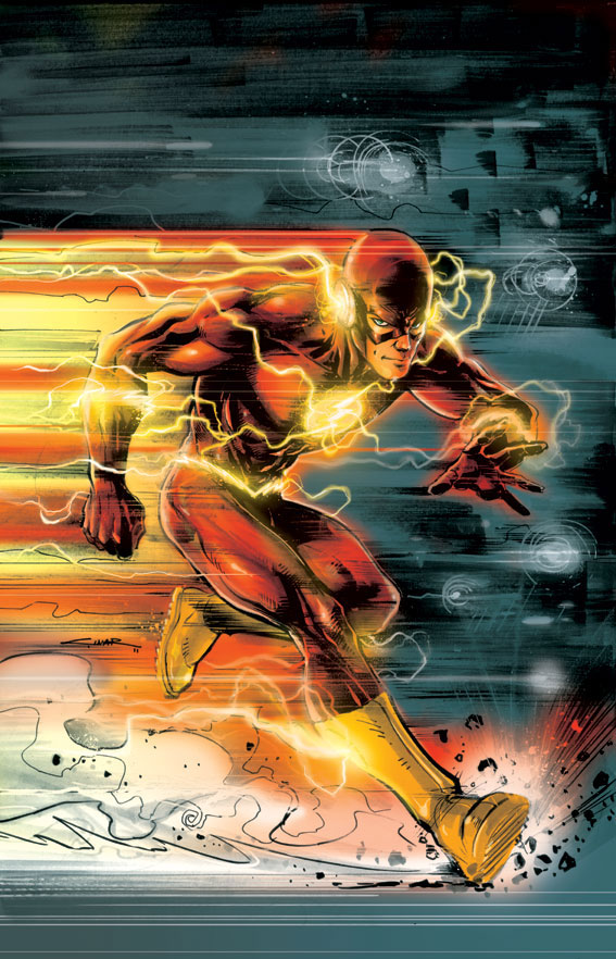
Flash By Yildiray Cinar
The fastest superhero in the world is featured here in this painting. The great comic book look here works well with the illustration itself and makes for another great piece of fan art.
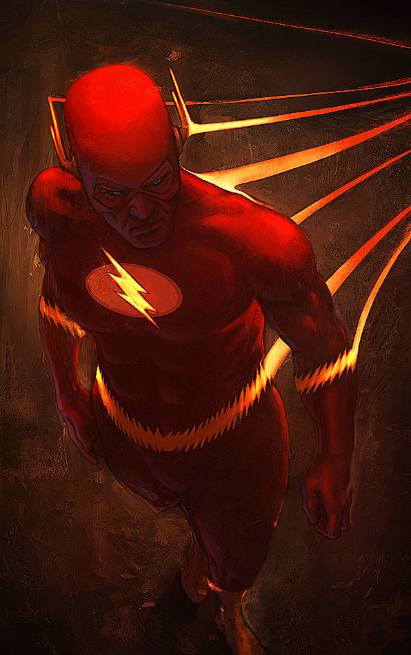
Flash By Memed
More Flash here but this time the painting looks a lot different. The textured style the designer chooses to use works great with the hero’s bright colors.
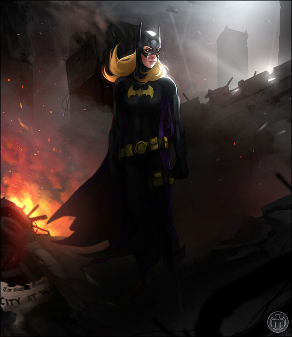
Fall Gotham City By Muller Pereira
Gotham City is burning to the ground in this fantastic painting featuring another one of Gotham’s famous heroes, Batgirl. The designer does a fantastic job in making her stand out in the painting.
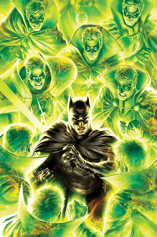
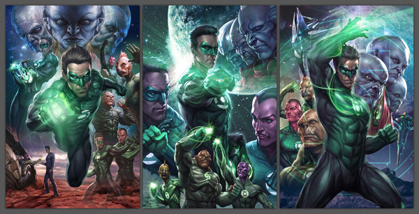
Green Lantern By Stanley Lau
This painting is completely epic as it illustrates all of the main characters in the upcoming Green Lantern film. On top of that the designer does an outstanding job in painting the realism of every character.
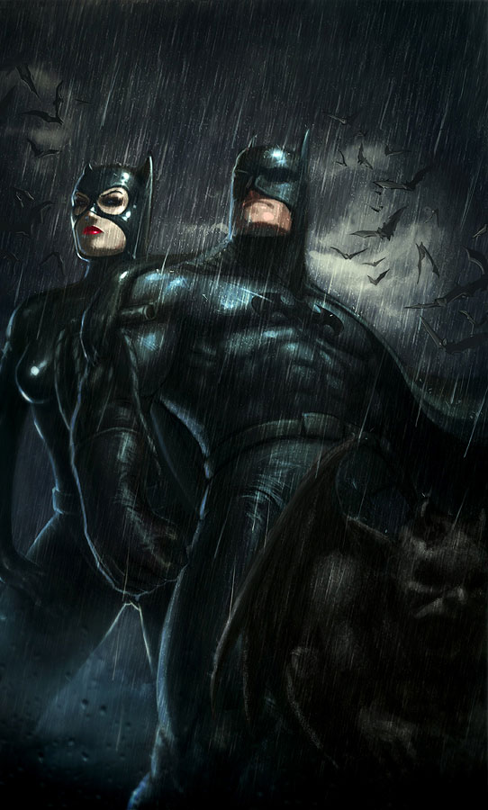
Catwoman And Batman By Memed
The duo of Catwoman and Batman can be seen in this painting, the dark scenery on top of the heavy rain fall make for a very neat illustration that has a cool overall dark feel to it.
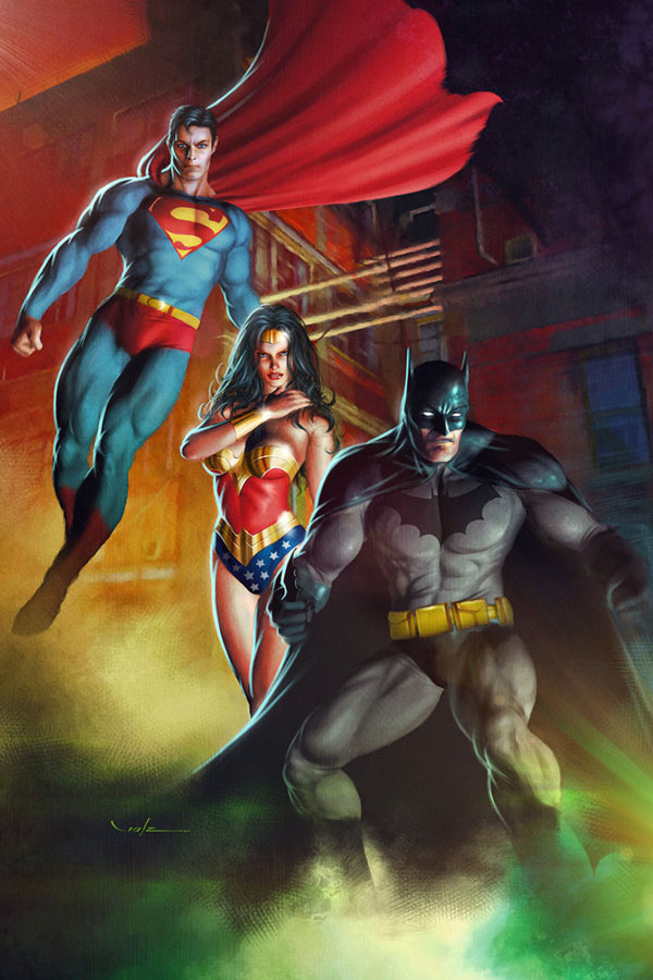
DC Heroes By Carlos Valenzuela
3 of the more popular superheroes from the Justice League are painted here is stunning realism. The designer does a fantastic job at putting together this painting, a stunning piece of fan art.
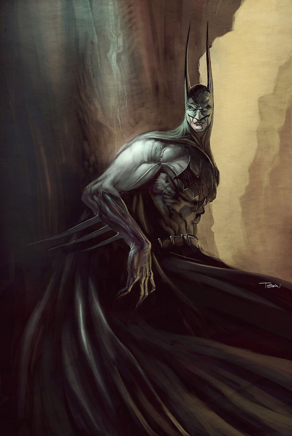
Batman By Fancis Tsai
Truly a unique piece of fan art, this one almost looks like the Surrealist version of Batman with its extra long bat ears and claws.
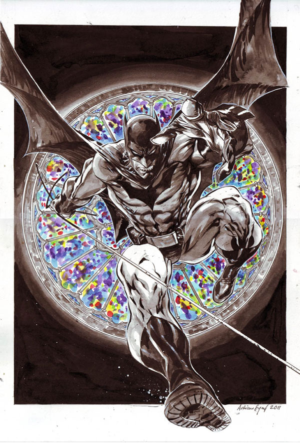
Batman By Ardian Syaf
More Batman art here and this one is truly unique, this action shot of Batman falling is awesome because of the detail in the painting as well as the lack of color in specific places. The designer definitely did a great job illustrating this scene.
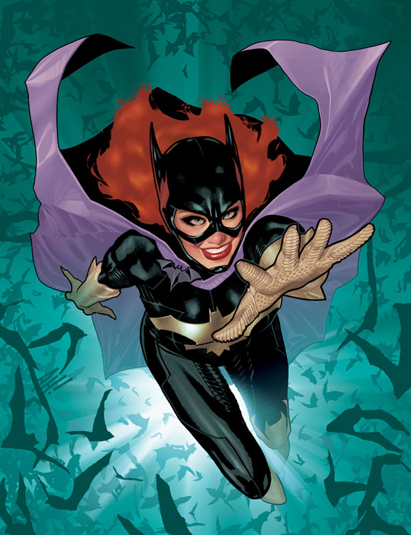
Batgirl By Adam Hughes
This illustration differs from the last piece of Batgirl fan art in this roundup, but the comic book style coloring of this one is still awesome. It features a different version of Batgirl but still does a great job with the overall look to the cover.
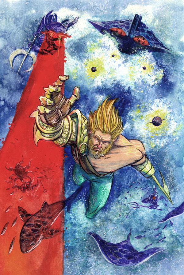
Aquaman By Neil Dutton
Our last piece of fan art illustrates the sometimes forgotten hero Aquaman. The painting style is extremely creative and unique as well as features an interesting action shot of Aquaman avoiding some pursuers.
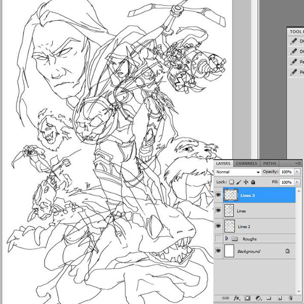
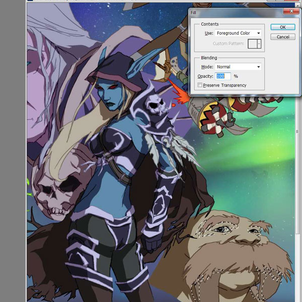
Create World of Warcraft Inspired Fan Art – Psd Premium Tutorial
2011-09-08 17:00:50 (читать в оригинале)Most of you are probably aware of the World of Warcraft. In fact, many of you are probably active players. In this Psd Premium tutorial, authors David and Sarah Cousens will demonstrate how to create a dynamic World of Warcraft fan art illustration. This tutorial is available exclusively to Premium Members. If you are looking to take your illustration skills to the next level then Log in or Join Now to get started!
Professional and Detailed Instructions Inside
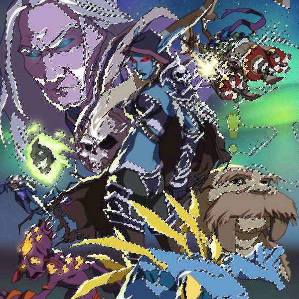
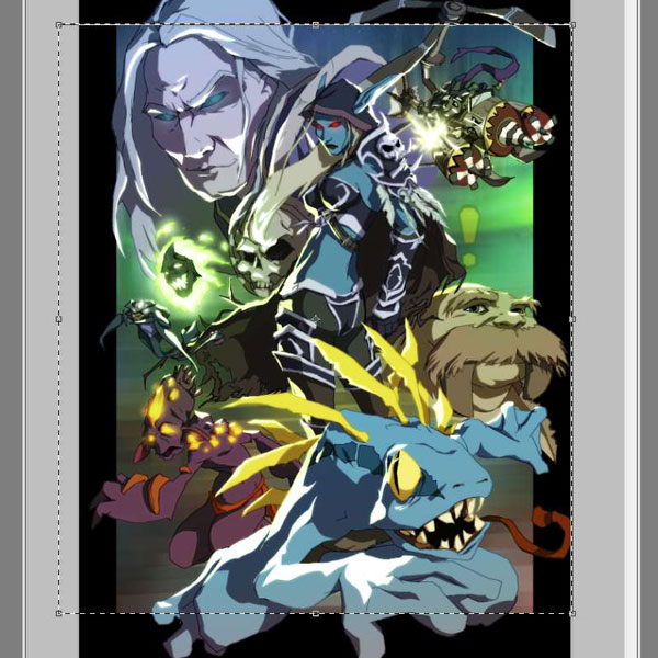
Premium members can Log in and Download! Otherwise, Join Now! Below are some sample images from this tutorial.
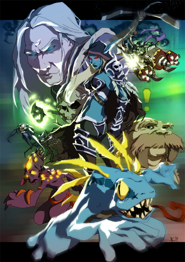
Final Image
Psd Premium Membership
You can join Psd Premium for as little as $9/month. Premium membership gives you access to the source files for all our tutorials as well as access to premium tutorials like this one. This also includes the rest of the sites in our network including Vectortuts+, Webdesigntuts+, Phototuts+, Nettuts, and more! Premium Members can Log In and download this tutorial. Otherwise you can Join Today!
How to Work With Perspective in Photoshop
2011-09-07 17:00:31 (читать в оригинале)Photoshop is an excellent tool for manipulating photographs but it can also be used as a means to create stunning digital art. This tutorial is part of a 25-part video tutorial series demonstrating everything you will need to know to start producing digital art in Photoshop. Digital Art for Beginners, by Adobe Certified Expert and Instructor, Martin Perhiniak will begin by teaching you how to draw in Photoshop. At the conclusion of this series you will know all you need to produce your own concept art and matte paintings in Photoshop.
Today’s tutorial Part 7: How to Work With Perspective in Photoshop will explain a bit about the theory behind perspective and will focus on how to set up construction lines, vanishing points and a horizon. We will also show different ways to create a perspective grid and then use it for drawing three-dimensional objects. These techniques are useful for retouching photographs, but crucial for digital art. Let’s get started!
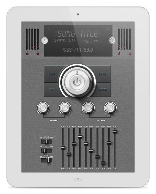
Create a Detailed User Interface for an iPad Application
2011-09-06 17:00:36 (читать в оригинале)In this tutorial we will show you how to design a detailed user interface for an audio-themed iPad application. We will design this application using a retina display resolution and will make use of Photoshop’s shape layers and layer styles. Let’s get started!
Tutorial Assets
- Tutorial Custom Shape
- Font
Step 1
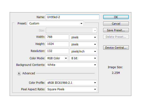
Create a new file. Set Width to 768 and Height to 1024 and the resolution to 133 PPI.
Step 2
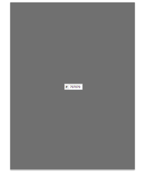
Make a new Group and name it Background. Inside that group, create a new layer and fill it with #707070.
Step 3
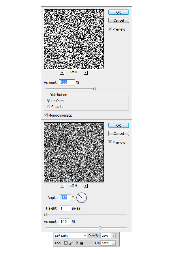
Now make another layer on top of the previous one, fill it with any color you want, I prefer to use White #ffffff. After doing this go to Filter > Noise > Add noise and se the Amount to 400%, Distribution to Uniform and check the Monochromatic box. Next step is to go to Filter > Stylize > Emboss and set the Angle to 135, Height to 1 and Amount to 146. Set the Opacity of the layer to 25%.
Step 4
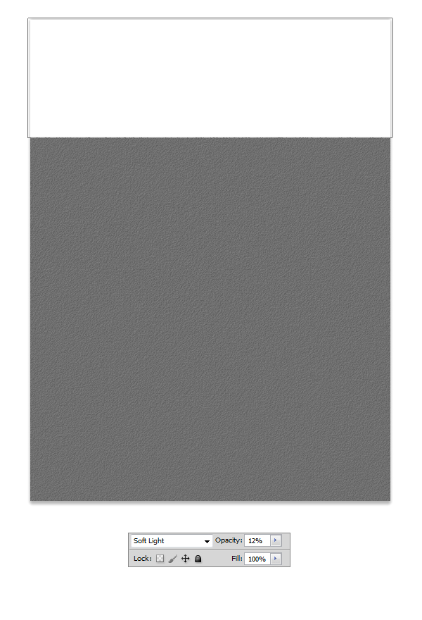
Select Rectangle tool (U) and make a white #ffffff shape like the one in the example. Set the blending mode for the layer to Soft Light and the Opacity to 12% and our
Background is done.
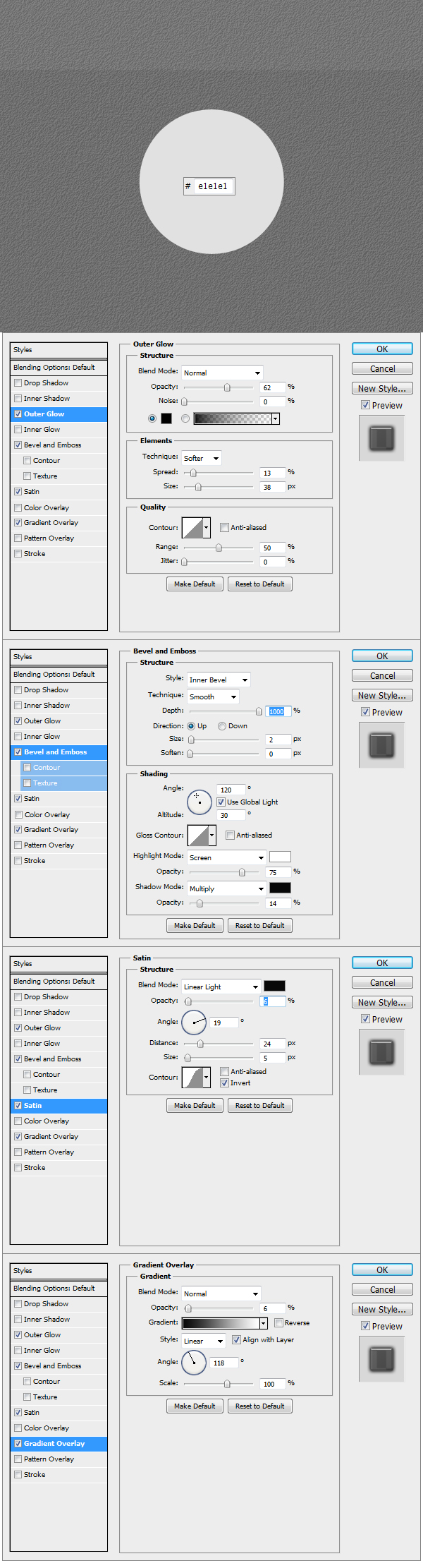
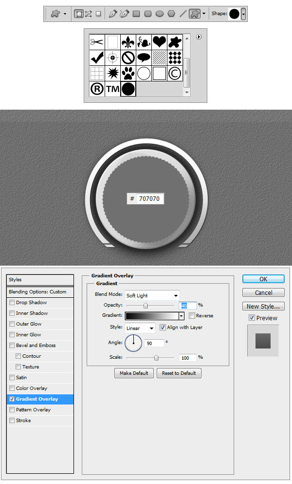
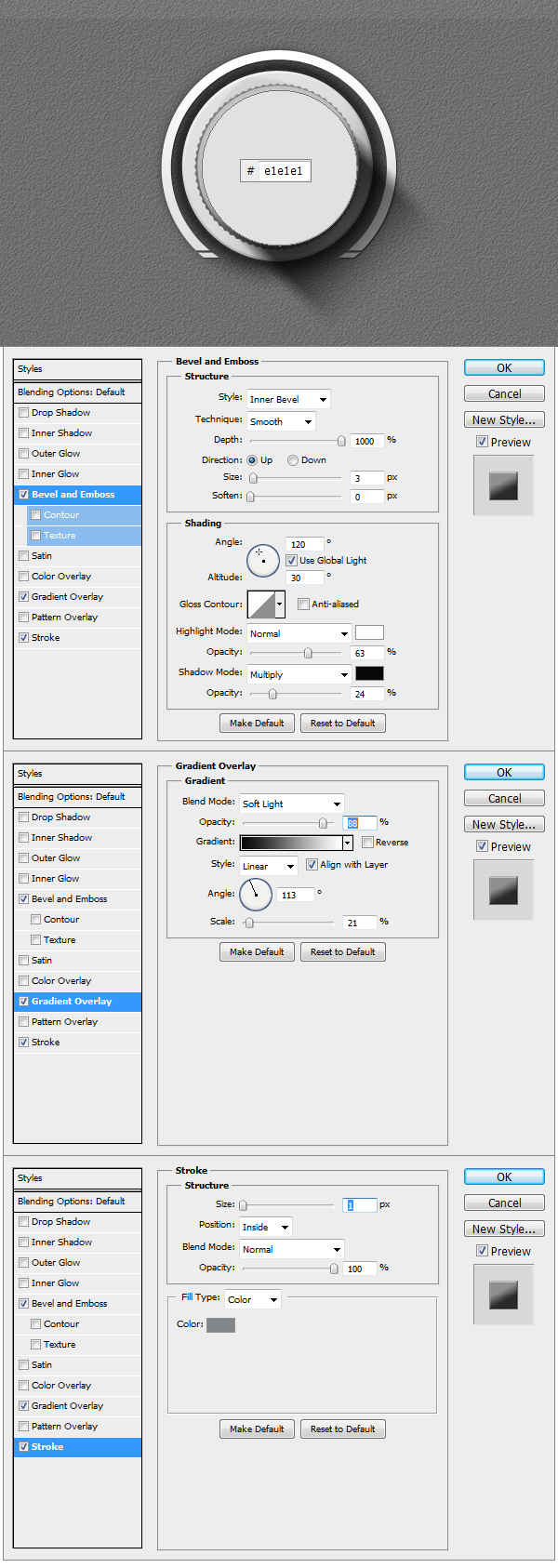
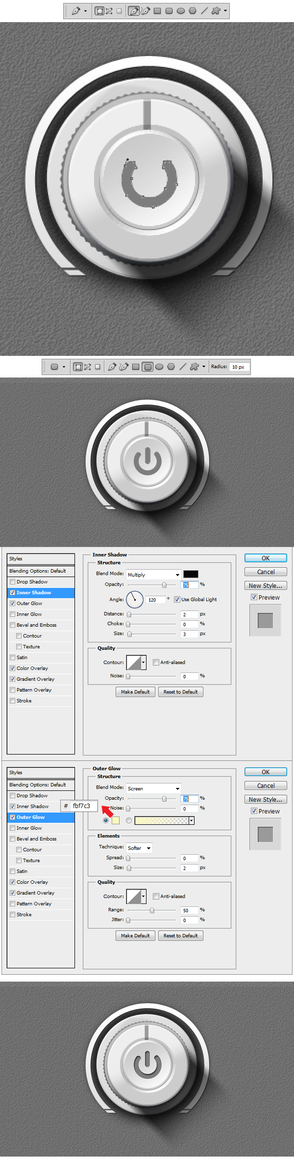
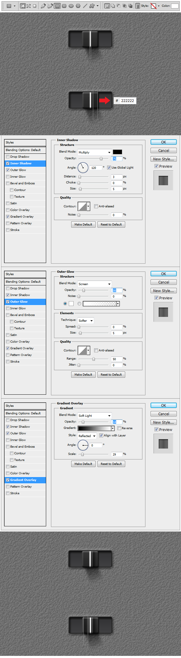
Step 5
Now to get started on the elements. Create a new Group and name it Main Knob. Using Ellipse Tool (U) make a circle like the one in the example and fill it with #e1e1e1. Apply the Layer Styles to get the base of the Knob done.
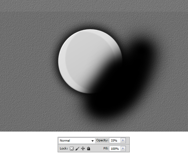
Step 6
Using Brush Tool (B), pick a medium size brush and set the Hardness to 0. Make a black stroke like in the example and set the Opacity to 33%. Right click on the layer
in the Layers panel and select Create Clipping Mask.
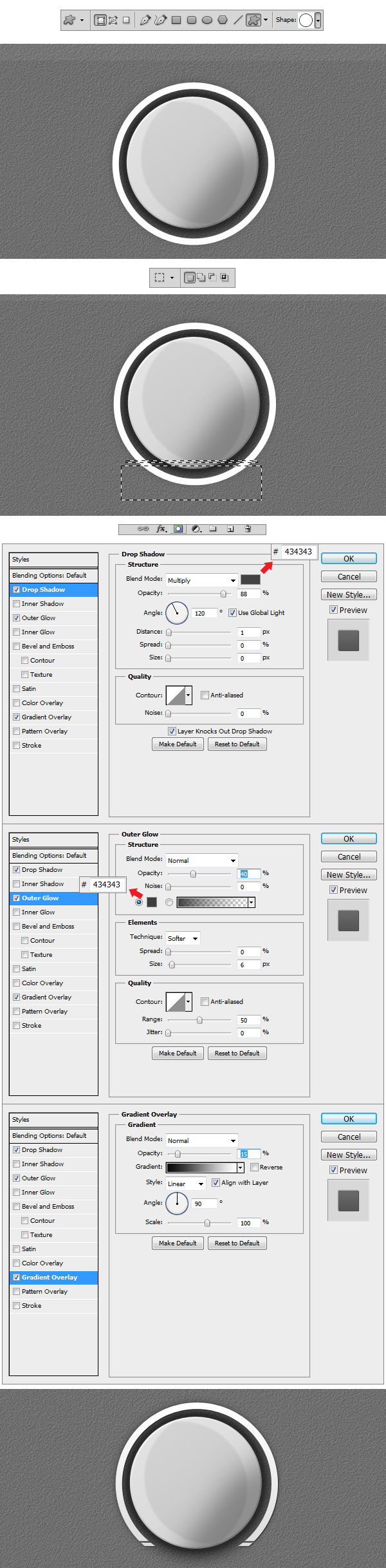
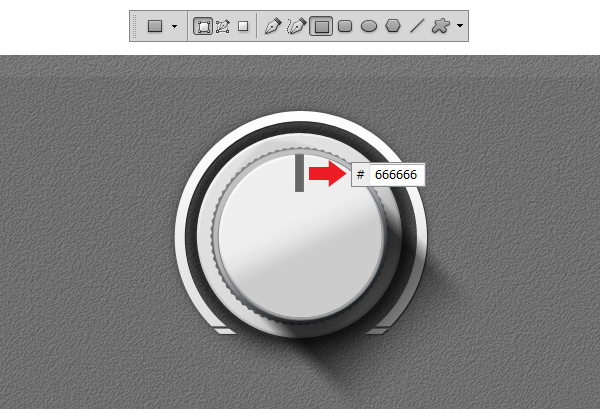
Step 7
Select Custom Shape Tool (U) and from there select the Circle Thin Frame shape that is in the library. Make a shape like the one in the example. Now using
Rectangular Marquee Tool (M) make two selections like the ones in the example, than right click on the image and Select Inverse so that you can add a Layer Mask to the shape.
Once everything is done apply the Layer Styles that follow in the example.
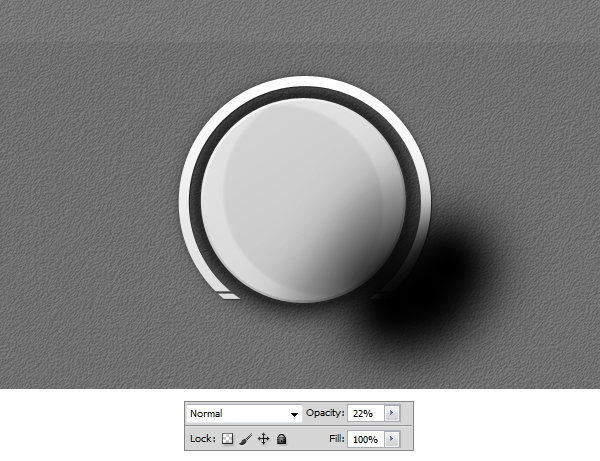
Step 8
Make a new layer on top of the previous one and using a black #000000 medium brush make a stroke like the one in the example. Reduce the Opacity to 22 % and transform
the layer in a Clipping Mask.
Step 9
Select Custom Shape Tool (U) and load the Tutorial Custom Shape.
Make a shape like in the example using the Custom Shape added. Set the color to #707070 and apply the Layer Style.
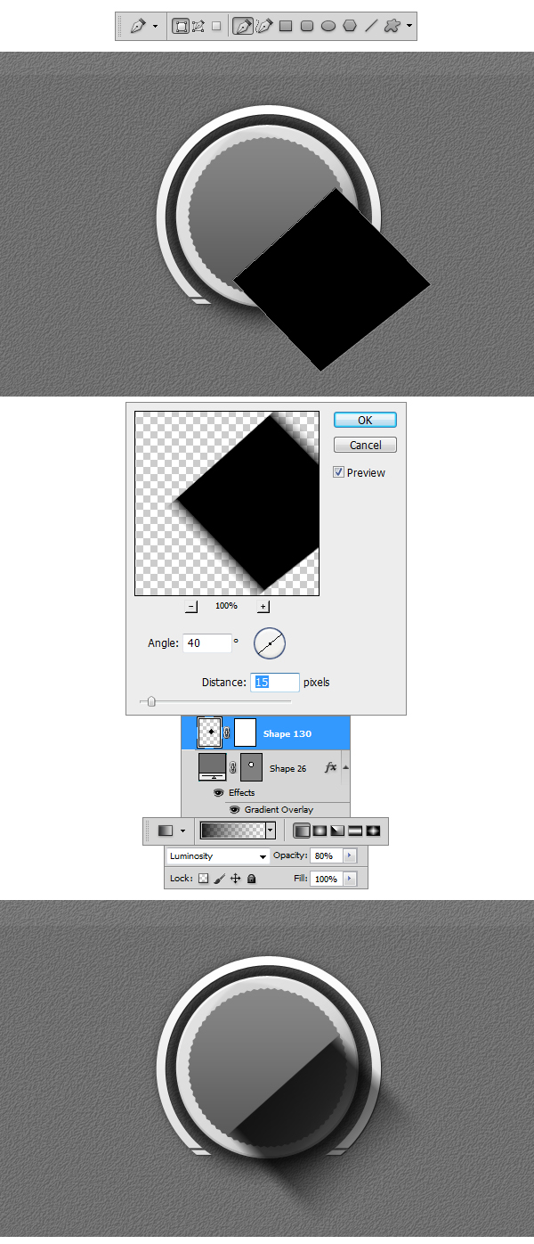
Step 10
Using Pen Tool (P) draw a shape like the one in the example. Afterwards go to Filter > Blur > Motion Blur and set the Angle to 40 and Distance to 15 px. Add a layer mask and using
a black #000000 Linear Gradient set to Foreground to Transparent make a stroke from the bottom up. Set the Opacity of the layer to 80 %.
Step 11
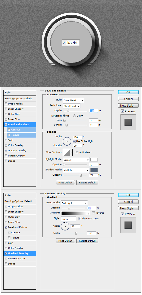
Make a circle using Ellipse Tool (U), set the color to #b7b7b7 and apply the Layer Styles.
Step 12
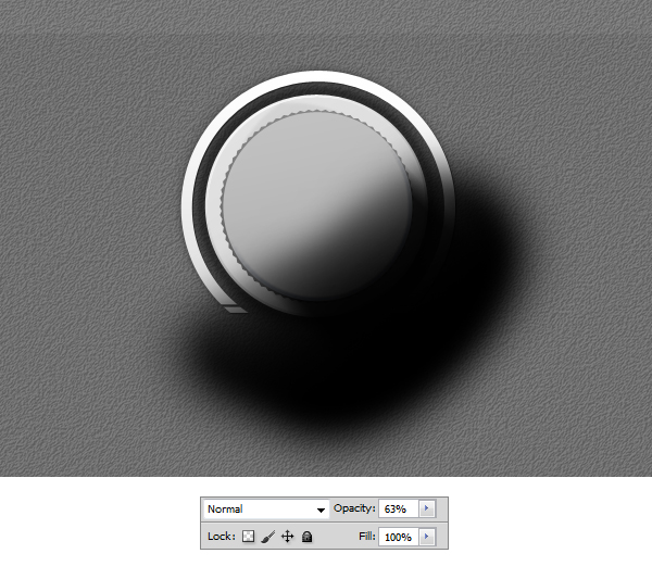
Using Brush Tool make a black #000000 stroke like shown in the example, set the Opacity of the layer to 63 % and make the layer a Clipping Mask.
Step 13
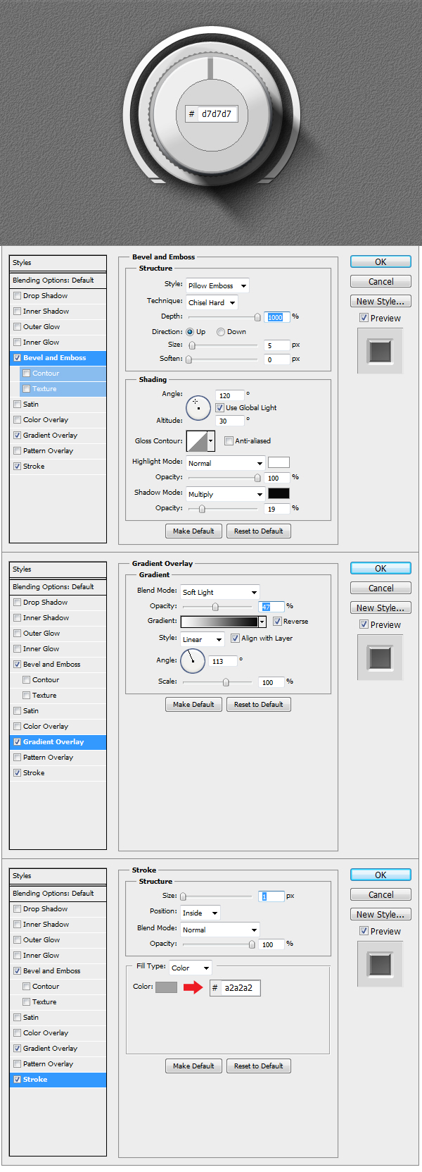
Make a new circle using Ellipse Tool (U), set the color to #e1e1e1 and apply the Layer Styles.
Step 14
Using Rectangular Tool (U) make a rectangle like the one in the example, set the color to #666666 and transform the layer into a Clipping Mask.
Step 15
Make another circle using Ellipse Tool (U), set the color to #d7d7d7 and apply the Layer Styles.
Step 16
Using Brush Tool (B) make a white #ffffff stroke like in the example and transform the layer into a Clipping Mask.
Step 17
In this step we will make the power symbol. Using Pen Tool (P) draw a grey #7c7c7a shape like the one in the example. Now using Rounded Rectangle Tool (U)
set the Radius to 10 px and make a shape similar to the one in the example. Apply Layer Styles to both shapes. Our Knob is done.
Step 18
Close the Main Knob Group and create another one under it. Name it Top Left Button. Inside using Rounded Rectangle Tool (U) set the Radius to 2 px and make a shape similar to the one in the example. Using Elliptical Marquee Tool (M) make a selection, 2-3 px bigger than the Knob, Right Click to Select Inverse. Add a layer mask to the button shape and our base is done.
Step 19
Apply the following Layer Styles to the Button shape.
Step 20
Using Ellipse Tool (U) make a circle like the one in the example. Apply the Layer Style and transform the layer into a Clipping Mask. This way the bevel will be shown inside the Button shape.
Step 21
Now to add some text. Using Horizontal Type Tool (T) set the size to 10 px, font to Arial and write down a word. Apply the layer styles and we have our first button ready.
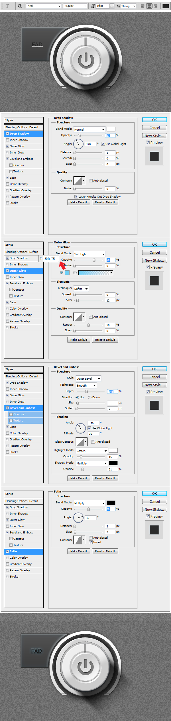
Step 22
In order to make the other 3 buttons you will have to re-make the previous 4 steps.
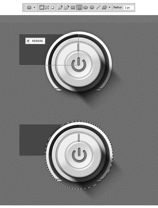
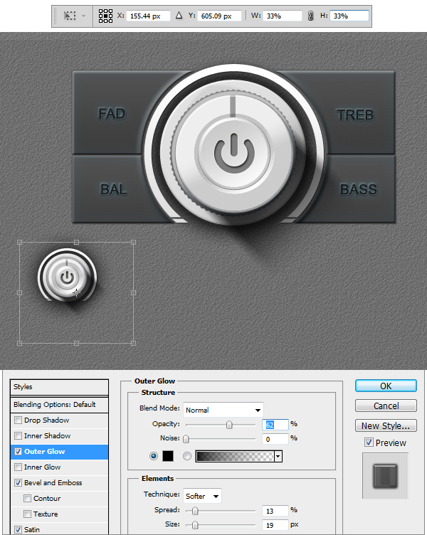
Step 23
Now we will make 4 smaller Knobs. The easy way is to simply duplicate the Main Knob Group. After we’ve made a copy of the group we’ll make another group and name
this one Small Knobs. You will have to insert the Main Knob Copy into the Small Knobs group. Once you’ve done this select the Main Knob Copy and rename it Small Knob.
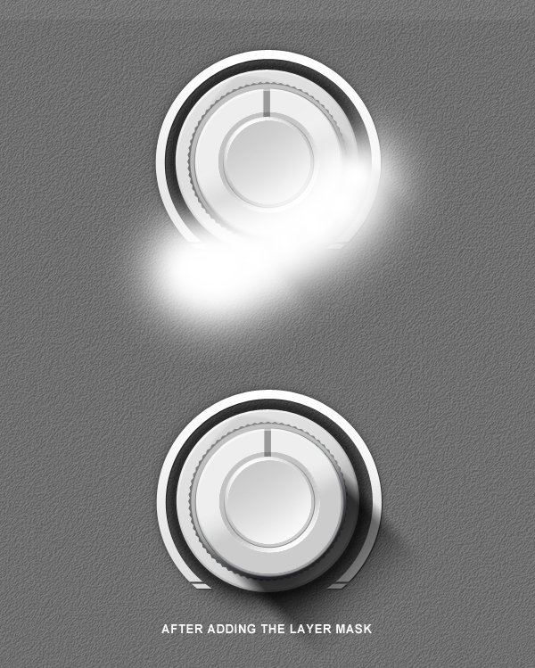
Now resize the whole group to 33 % like shown in the example. Delete the last two shapes inside the Small Knob, representing the power symbol, and open the Layer Styles of
first layer shape in the group. Reduce the size of the Outer Glow to 13%.
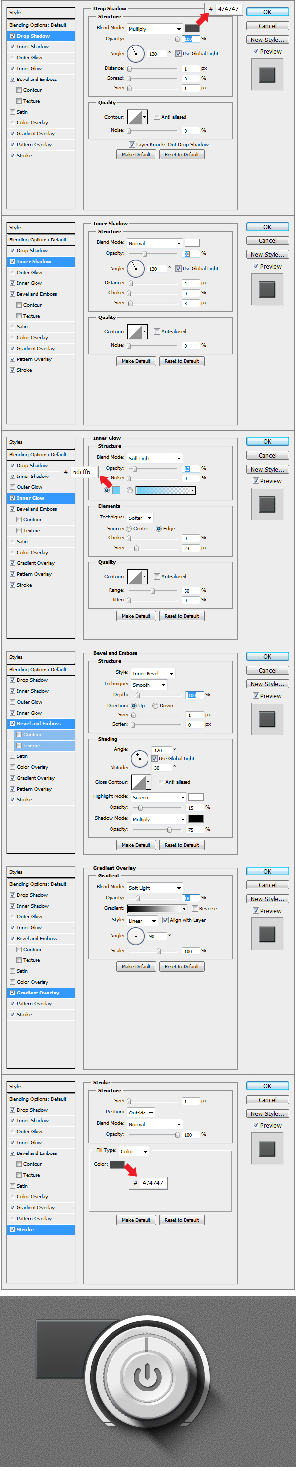
Step 24
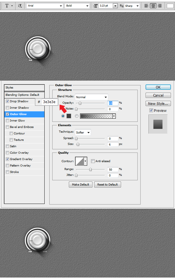
Using Horizontal Type Tool (T) we will insert a few intensity indicators. On the left site we will write using a 3. 23 pt Arial-Black Font 0 db and on the right side 40 db.
Apply the layer Style to both text layers.
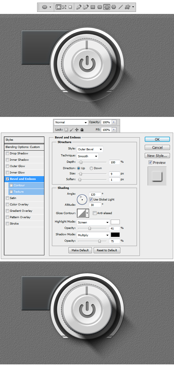
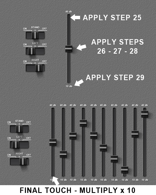
Step 25
Duplicate the Small Knob group four times, and move the rectangular indicator as you wish, giving a more dynamical aspect to the knobs. Using Pen Tool (P) draw two shapes like the ones in the example. Color both of them with #464646 and apply the Layer Styles. After with the help of Horizontal Type Tool (T) write under each previous shape using a 7. 50 pt Arial – Black Font the words INPUT (on the left side) and OUTPUT (on the right side). Apply the layer styles and everything is done.
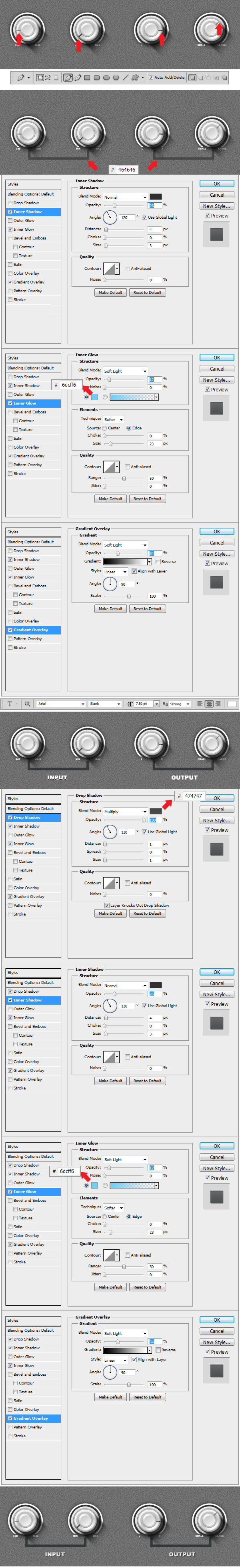
Step 26
Make a new Group and name this one Switch. Now using Rounded Rectangular Tool (U) set the Radius to 2 px and make a shape like the one in the example. Set the color to
#383839 and apply the Layer Styles.
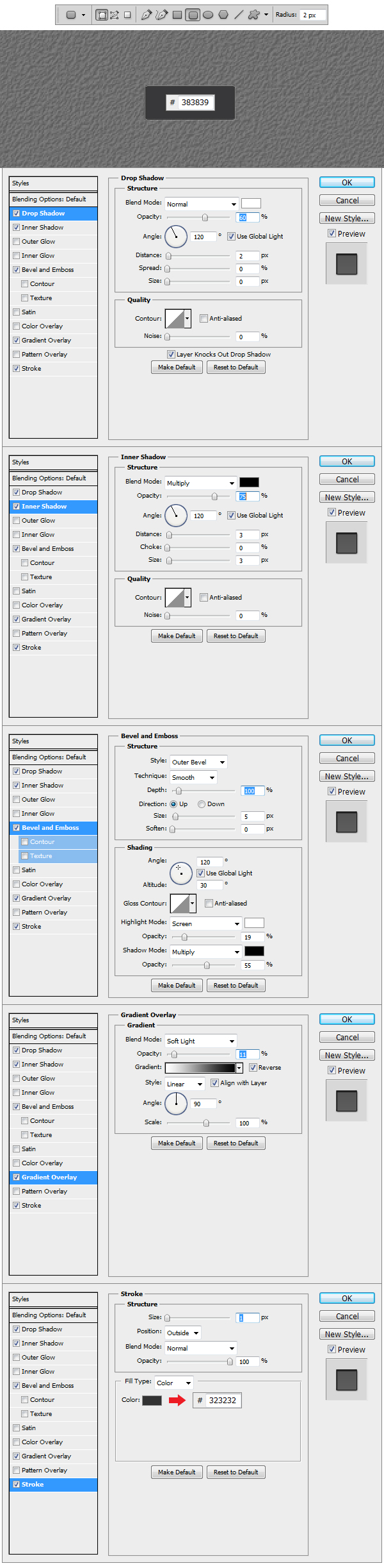
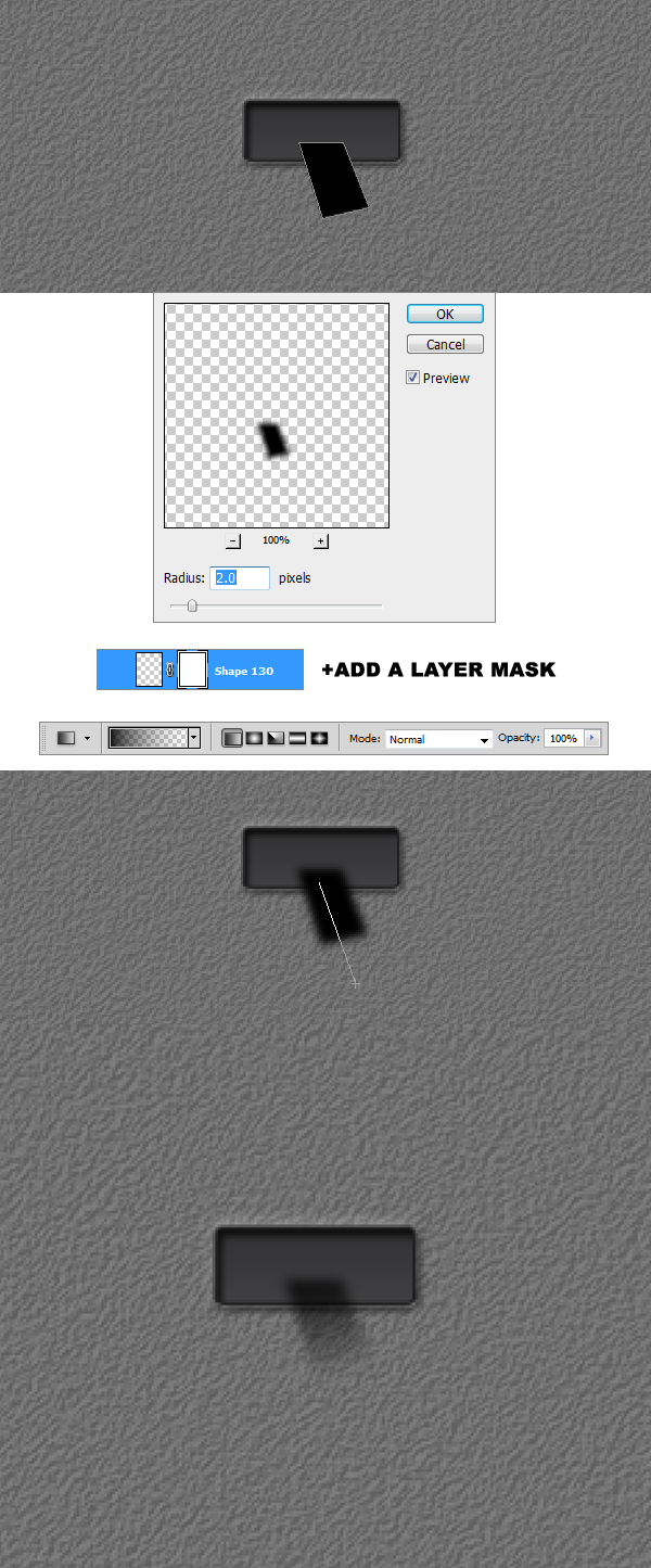
Step 27
After creating the basic shape of the switch we are going to build the shadow. Using Pen Tool (P) draw a black #000000 shape like the one in the example. Afterward
go to Filter > Blur > Gaussian Blur, set the Radius to 2 px and apply the filter. Add a layer mask to the shadow layer and using a black #000000 Linear Gradient set to
Foreground to Transparent make a stroke from the bottom up like in the example.
Step 28
Using Rounded Rectangular Tool (U) with the Radius set to 2 px, make a shape like the one in the example. Set the color to #2c2c2c and apply the Layer Styles.
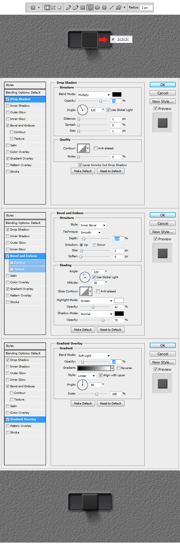
Step 29
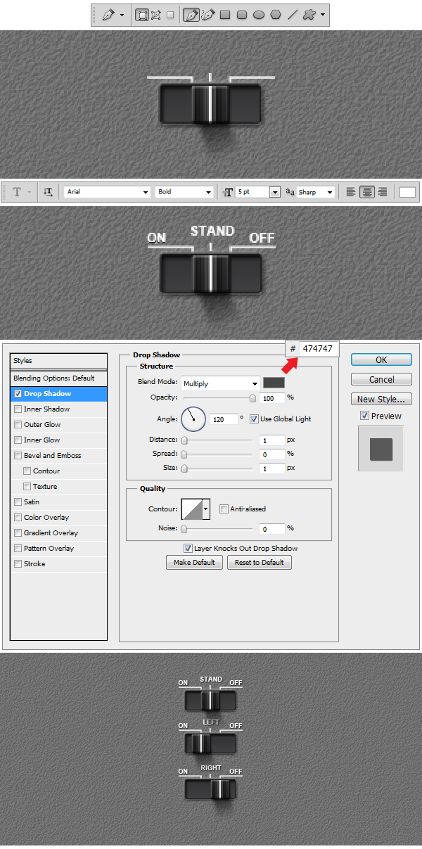
Add a new layer and make it a Clipping Mask. Using Rectangular Tool (U) make a white shape like the one in the example. Now make another shape, which also has to be a Clipping Mask and color it with #222222 and apply the Layer Styles. Duplicate this last layer on the left side of the switch.
Step 30
Using Pen Tool (P) draw 3 white #ffffff shapes like the ones in the example. After using Horizontal Type Tool (T) set the size to 5pt, font to Arial and above the 3 elements ON, STAND and OFF and apply the Layer Style. Duplicate Switch group 3 times and we’re done.
Step 31
Make a new Group and name it EQ. Now to build the Equalizer bend follow the steps indicated in the example. After you are done creating the bend, duplicate it 10 times
to get number of bends needed.
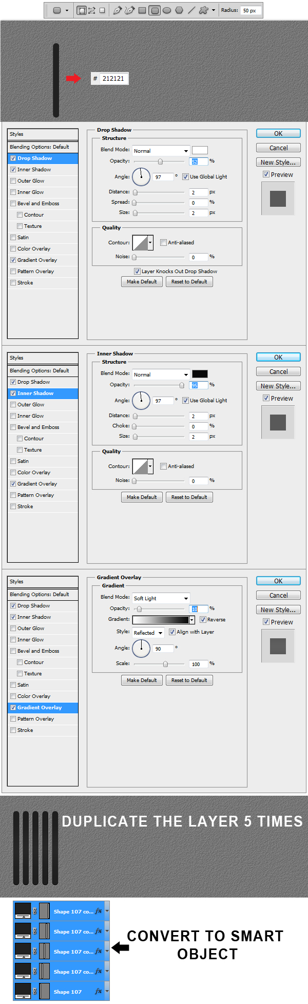
Step 32
Create a new Group and name it Grill. Using Rounded Rectangular Tool (U) set the Radius to 50 and make a shape like the one in the example. Set the shape color to #212121 and apply Layer Styles. Duplicate the layer 5 times, afterwards select all 5 layers and Convert to Smart Object.
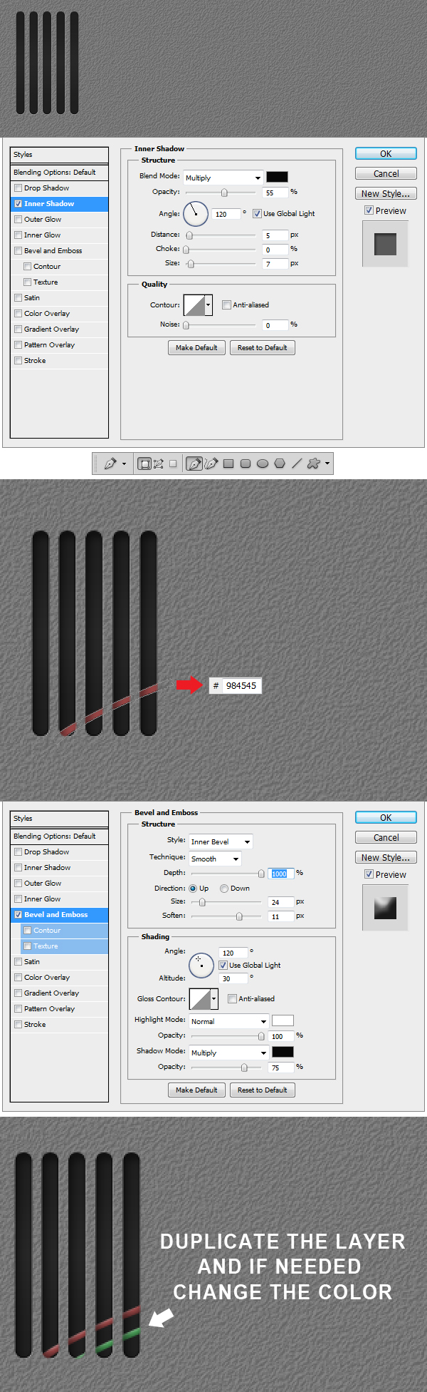
Step 33
After you’ve made the conversion, apply the Layer Style. Using Pen Tool (P) make a shape like the one in the example, set color to #984545 and apply the
Layer Style. Duplicate the layer and change color if needed.
Step 34
Using Rectangular Tool (U) make to red #871b19 squares like the ones in the example. To the left one (indicating the pushed version of the button) apply the
Layer Styles shown in the example.
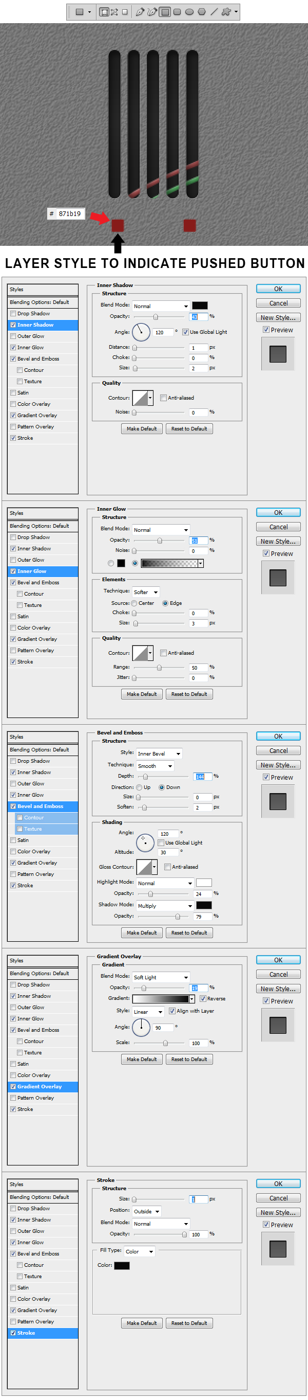
Step 35
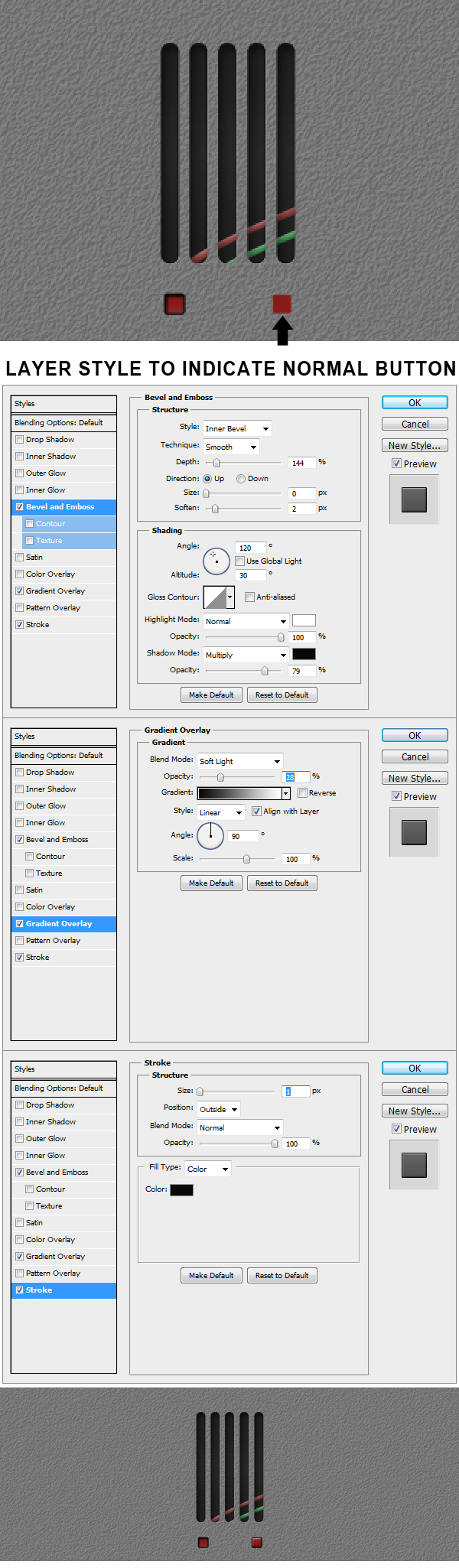
Now we are going to make the normal mode button. Apply to the right square the Layer Styles indicated in the example.
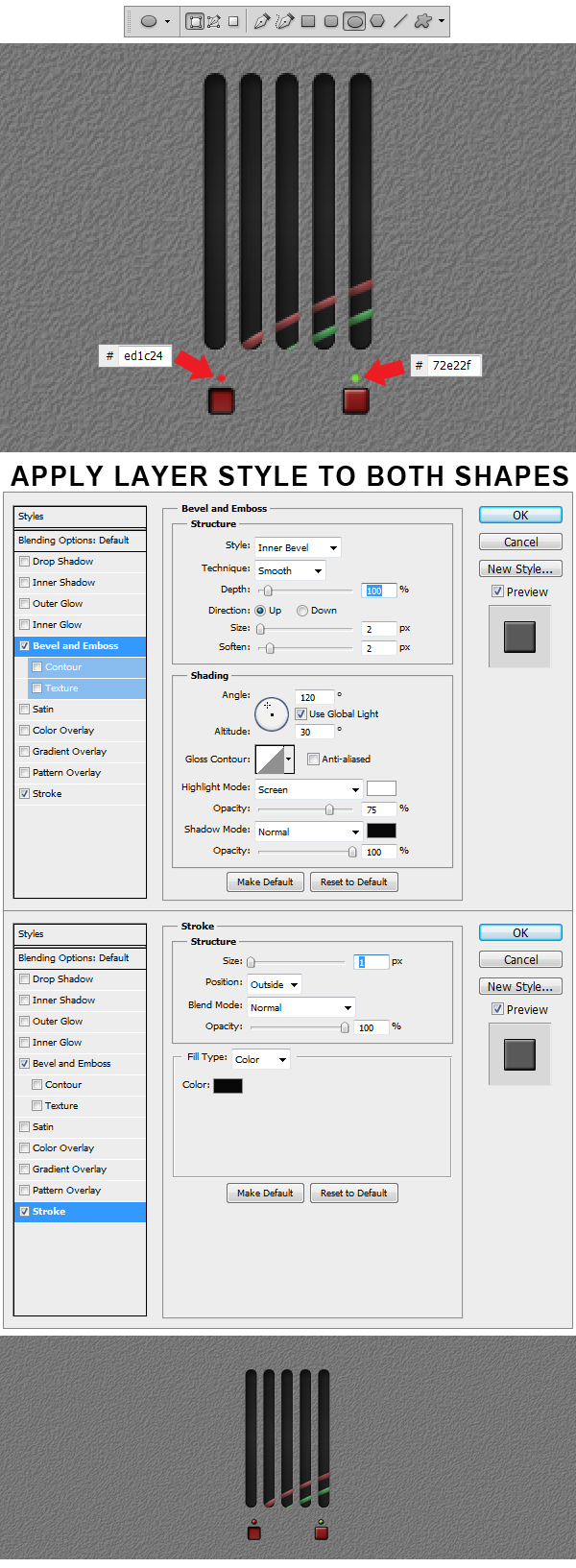
Step 36
Using Ellipse Tool (U) make 2 shapes above the previous buttons like the ones in the example. Color the left one #ed1c24 and the right one #72e22f. Afterwards apply the Layer Styles to both circles.
Step 37
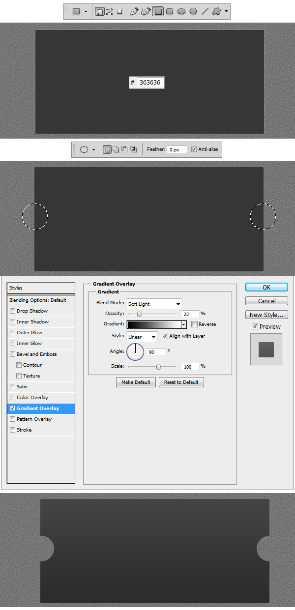
Make a new Group and name it Display. Using Rectangular Tool make a shape like the one in the example. Set the color to #363636. Now using Elliptical Marquee Tool (M) make to perfect selection circles like the ones in the example. Right click and Select Inverse and apply the Layer Style.
Step 38
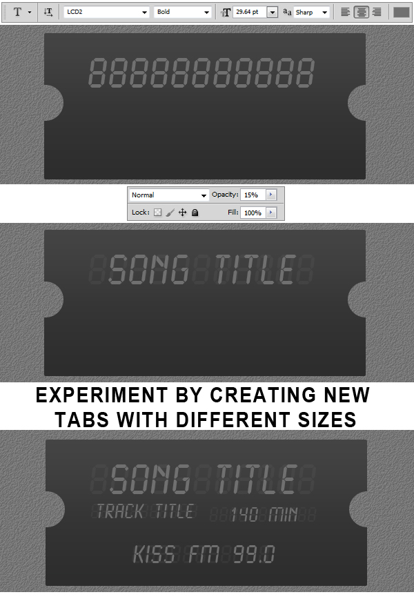
Using Horizontal Type Tool (T) set the size to 29. 64 pt and Font to LCD and type 11 eights. Reduce the Opacity
of the layer to 15%. Make another type layer and write Song Title but keep the Opacity to 100% this time. Now try to make some more text layers, experimenting with font size
and with color.
Step 39
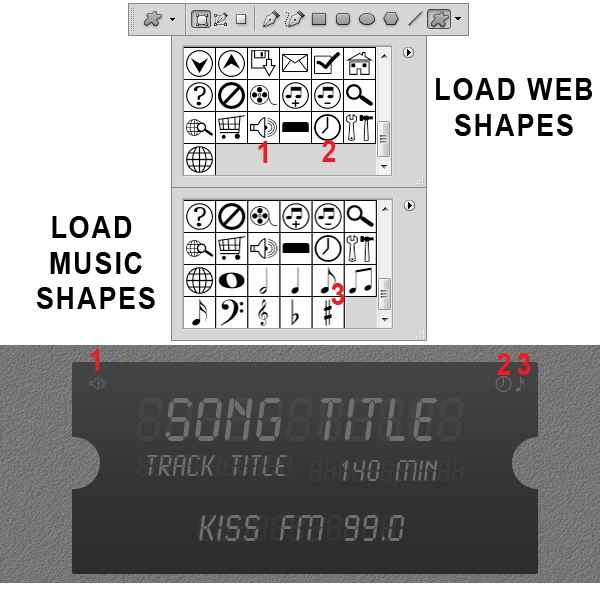
Using Custom Shape Tool (U) Load Web Shapes and Music Shapes from the shape library and insert the 3 elements showed in the example.
Step 40
Make a new Group and name this one Info Button. Now using Ellipse Tool (U) make a grey #d7d7d7 circle like the one in the example and apply the Layer Styles.
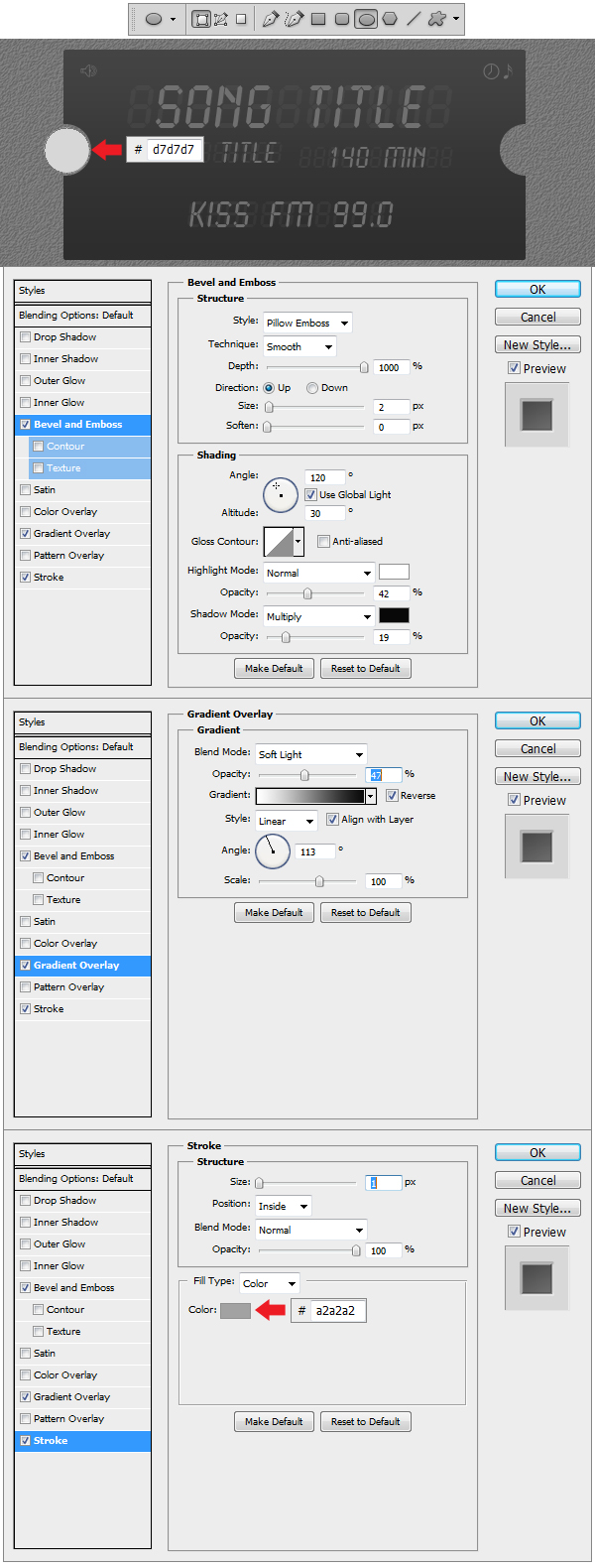
Step 41
Make another circle using Ellipse Tool (U) using the same fill color #d7d7d7 and apply the Layer Styles. Using Custom Shape Tool (U) load Symbols from the library and insert the Information Custom Shape and apply the Layer Style.
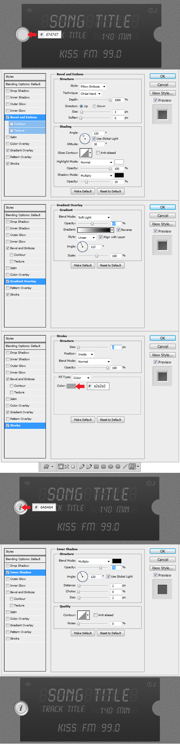
Step 42
Make a new Group and name it Music Button. Now using Ellipse Tool (U) make a gray #d7d7d7 circle like in the example and apply the Layer Styles from Step 40. Using Ellipse Tool (U) make a new circle and color it #b6b6b6 and apply the Layer Style. This will be the pushed version of the 2 buttons.
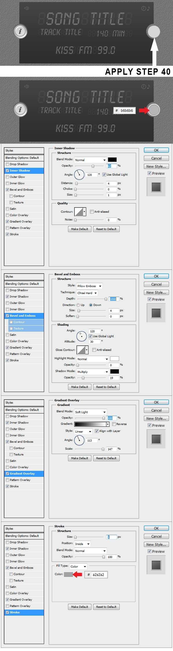
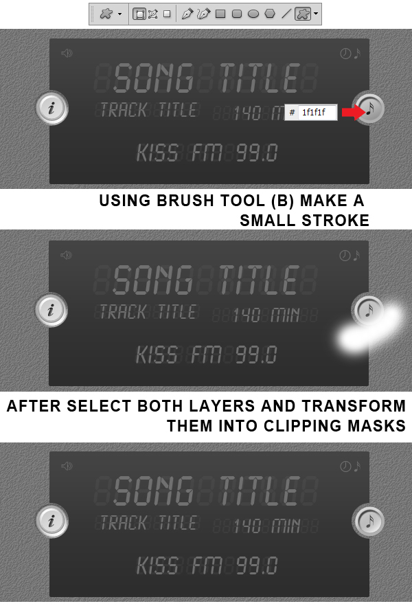
Step 43
Using Custom Shape Tool (U) insert the Sixteenth Note Shape and color it #1f1f1f. Make a new layer on top and using Brush Tool (B) select a medium white #ffffff
brush and stroke at the top end of the circle. Transform this layer in a Clipping Mask and Voila! Everything is ready now.
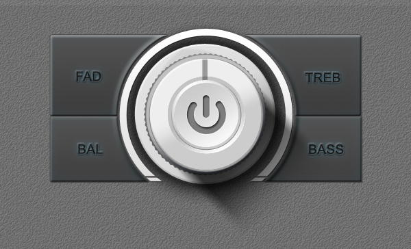
Final Image

|
| ||
|
+140 |
160 |
Zoxx.ru - Блог Металлиста |
|
+121 |
146 |
artnotes.ru |
|
+113 |
313 |
Yukari_7 |
|
+81 |
140 |
кино и люди |
|
+26 |
139 |
Mellanius.ru |
|
| ||
|
-1 |
72 |
Bestmult.info - лучшие мультфильмы для просмотра on-line |
|
-1 |
67 |
Блог |
|
-4 |
62 |
Выкрутасы скачать бесплатно |
|
-9 |
15 |
Скачать все субтитры |
|
-10 |
14 |
Скачать субтитры L |
Загрузка...
взяты из открытых общедоступных источников и являются собственностью их авторов.