|
Какой рейтинг вас больше интересует?
|
Главная /
Каталог блоговCтраница блогера PSDTUTS/Записи в блоге |
|
PSDTUTS
Голосов: 2 Адрес блога: http://psdtuts.com Добавлен: 2008-10-26 20:48:58 блограйдером DrakAngel |
|
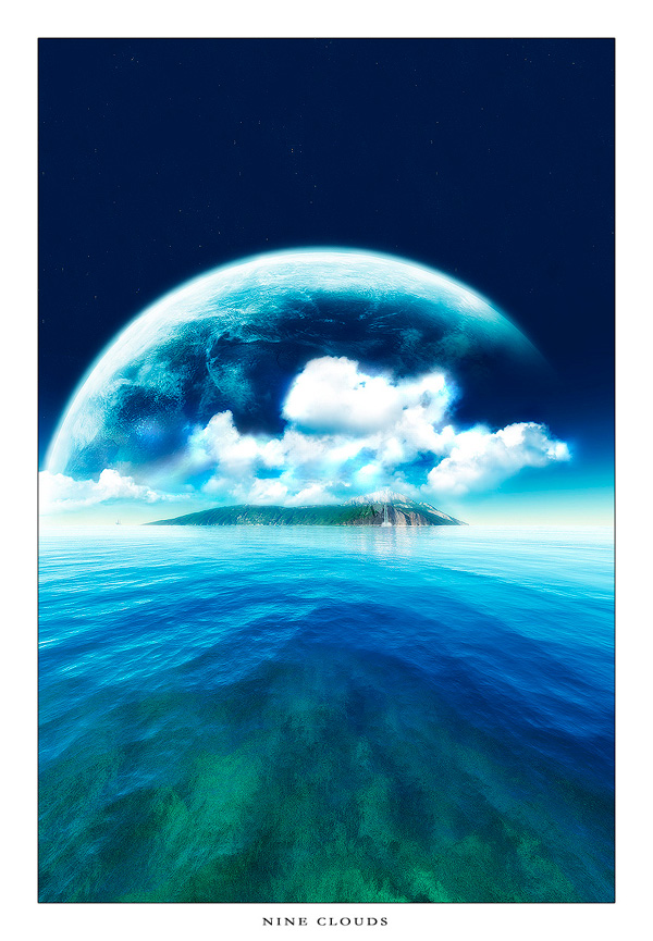
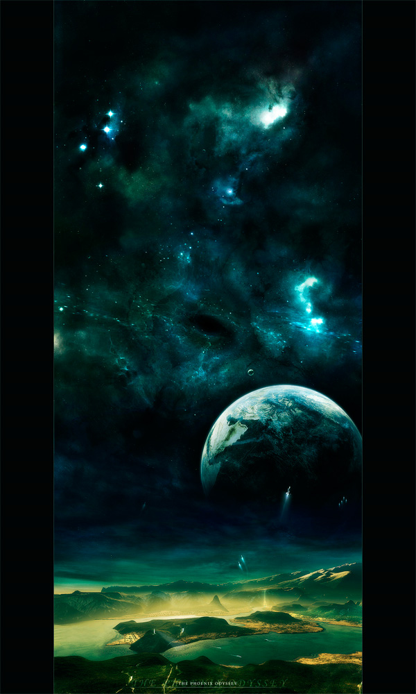
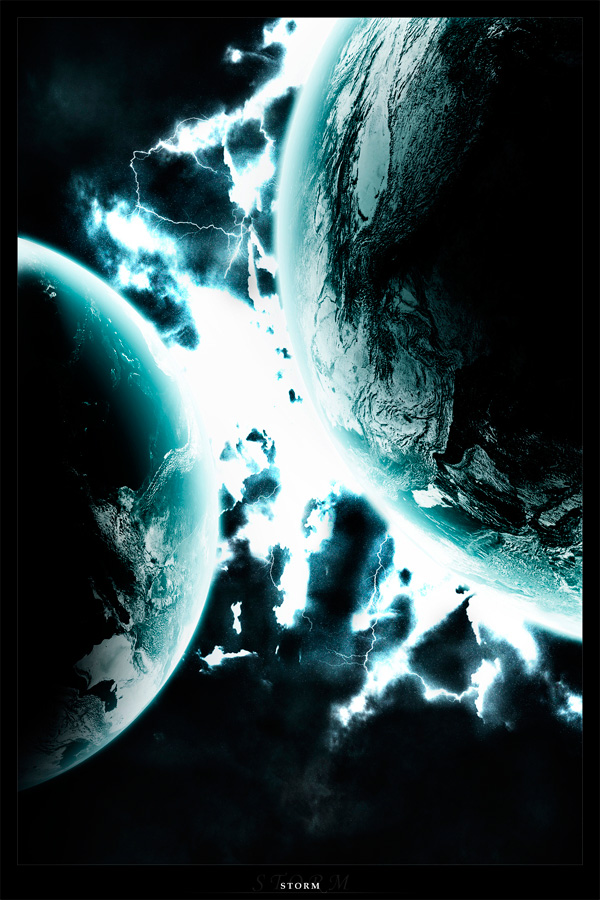
40 Mind-Blowing Digital Space Paintings
2011-05-24 17:00:36 (читать в оригинале)Advertise here
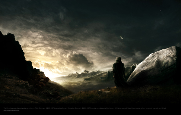
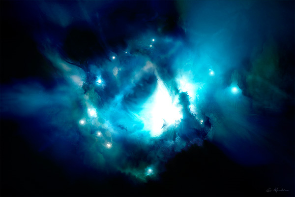
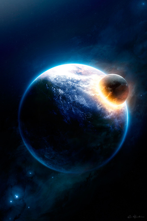
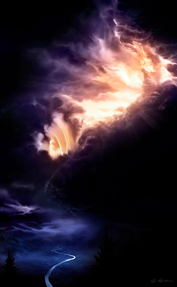
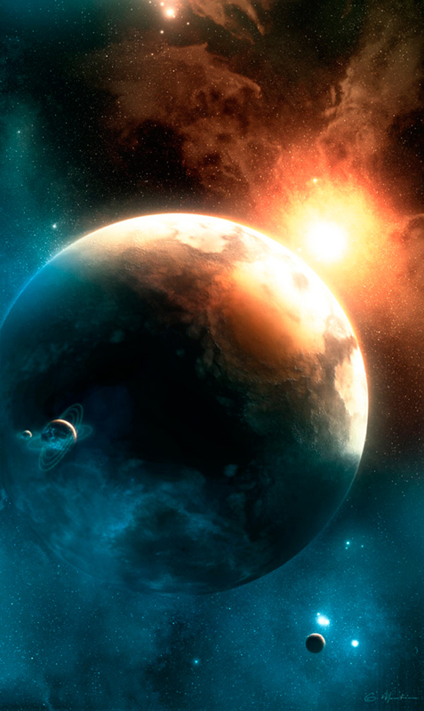
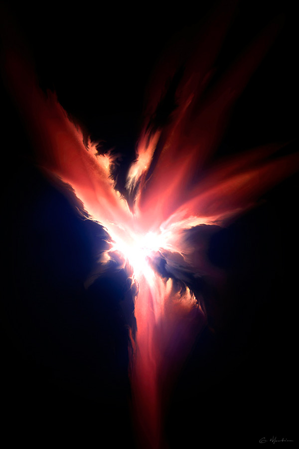
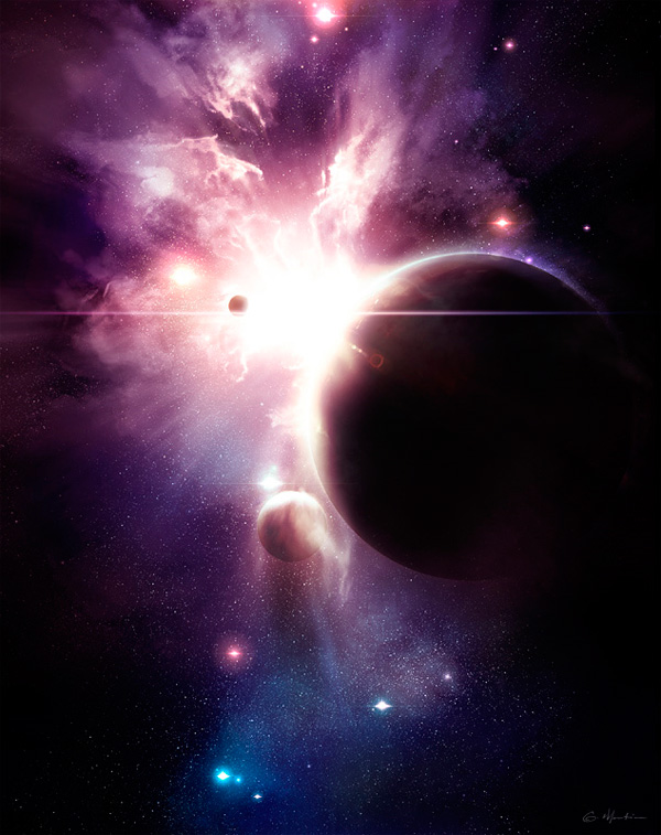
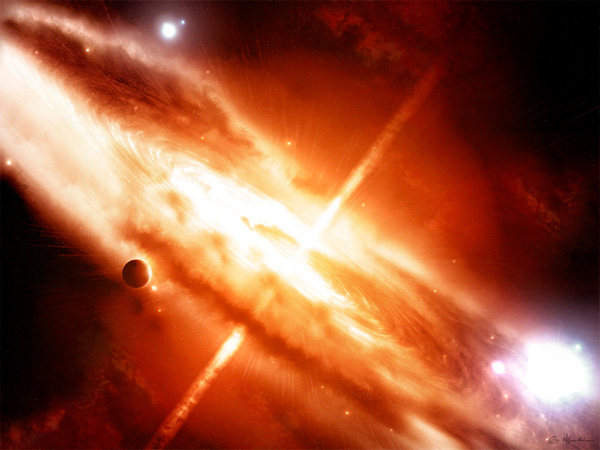
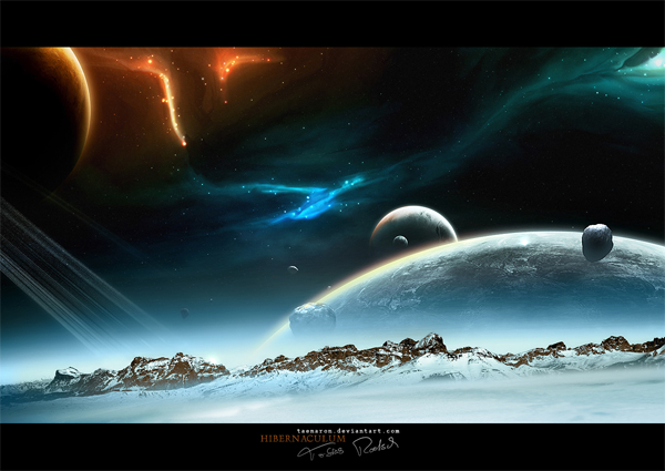
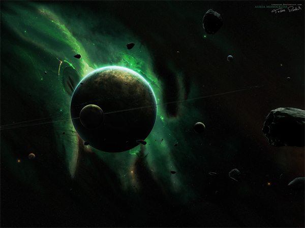
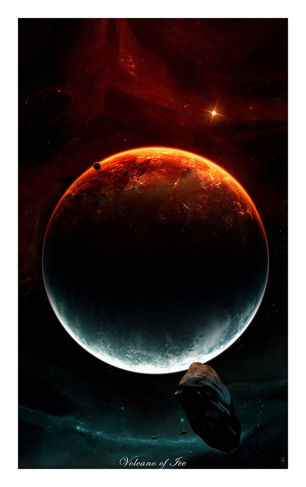
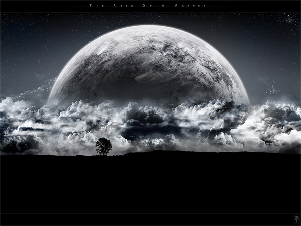
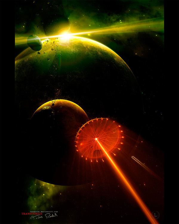
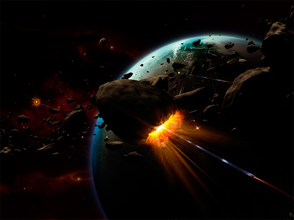
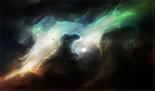
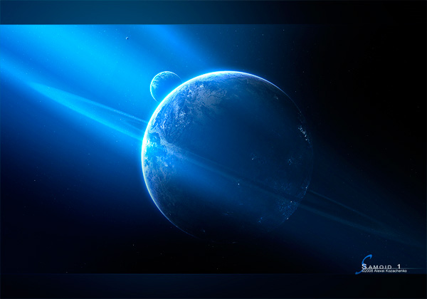
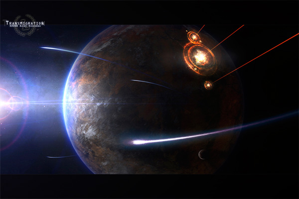
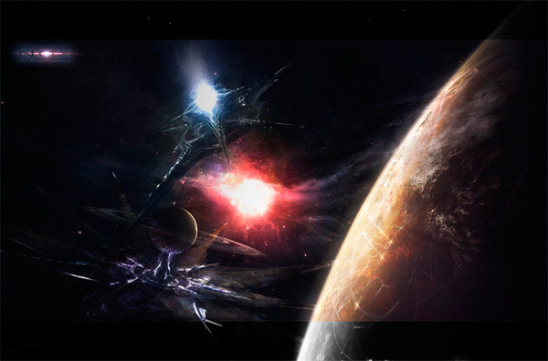
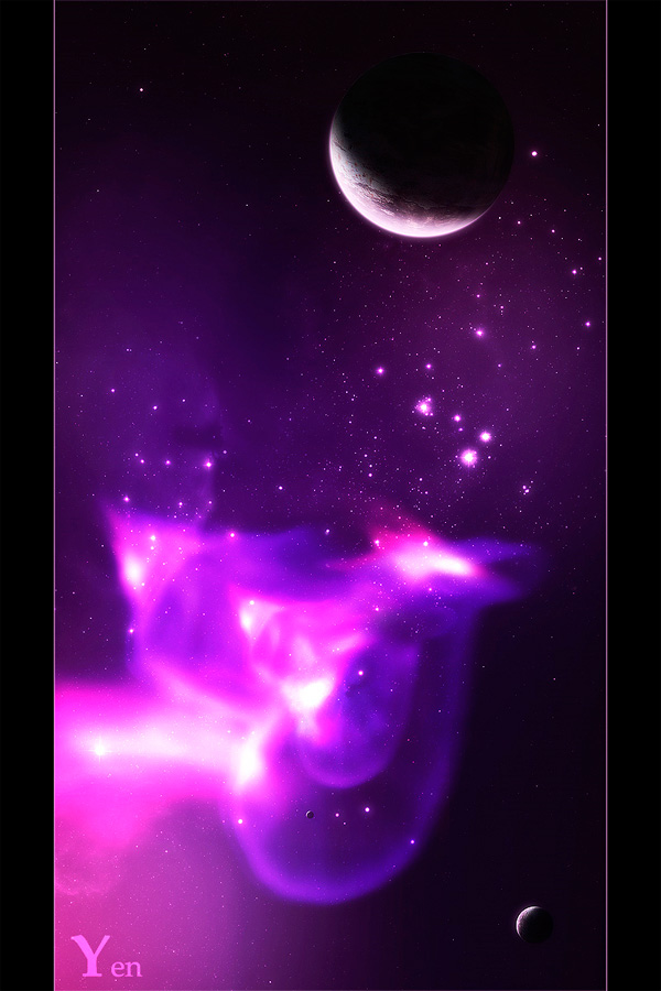
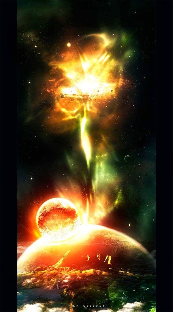
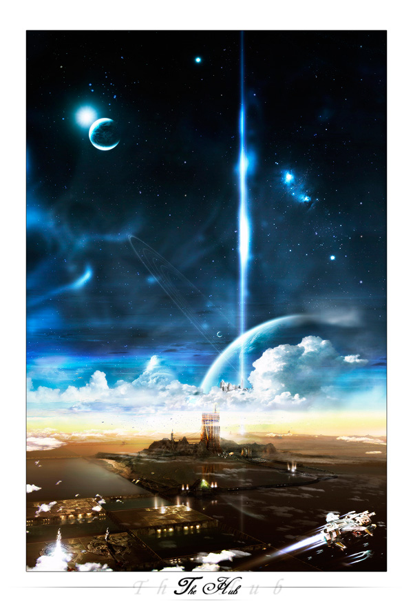
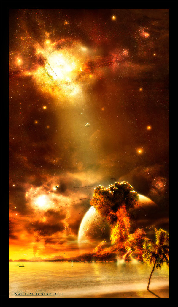
Some of the world’s most stunning visions of space are made possible with Photoshop. The ability to combine vibrant colors, photo manipulations and ethereal effects makes the software ideal for this kind of work. Here are 40 incredible visions of space from four extremely talented Photoshop artists.
Editor’s note: This article was originally posted on Psdtuts in January of 2009
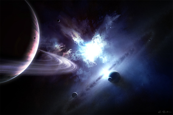
Greg Martin
Greg Martin has been fascinated with sharing his outlook on life through his art since he was a child. He started out as most young artists do, drawing and painting. Later on, he moved into visual design. Today, Greg works on a variety of projects including concept art for movies, illustrations, and other design projects.

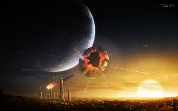
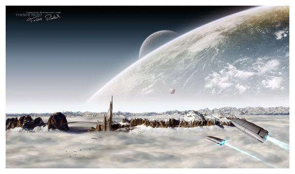
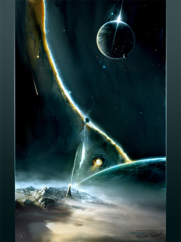
Tobias Roetsch
Tobais is another extremely impressive young artist. He is 21 and lives in Germany. He manages to do quite well selling his space art on his own website as well as the DA Prints store. Something unique about Tobais and his work is that he uses a lot of his own photography in his space art.
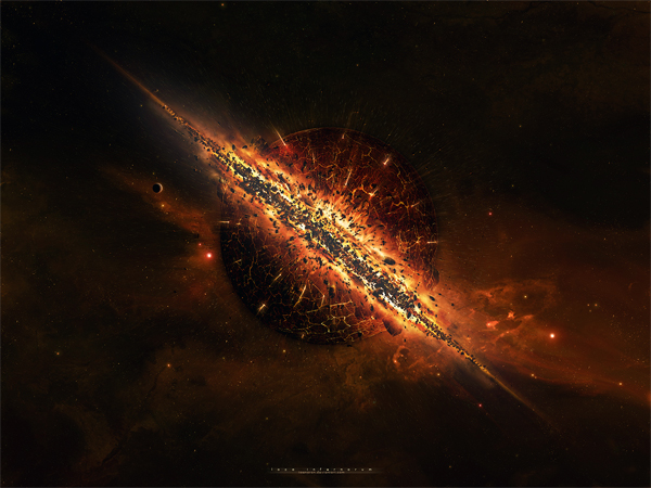
Alexei Kozachenko
Mr. Alexei Kozachenko is a young designer I came across on Deviant Art. Alexei Kozachenko is a young designer in his early 20s and currently lives in Switzerland. He started learning design in 2005 and used the Deviant Art community to learn more about his art and perfect his skills.
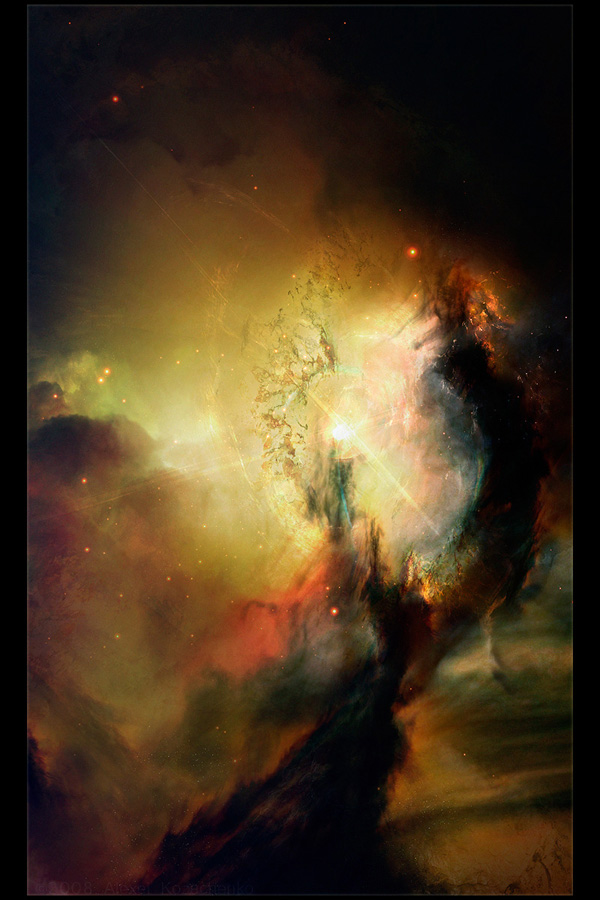
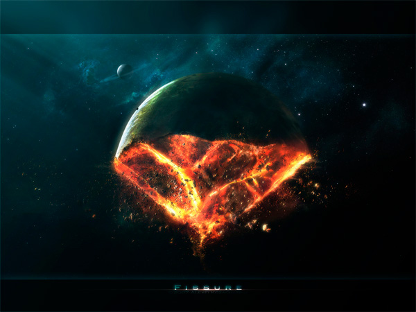
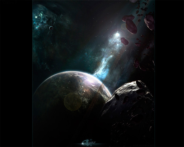
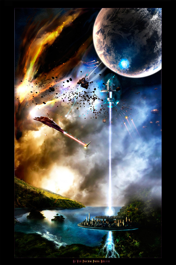
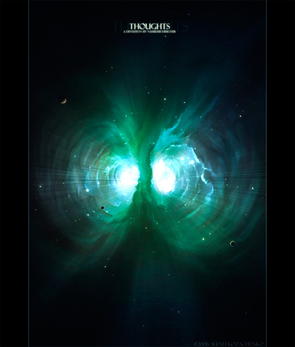
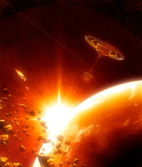
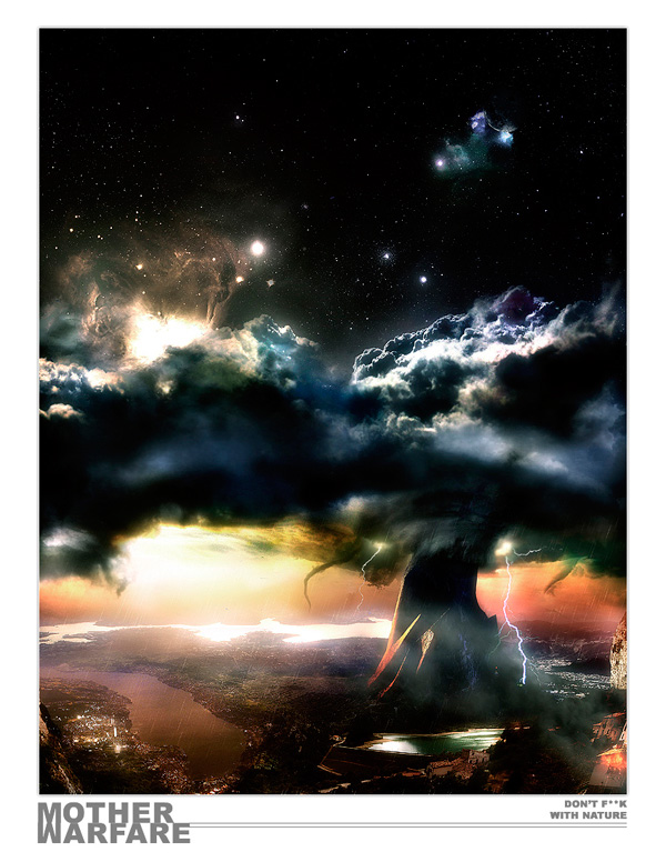
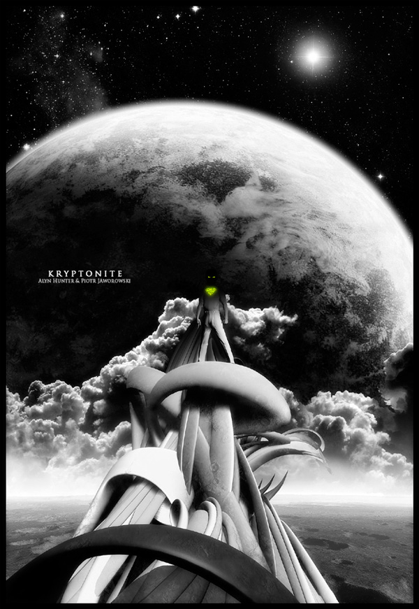
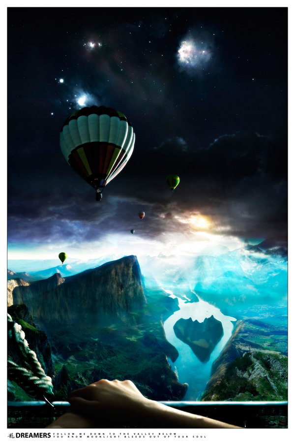
Just Alyn
Alyn is a spirited young designer, 19 years young. This creative and humorous artist has the ability to create a variety of landscapes and images that are, well, out of this world. He also uses Deviant Art on a regular basis to partner up with other artist and collaborate on projects to share with the community.
Tutorials
You might also want to take a look at a few of these tutorials.
- The Cosmos: Create a Red Giant Star in Photoshop
- The Cosmos: Create a Supernova and a Ringed Planet in Photoshop
- The Cosmos: Create a Spiral Galaxy
- Premium: Create an Exploding Moon Orbiting a Gas Giant in Photoshop
- Premium: Paint a Planetary Typhoon With Default Photoshop Brushes
Tell Us How Psdtuts Has Affected Your Life: Win a Wacom Intuos 4 Medium Tablet
2011-05-23 19:00:16 (читать в оригинале)Advertise here
When we published our first article back in September of 2007 we had no idea how successful this site could become. In fact, we weren’t quite sure anyone would be interested in it. Since then, a lot has changed. We’ve grown from a small Photoshop blog to the largest Photoshop site on the planet. We’ve welcomed many new editors, authors, and readers to our site and have touched the lives of hundreds of thousands and possibly millions of people. Today, we would like to hear your stories. We want to know how Psdtuts has affected your life and we want you to share your story by uploading a video testimonial to our Facebook page.
I will be the first to tell you how Psdtuts has changed my life. When I left my 9 – 5 job, it gave me some much-needed income while I looked for a new position. When nothing panned out, Psdtuts gave me a part-time job assisting Sean Hodge, the previous editor, and finally, when I was promoted to editor, it allowed me to move to New York City to live with my girlfriend.
Now that I’ve told you how Psdtuts has changed my life. What’s your story? Have we helped you land a job? Have we helped you with a key project? Have we helped you make a major life change? We want to know! To encourage you to share your stories we will give one of you a free Wacom Intuos 4 Medium Tablet (via Amazon).
How to Submit
To submit, record a video testimonial explaining your story. This can be done on your webcam or camcorder. Feel free to have fun with this video – edit it, add animation, music, graphics or whatever you need to do to tell your story. Just try to keep the video between 1 – 5 minutes.
Once you’ve recorded your video, upload it to our Facebook Page. Follow the instructions below to upload your video.
How We Will Award the Tablet
After we have reviewed all the entries, we will choose our favorite from all the submissions. While we may take the quality of the video into consideration when we award the tablet, ultimately, the most important factor for judging the videos will be the story that is told. So don’t let your lack of video production skills get in the way of telling us how we’ve affected your lives.
Rules
- You can only submit 1 video.
- Avoid giving away too much personal information in your video. For example, don’t tell us your phone number or street address. We will figure all that out later on.
- Submissions will be accepted until June, 20, 2011
- While this giveaway is open to all of our readers, Amazon may not ship to your area. If that is the case we will send you the value of the tablet via PayPal.
- Terms are subject to change.
Upload Your Video
Combine Images to Create a Surreal Portrait in Photoshop
2011-05-23 17:00:25 (читать в оригинале)Advertise here
The liquify tool is great for making adjustments to photographs. In this tutorial we will use the liquify tool and several image blending techniques to create a surreal and slightly creepy photo manipulation. Let’s get started!
Tutorial Assets
The following assets were used during the production of this tutorial.
- Image 1
- Image 2
- Image 3
- Image 4
- Image 5
- Image 6
- Image 7
- Image 8
- Image 9
Step 1
Open this image.
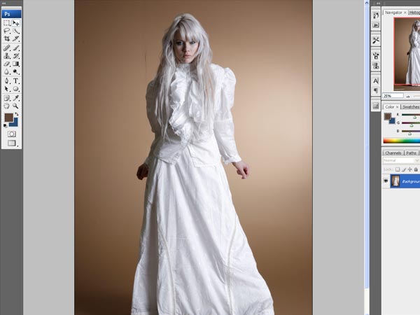
Step 2
Now let’s go to the liquify filter (filter > liquify) where we’re going to change the look of our model. We can use this tool to modify the image like a clay figure. It’s important to use it carefully and slowly to preserve the quality in the original picture and trying not to distort unnecessary details. Let’s start with her face. We need a childish look, like a doll. So we need to make her head smaller. Use the Forward Warp Tool (W) and change the brush size on the left to 450, carefully slip down in the marked place on the picture. Use a smaller brush to retouch details.
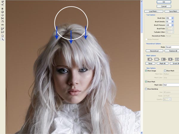
Step 3
Use the Pucker Tool (S) with a size of 85 to make smaller mouth. Just apply it in the middle of her lips with subtle touches. Then use again the Forward Warp Tool (W) in the corner of her mouth with a brush in size 30 and stretch it to make longer.
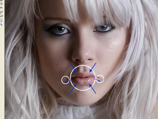
Step 4
Now use the Bloat Tool (B) in her eyes. We are going to make them bigger and striking, but as always, try not to be excessive and use the tool subtly. A size of 60 will be right, use it in the center of her eyes and then touch in the corners trying not distort the shape of the eye.
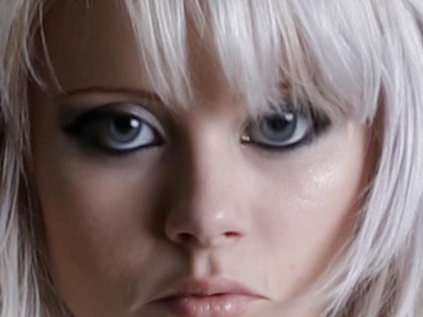
Step 5
Before we have finished with the liquify filter, let’s give some last strokes with the Forward Warp Tool (W) to harmonize the shape of the head. I used it with a brush of 150 to make it a little bit wider and round. Be sure that you have not distorted details like eyebrows and then press accept to leave this window.
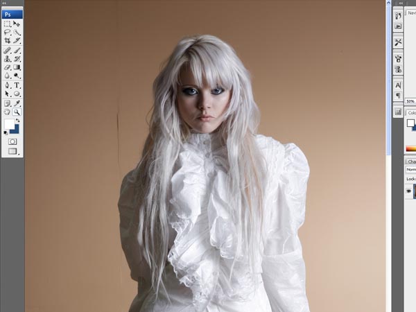
Step 6
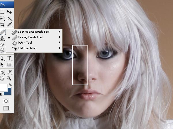
In the main window of the program, use the healing Brush Tool (J) with a size of 25 to erase the nasal septum (and the shadows in the left). That will be the final detail to get a childish look in the face of our model.
Take care into the shadows near the eye and the wing nose, try that the pass between these shadows and the light looks natural. You can use the Smudge Tool (R) to help in this step.
Step 7
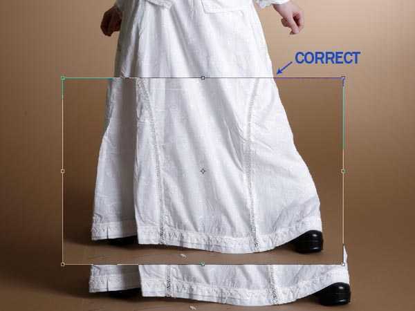
Now we need to make shorter to the model. Select the Rectangular Marquee Tool (M) and use it to select a rectangle like the one in the picture, from her feet to her knees more or less. Copy and paste this selection over the main layer and move it up to the position in the image. Rename this new layer to "Skirt".
Go to Edit > Free Transform and make it narrower until the shape of the skirt coincides in the right side.
Step 8
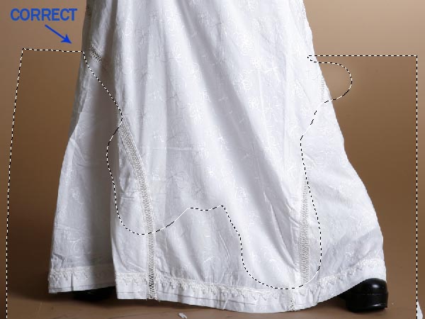
Go to Edit > Transform > Warp and use it to make coincide the left side of the skirt like in the image. Then select the Eraser Tool (E) and delete part of the layer "Skirt" to make a correct merge between the two layers. In the image you can see what I’ve preserved from the "Skirt" layer.
Step 9
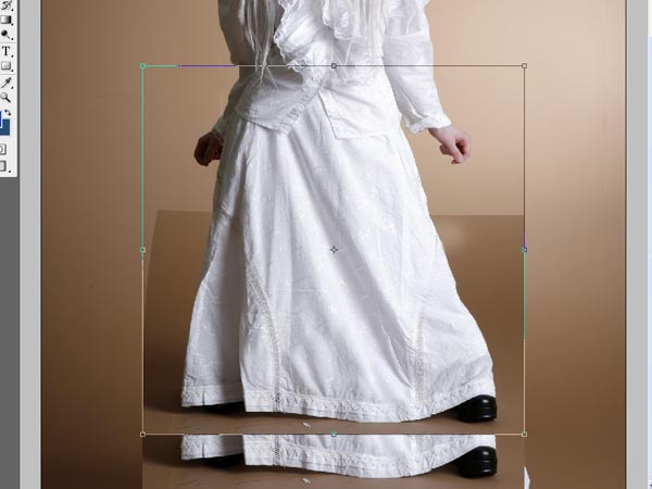
We need a model even shorter, so go to Image > Flatten Image and then select a rectangle like in the image. Copy and paste it over the main layer and then go to Edit > Free Transform. Take the box from the bottom and finally make the selection shorter like in the image.
Step 10
Merge all the layers again and one more time use the Rectangular Marquee Tool (M) to make a selection like the one in the image, then go to Layer > New > Layer via Copy. Go to Edit > Free Transform and make the new layer narrower.
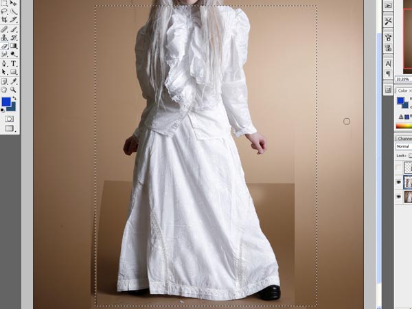
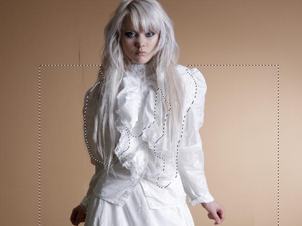
Step 11
As we made in step 8, we are going to use the Eraser Tool (E) to delete part of the new layer to get a perfect merge. Check the image to look what I’ve deleted and when you have finished go to Layer > Flatten Image.
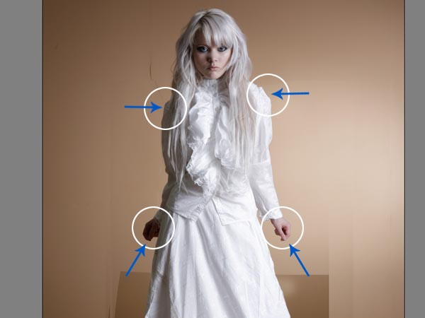
Step 12
Finally go again to the liquefy filter and give the last touches to the model. I’ve used the Forward Warp Tool (W) in the shoulders and the arms in the direction that you can see o the image to make it proportional to the body. When you have finished, press "Accept".
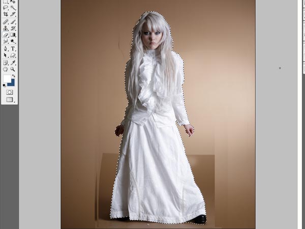
Step 13
Time to select and cut our retouched model. I used the Magnetic Lasso Tool (L) and then edit the selection in the Quick Mask Mode (Q).
Step 14
Now open a new file with this settings:
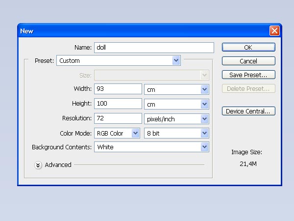
Step 15
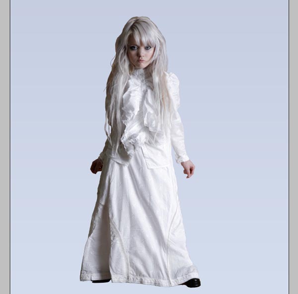
Use the Gradient Tool (G) for the background from color #d3dcec to #c5cde1 and then paste over it to our model. Call the model layer: "Girl"
Step 16
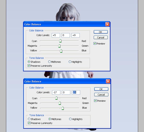
Colours on the model doesn’t help to integrate her on the background so we need to change them a little. Go to Image > Adjustments > Color Balance and add these settings in Shadows and Midtones:
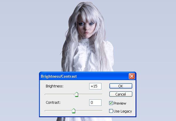
Now go to Image > Adjustments > Brightness/Contrast and add these settings:
Step 17
Let’s add some clouds in the background, use his image:
Add it between the "girl" image and the background, modify the opacity of this layer to 41% and place it on the left corner. Finally use the Eraser Tool (E) to delete the most of this layer. Use the same image to create new clouds in the opposite corner.
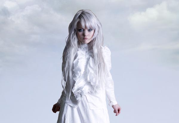
Step 18
Now select the Ellipse Tool (E) and draw an ellipse in white under the "Girl" layer, like the one in the image. Then apply to our ellipse a Gaussian Blur (Filter > Blur > Gaussian Blur) with a radius about 120 px.
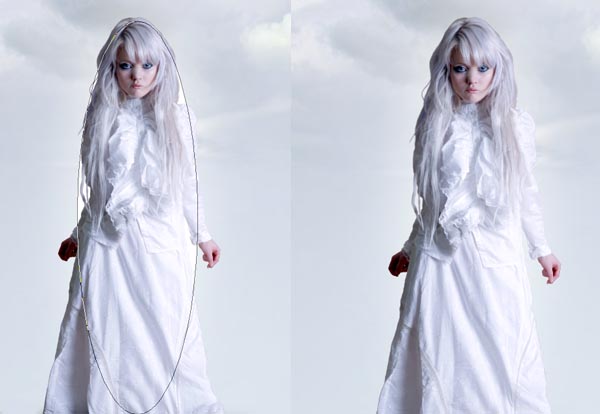
Step 19
At this point I modified some details on the hair of our model to get a better integration with the background. Use de Eraser Tool (E) with a blurred brush of 50 px in the right surroundings and then the Dodge Tool with a blurred brush of 65, range in midtones and an exposure of 50% in the same until the color of the hair looks quite similar to the color in the background.
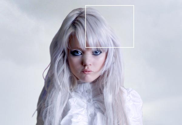
Step 20
Now select again the Elipse Tool (E) and draw an ellipse in black under the "Girl" layer simulating the shadow of the girl like the one in the image. Then apply to the ellipse a Motion Blur (Filter > Blur > Motion Blur) with a radius about 600 px and an angle of 0º. Finally apply a Gaussian Blur (Filter > Blur > Gaussian Blur) with a radius about 30 px. Rename this layer to "Girl Shadow".
You can use the Eraser Tool (E) with a blurred brush to delete some parts of the shadow so it blends better with the background.
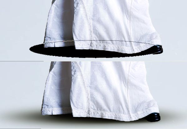
Step 21
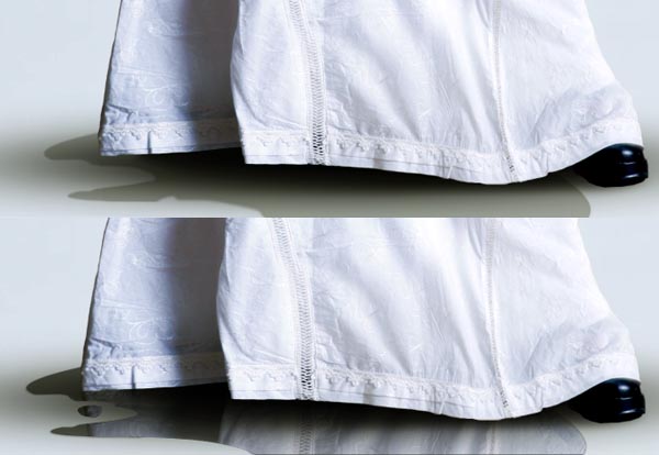
Use the Pen Tool (P) to draw an irregular form similar to the one in the image using the #484c43 color. We’re trying to simulate a pond so the shape it’s not too important, just try it has a rounded appearance. Situate this layer under the "Girl Shadow" layer.
The second step it’s to add the reflection of the skirt into the pond. Copy the "Girl" layer, rename it as "Reflection" and change the opacity to 50%. Now go to Edit > Transform > Flip Vertical and adjust it so you can see the lower part of the skirt over the pond. Cut the "Reflection" layer and Paste into your pond layer (Edit > Paste Into).
Step 22
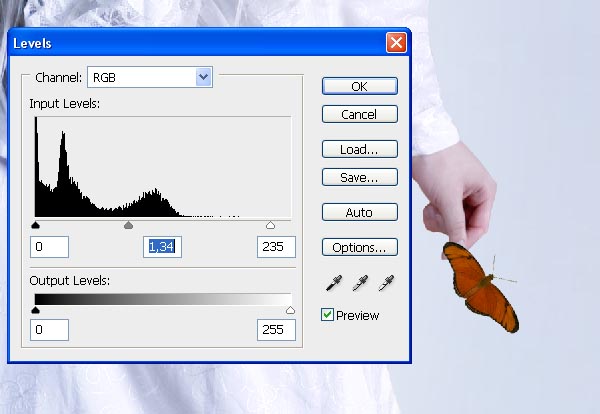
Now we will add a butterfly in the left hand of the girl. Open this image: cut the butterfly and paste it in our main image. Situate it over the "Girl" layer and then adjust its size and levels (Image > Adjustments > Levels) like in the next image.
Step 23
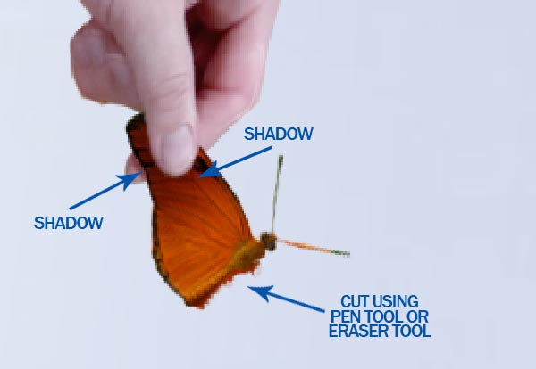
Now use the Eraser Tool (E) to delete the part of the butterfly covered by the thumb of the hand. Use the Burn Tool (O) to add a subtle shadow on the butterfly and in the hand like in the image. Finally cut the left wing of the butterfly using the Polygonal Lasso, the Eraser Tool or the Pen Tool.
Step 24
We want to add some blood in the hand of the girl. Create a new layer over the "Child" layer. Use red (#9a221e) and the Brush Tool or Pen Tool (P) to draw the shape following the shape of he fingers. Then use the Burn Tool (O) in midtones and an exposure at 25% to add some shadows like in the image.
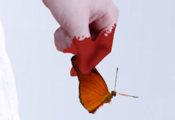
Finally change the blending mode for the layer to linear burn.
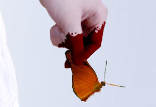
Step 25
Move the cut wing of our butterfly to the right hand of the model. Use again the Eraser Tool to make visible her thumb and modify the levels on the wing as you can see in the image. Finally add a subtle shadow falling on the wing from the finger; you can draw it and blur with Gaussian Blur (Filters > Blur > Gaussian Blur) or use the Burn Tool (O) to underexpose.
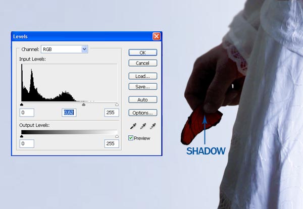
Step 26
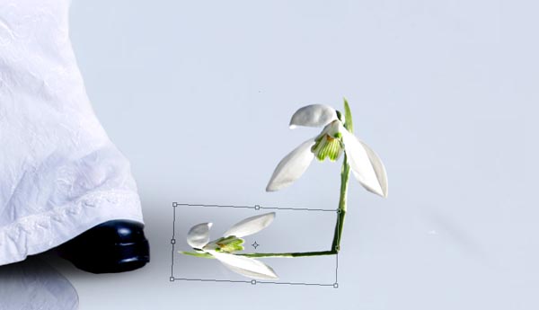
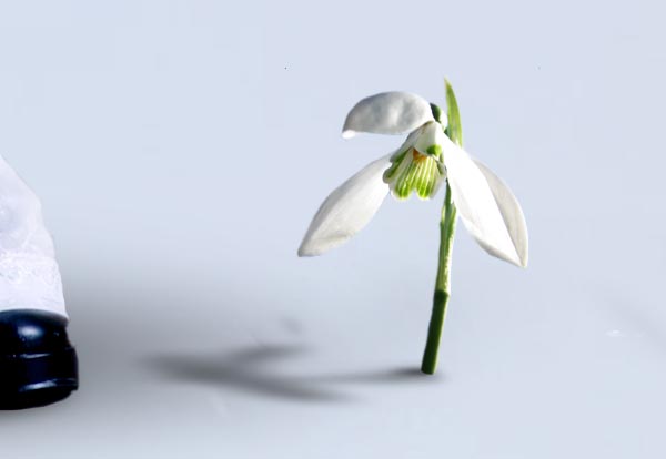
Now we want to add some details on the ground around the girl. Open this image: and cut the flower. Then copy it to our main image and then go to Edit > Transform > Flip Horizontal. Duplicate the flower layer and move it using Edit > Free Transform to situate in the same place that in this image:
Then go to Image > Adjustments > Levels and modify the Output Levels bar like here:
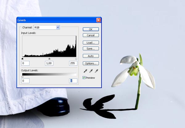
Finally go in the layer of the shadow to Filter > Blur > Motion Blur and apply an angle 0º and a distance of 65 px. Readjust a little the shadow using again the Free Transform (Edit > Free Transform) and the Erasing Tool (E).
Step 27
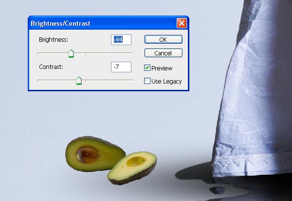
Now we want to add an avocado in the other side of the image. Open this image: and select the avocado.
Copy it in our image and change settings in Image > Adjustments > Brightness/Contrast as in the image.
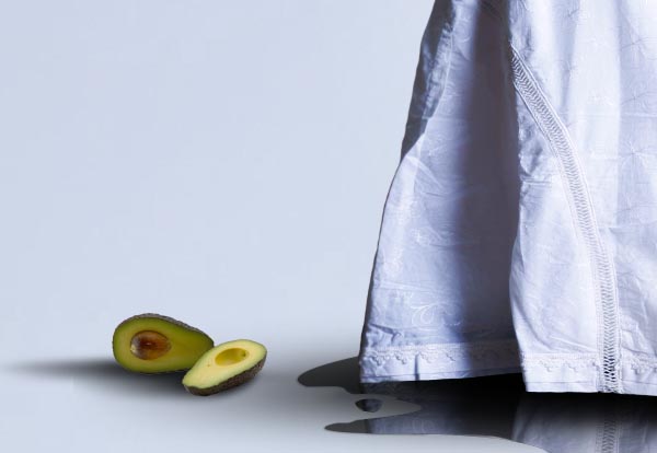
Finally repeat the steps that I explained on the shadow of the flower to create the shadow of the avocado.
Step 28
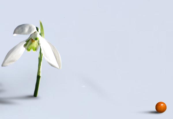
Now we will add some little orange spheres in different points on the ground. It’s really simple to do. Open this image:
Copy and paste in our image the cherry on the upright and use this settings on Image > Adjustments > Hue/Saturation.
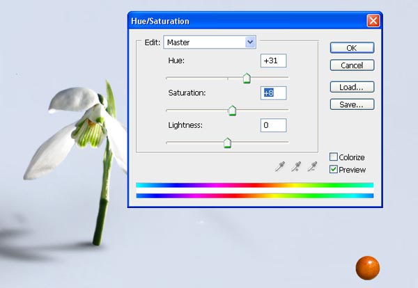
Then add the shadow duplicating the layer, modifying the levels and finally using Filter > Blur > Motion Blur as we did before.
Step 29
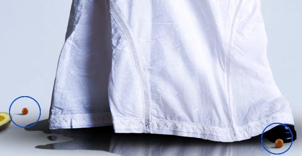
Now you can copy and move the cherry with its shadow and move to the points marked in the next image. If you prefer you can use other cherries from the image instead repeat the same one in three places.
Step 30
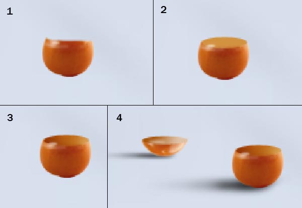
The last cherry it’s a little different because we want it broken. First step is to copy one of the previous cherries and paste it in a new layer. Then use the Elliptical Marquee Tool (M) or some similar Tool to cut the upper part of the cherry (as you can see on box 1 in next image). Then use the Ellipse Tool (E) to draw an ellipse in color #d29240 like the one in box 2. The third step is to use the Burn Tool (O) in midtones and an exposure of 25% on the left side of our orange elipse. Finally add the shadow as we have explained in other steps and repeat the steps to create the upper part of the cut cherry.
Step 31
Finally, we want to add some arms coming up from the ground. To start with this, open the image: Cut the arm and paste into our image like in this picture:
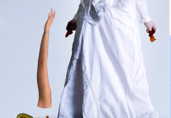
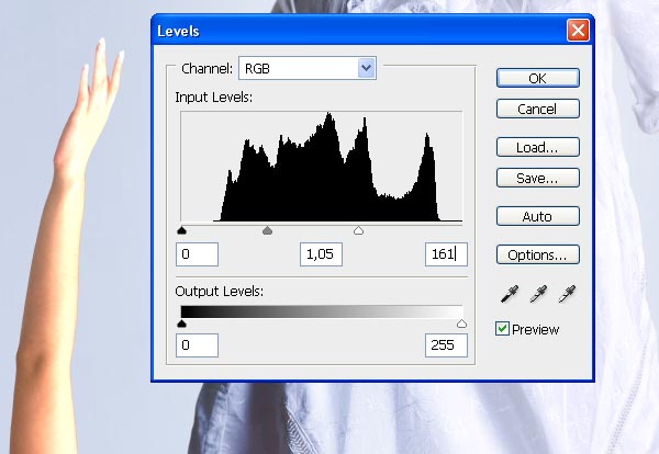
Now modify its settings in levels (Image > Adjustments > Levels) like in this picture:
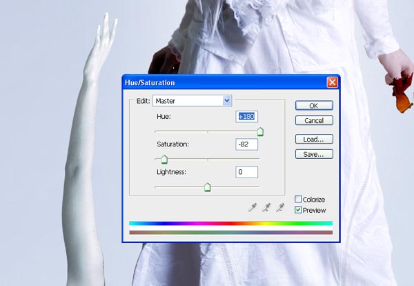
Next go to Image > Adjustments > Hue/Saturation and change the settings like below. Finally go to Image > Adjustments > Color Balance and add + 22 to Blue.
Step 32
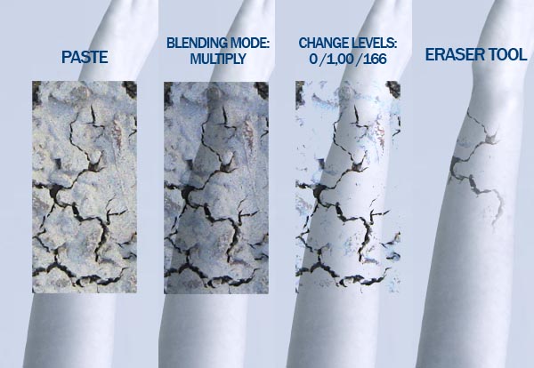
Let’s add some cracks to the arm. Open this image: and select one of the cracks, copy and paste in our image.
Now go to Image > Adjustments > Levels and modify the input levels to: 0/1,00/166. Then use the Eraser Tool (E) to delete all the broken parts that we don’t need.
I used these same steps to add another break in the down part.
Finally add the shadow as I explained for the shadow of the girl in step 18.
Step 33
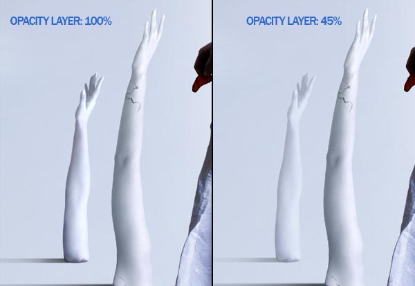
With these steps you can add the other arms to the image. Just have one thing in mind: the farther the arms are the brighter they have to look. Look at the sample below:
As you can see, to make the effect of depth we have changed the opacity layer to 47% in the layer of the arm in the background.
Following this method helps to get a better blending with the background too.
Step 34
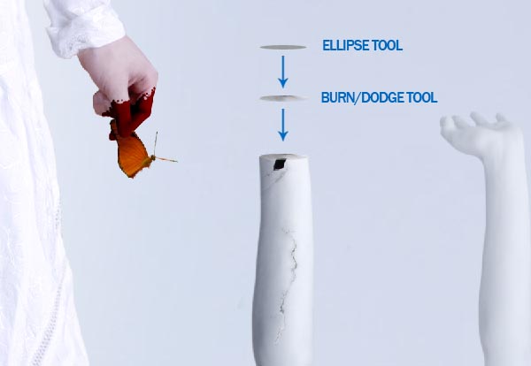
Now we want to add some different details to one of our arms. First repeat all the steps that you did on previous arms (steps 30-31). Then we are going to broke our new arm. Cut the hand at the wrist using a Marquee Tool (M) and create an ellipse with the Ellipse Tool (U) as you did on step 29, but this time with color #98999e. Then use the Dodge Tool (O) and the Burn Tool (O) to add some lights and shadows on the ellipse, finally put it over the arm as you can see on next image and merge this layer with the arm one (Command/Ctrl + E).
Step 35
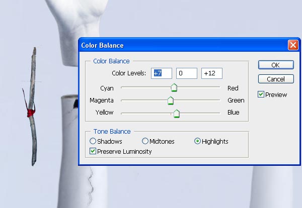
Add the hand that you cut in a new layer and open this image: Copy and paste the stick in our image. We will use it to create two little sticks that fix the hand to the arm. Change the stick Color Balance (Image > Adjustments > Color Balance) as you can see on the image:
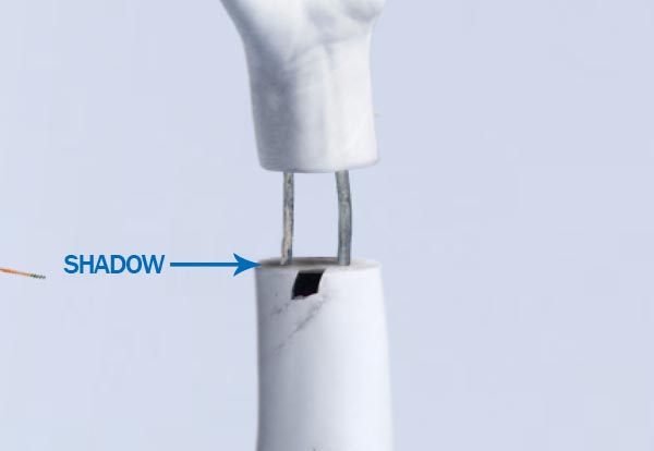
Then duplicate the stick layer and put them between the hand and the arm. Finally draw two little shadows for them.
Step 36
Finally we will add a bandage to the harm. Use this image:
Cut and paste in our main image and go to Edit > Transform > Warp to adapt the shape of the bandage to the arm.
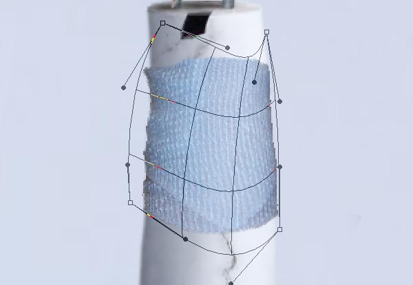
Then go to Image > Adjustments > Hue/Saturation and change the settings to these ones:
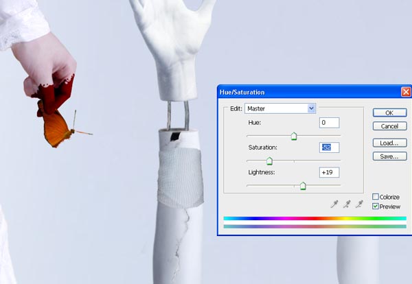
Lastly use the Burn Tool (O) on midtones to make darker the left side of the bandage and the Dodge Tool (O) on midtones to make brighter the right side.
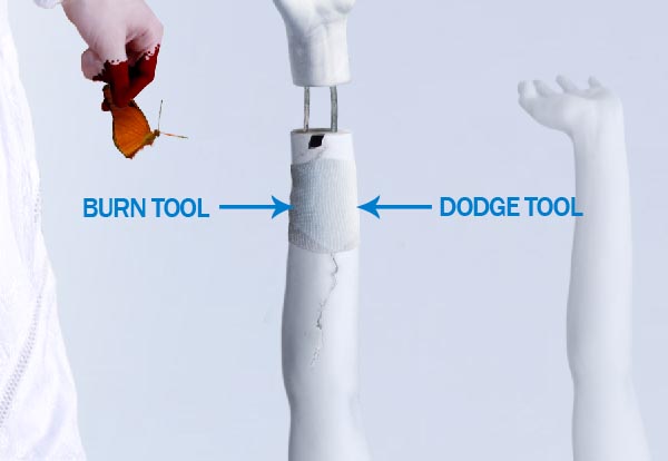
Step 37
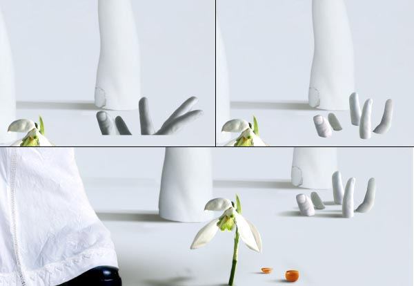
Finally we are going to add a hand coming up from the ground. For this one I used fingers from different hands. Just be careful that the light it’s similar in all of them (for our image we need light coming from the right and shadows in the left), as I’ve explained before you can help to get a better effect on light/shadow using the Burn Tool (O) and the Dodge Tool (O).
Now we will repeat exactly the same steps that we used to add the complete arms but this time using only fingers.
So, cut and paste some fingers on our image. Modify levels (Image > Adjustments > Levels) and add some blue (Image > Adjustments > Color/Balance). Then retouch a little with Dodge/Burn Tool (O) and with Brightness/Contrast (Image > Adjustments > Brightness/Contrast) if it’s necessary.
The last step, as always, it’s to add shadows using Motion Blur (Filter > Blur > Motion Blur) at 0º and a subtle Gaussian Blur (Filter > Blur > Gaussian Blur).
Step 38
We have our image almost ready. But I would like to give it a little final touches.
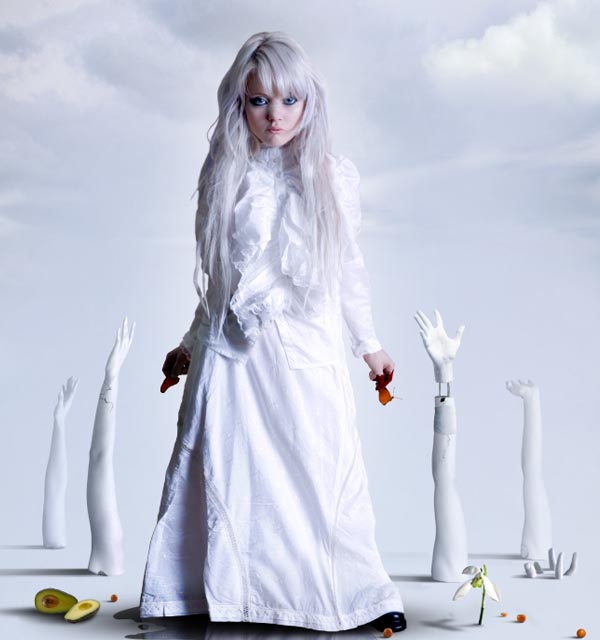
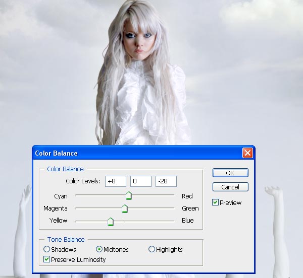
Select your first layer and then go to: Layer > New Adjustments Layer > Color Balance. Press OK in next window and then add the settings that you can see on the next image.
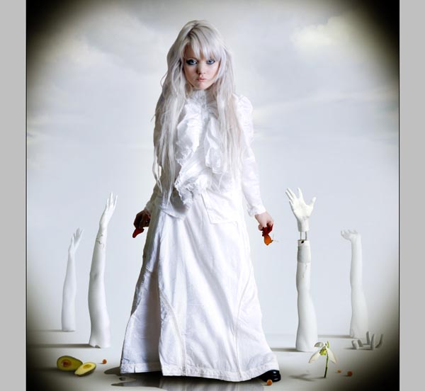
Our last step it’s to create a new layer under the Adjustment Layer and draw a little shadows on the corners of our canvas. I used the Brush Tool (B) with a blurred brush and size 900 px.
In this new layer change the opacity layer to 20% and we have finished.
Conclusion
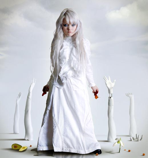
You can always modify details, add elements or play with concepts using this simple technique and some good stock images. The most important thing is to respect basic details like the position of light, the direction of shadows or the perspective of the elements.
Video Interview With Anthony Harmon, Creative Director for SlashThree
2011-05-22 19:00:30 (читать в оригинале)Advertise here
Recently, I had the opportunity to chat with Anthony Harmon, Creative Director for SlashThree. SlashThree is one of the world’s top art collectives. They’ve been producing some really fantastic work lately so I was excited to hear what Anthony had to say. This interview is also a first for Psdtuts, as it is the first video interview that we have ever done. Please take a moment to review our 30-minute discussion regarding art collectives, the SlashThree collective in general, and how the educational system is failing us.
Notes
Here are links to some of the items we discussed in the video.
- SlashThree’s Website
- Anthony’s Website
- Offf
- Presentation From Nick Campbell of Greyscale Gorilla
How to Create a Photo Manipulation of a Flooded City Scene
2011-05-20 17:00:23 (читать в оригинале)Advertise here
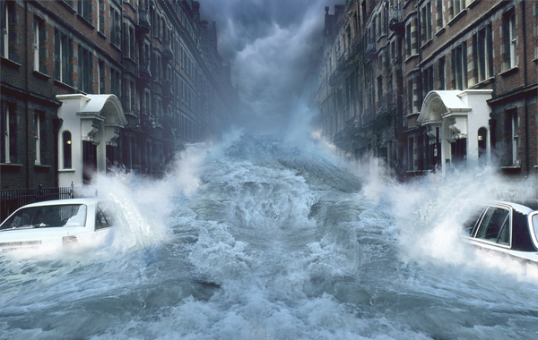
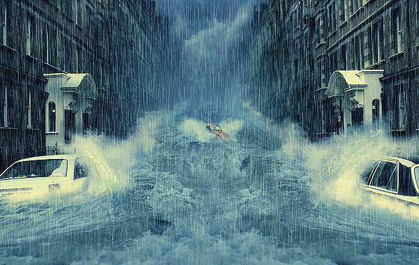
In this tutorial, we will learn how to manipulate a simple photo into a flooding torrent of a scene. We’ll use some relatively simple techniques to give this image a semi-realistic, stylized feel. Let’s get started!
Video Tutorial
Our video editor Gavin Steele has created this video tutorial to compliment this text + image tutorial.
Step 1
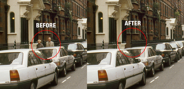
With the main image opened, use the Clone Stamp tool to remove any unwanted entities, like the elderly couple walking. Try and clone areas around the couple so it doesn’t look odd and mix your usage of soft, and heavy round brushes to define those edges.
Step 2
Next you will want to cut around the edges of the roof tops so we can add in our stormy sky. Use the Polygon Lasso Tool for this. Don’t worry about accuracy, as we’ll be blending everything later, just make sure that the sky is cut out. Once selected, unlock the “background.” Now double-click the layer, then rename it to “backdrop” and hit Enter. Delete the sky.
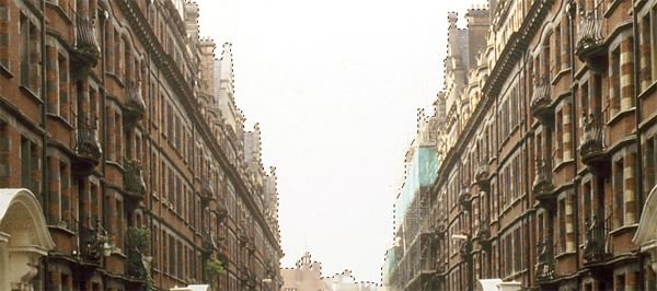
Step 3
Open the Stormy Sky image and place it underneath your “backdrop” layer. Then press Command + T to Free Transform), hold Command while you drag the bottom corners inwards to add some perspective to the sky, don’t forget to resize if necessary. Apply the transformation when you are happy.
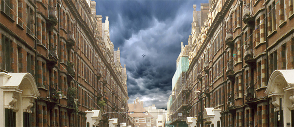
Step 4
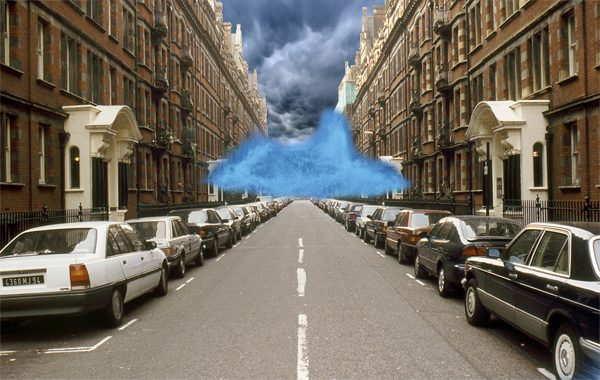
It doesn’t look very nice does it? That’s because we’re not done yet. Open and place the wave image in the center of the image. Now use the eraser, and a soft brush on it. Get in close and erase the bits you don’t want. Don’t worry if your messy, as the tidying comes later.
Then go to Image > Adjustments > Brightness/Contrast and use the settings shown below.
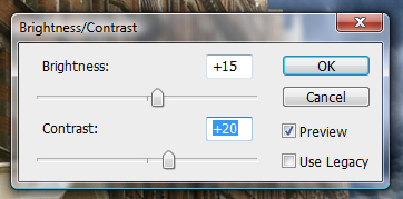
Then go to Image > Adjustments > Hue/Saturation and use these settings.
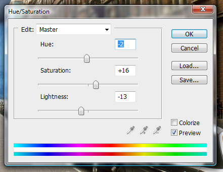
Rename the layer to “Wave,” and your image should now look like the one shown below.
Step 5
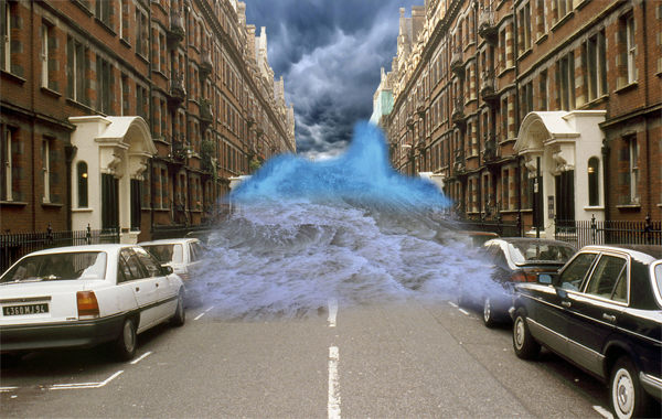
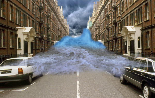
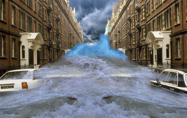
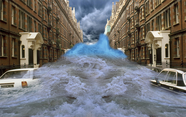
Now comes the complicated bit. What you’ll need to do is add all the water files to you’re image and one by one, free transform them to flow with the perspective of the water then erase the hard edges.
You might also need to duplicate some files in order to fill up areas. Always remember to play about with the textures using the distortion method in free transform and a soft eraser. The more you do, the better it will look. You can see the phases of building up the flooding water in this image.
Step 6
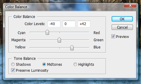
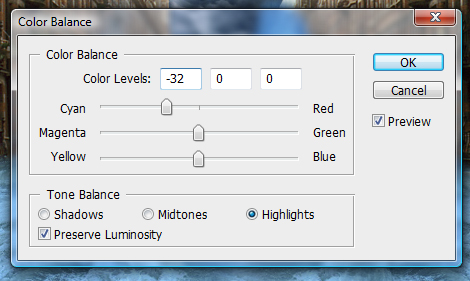
Now we have our water sorted, merge all the “water” layers into one single layer and go to Image > Adjustments > Color Balance and use the following settings.
Your water should now be nice and blue and match the “wave” layer from earlier. Now merge the “wave” layer with the “water” one.
Step 7
Remember the tidy up I mentioned a while back? Well its time now. Turn off the “water” layer so you are left with just the backdrop and the sky.
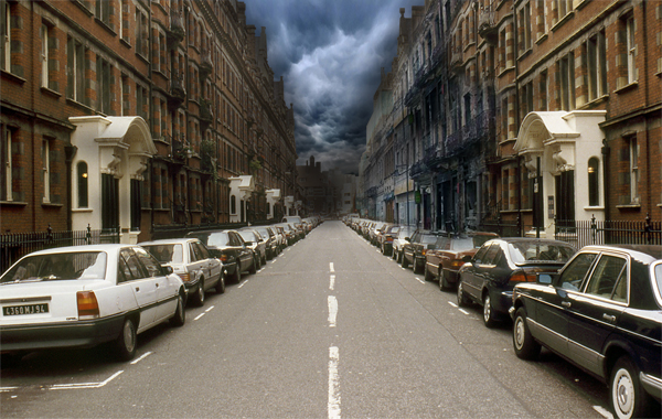
With the Burn Tool selected at highlights and at 50% exposure, and a soft brush set, start burning the rooftops and the sky around the rooftops so they appear darker.
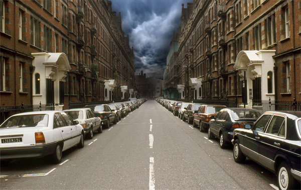
Open the derelict1 image and place it at the right side of the street in the distance. Use a soft eraser to remove those sharp edges. Merge it with the “backdrop” layer.
Step 8
Let’s tidy up some more. Turn on the “water” layer sand and start tidying around the edges using a soft eraser. Then select the Smudge Tool and a 20px charcoal brush using the settings below.
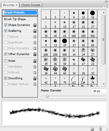
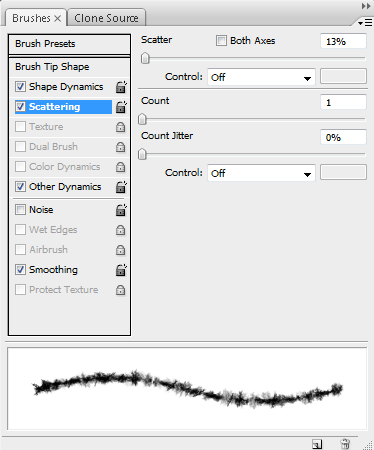
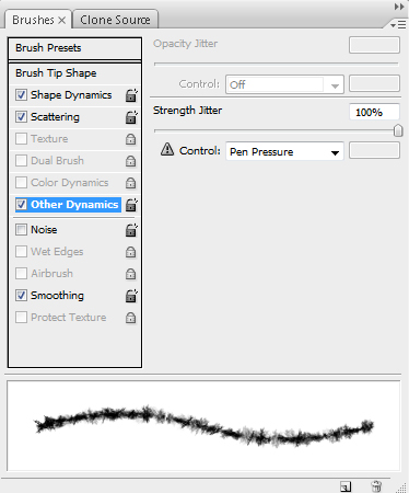
Start smudging the edges of the “water” layer creating very small splashes and more defined edges to realistically create the effect of water hitting a surface. This might require patience and a steady hand, but time will pay off. It might also be wise to duplicate the layer before smudging as you don’t want to use all your undo’s.
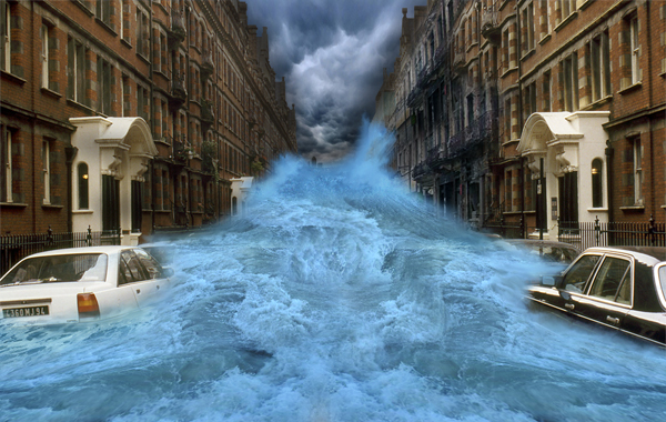
Step 9
Next, select the backdrop layer and go to Image > Adjustments > Color Balance and use these settings.
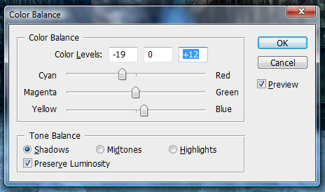
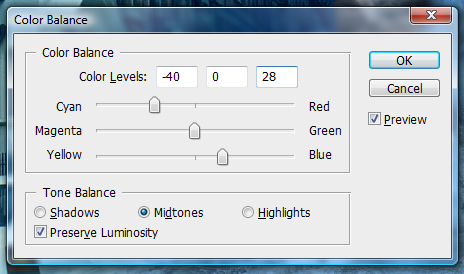
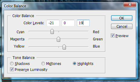
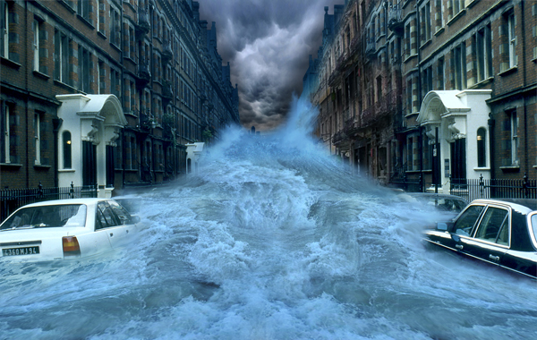
And your piece should now be coming together. Its still a little off, but there is a lot more to do, so lets move on!
Step 10
Time for the splashes. Now this is the hardest step of the tutorial, and requires a lot of patience, but persevere and you will find that patience is in fact a virtue (I know, silly right?).
Open up the splash1 and splash2 images and carefully cut out the splashes themselves one by one. Place them onto the canvas. Now use the Warp Transformation (Edit > Transform > Warp) to get the arches you need to create effective splashes, and erase any unwanted areas.
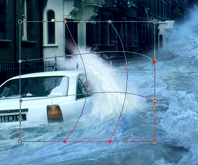
You’ll need to do this for the two cars and for where the water hits the wall down the buildings of the street.
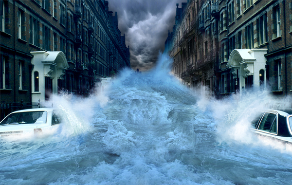
You might also benefit from smudging the edges of the splashes to give them more movement, as well as adding some white brushing to a new layer and smudging it. Now merge all your “splash” layers.
Step 11
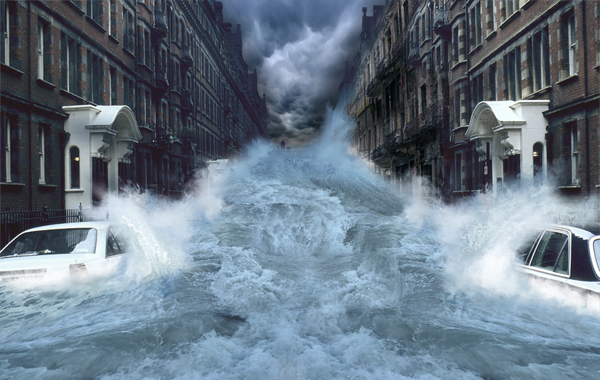
Getting there right? Now you need to do some tweaking to the colors of the image. This can mean anything from water, to the sky or the buildings. In my example, I think the water is a little too blue, so I’m going to desaturate it a little.
Basically use this step for any odd bits and bobs to tweak your image to make it look more streamlined. Be creative, and more importantly, make it look tidy. I lowered the saturation of the water a little, and added some red to the buildings.
Step 12
Now we’ll work on the fog. Its sounds daunting but its actually fairly simple to do. Select a blue color from your water using the Eyedropper Tool. Now select the Gradient Tool and use the following settings.
You will need to create a new layer underneath you’re “water” layer and create the gradient so it blocks out any backdrop behind the water.
Duplicate the layer (Command + J) and place it on top of your water layer, at about 30% opacity. Set this layer to Multiply.
Step 13
This next step is to add rain. There are lots of tutorials on the web that show how to create rain. Here is one that goes into great detail, which you could check out. We’ll keep it relatively simple in this tutorial though. First, create a new layer and fill it with black. Go to Filter > Noise > Add Noise and use these settings.
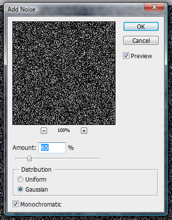
Then Filter > Blur > Motion Blur> and use these settings.
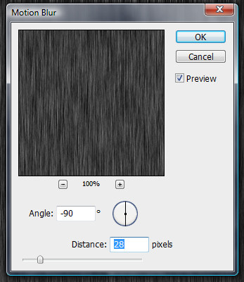
Then Image > Adjustments > Levels and use the following settings.
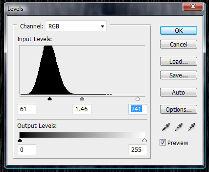
Set the Layer to Screen and use a soft eraser to erase the bottom and top of the Layer, then go to Edit > Transform > Free Transform the “rain” Layer so it covers the whole screen.
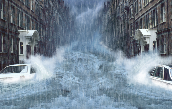
Step 14
It looks a little bit empty in the middle of the water doesn’t it?
Open up the car image and place it somewhere in the distance, underneath the “fog” layer. Resize the images and erase the edges carefully and use the splash1 image to give some life to the car.
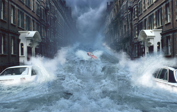
Step 15
Now is the fun part. You’ll need to create a few gradient maps first. Click the Adjustment layer button located at the bottom of your layers window and select the Gradient Map option. Then Click the little arrow in the top-right of the box and select Pastels as shown.
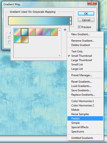
Use the following settings. Finally, set the layer to Multiply at 100%.
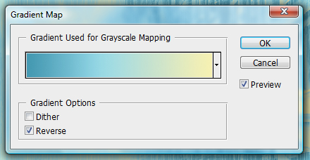
Conclusion
Now its just a case of adding depth and a few other adjustments. Select the Blur Tool at 20% strength, then start blurring the “backdrop” layer in the distance and on the rooftops.

Create a new layer and go to Image > Apply Image and then go to Filter > Sharpen > Sharpen, which gives the image a more detailed and stylized feel. Now you’re done!
Subscribe to the Psdtuts+ RSS Feed for the best Photoshop tuts and articles on the web.
|
| ||
|
+4 |
68 |
Позже,чем кажется |
|
+1 |
2 |
священник Стефан Красовицкий |
|
|
|
|
|
|
|
|
|
|
|
|
Загрузка...
взяты из открытых общедоступных источников и являются собственностью их авторов.
